Docs Home → View & Analyze Data → Atlas Charts
General
Atlas Charts provides general customization options which modify the visualization at a high level, rather than individual pieces of the visualization.
Note
This page illustrates the general customization options which are available for most chart types. Some chart types have other customization options which are noted on their individual documentation pages.
To access the general customization options, expand the General section of the Customize tab.

Color Palette Customization
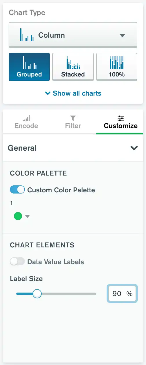
Palette customization allows you to select custom colors for your chart. To enable color customization, select the Customize tab of the Chart Type column. A toggle switch labeled Custom Color Palette appears in the General section.
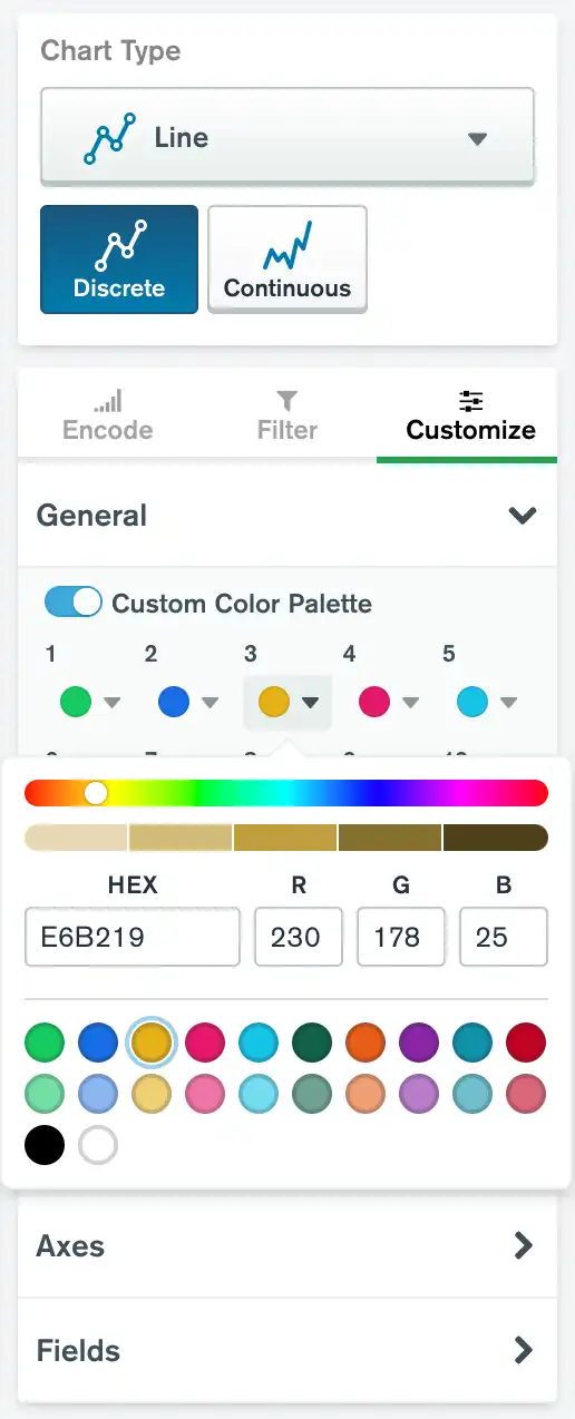
You can also customize individual colors in your palette. Most chart types use a custom color picker with color swatches that correspond to your data series.

Depending on the chart type, each color swatch has a corresponding number or a corresponding name:
Single-series charts have a single numbered swatch.
Multi-series charts built by mapping multiple fields have color swatches with the names of your selected fields.
Multi-series charts built with a numeric or date field in the Series channel have numbered color swatches.
Multi-series charts built with a string field in the Series channel allow you to choose how you want to assign color. For numbered color swatches, select the By Order option. For swatches with field names, select the By Series option.
To change the color of the corresponding data series, click the color swatch. You can select a new color with a color slider, by entering a hex value, by entering RGB values, or by choosing a predefined color. You can also drag and drop color swatches to rearrange the colors in your palette.
Note
For multi-series charts with numbered color swatches,
the custom color palette shows swatches for 10
data series by default, and it can expand
to show up to 20 data series. However, you can only modify as many
swatches as you have data series. For example, if you have two
data series in your chart, only the swatches numbered 1 and
2 have an effect on your chart. If additional series appear
while the chart is rendering, Charts assigns them a new color.
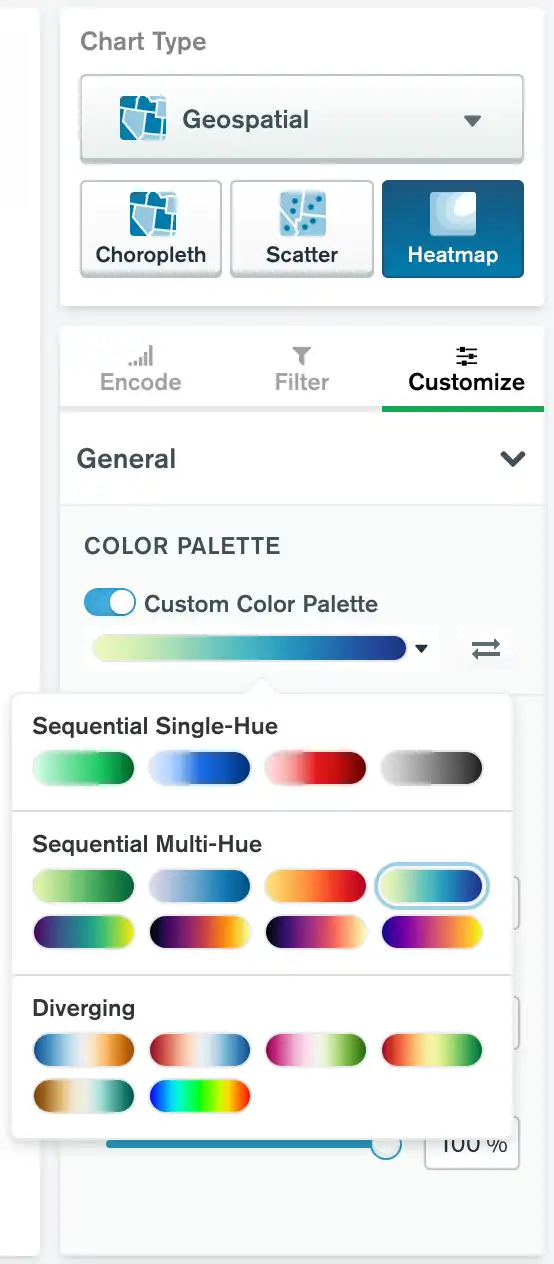
Other chart types use a gradient color scale with a set of pre-defined gradients. The heatmap and colored bar and column types use this method.

To close the color customization tool, click somewhere outside it. To revert the entire chart to its default colors, set the Custom Color Palette toggle switch back to Off.
Applicable Chart Types
This customization option is available for all chart types except Text.
Resize Labels
You can resize the text labels on a chart. Resizing text labels changes:
Axis labels
Axis tick labels
Data value labels
Data category labels
Legend caption and entries
To set this option:
Navigate to the Customize tab in the Chart Builder.
Expand the General section.
In the General section, set the Label Size slider to the desired text size. You can adjust label text to be between 50% and 200% of the default text size.
Applicable Chart Types
This customization option is available for all charts except Gauge, Number, Table, and Word Cloud charts.
Customize Legend
You can show or hide a chart legend. If you show the legend, you can specify its position relative to your chart.
To set this option:
Navigate to the Customize tab in the Chart Builder.
Expand the General section.
In the General section, set the Legend toggle switch to the desired setting. The legend is shown by default.
If you toggle Legend on, you may select a position for the legend relative to the chart:
Right
Bottom
Top
The legend is positioned to the right of the chart by default.
Applicable Chart Types
This customization option is available for all charts which may display a legend. This includes any multi-series chart, as well as charts that have a field mapped to a Color, Intensity, Shape or Size channel.