You can bin, sort, and limit data in your charts to highlight key aspects in your data.
Bin Data
Atlas Charts supports binning date, numeric, and string fields in your data. Binning breaks continuous data into discrete groups called bins, with each bin containing a contiguous subset of the original values. For example, you might group users into bins by the decade they were born, or group timestamped calendar events by the month of their start date.
Example
Continuous vs Discrete Data
Continuous data can occupy any value over a continuous range. Some examples of continuous data include height, temperature, or the time a person was born.
Alternatively, discrete data is data which can only take certain values, categorized into a classification. Examples of discrete data include eye color and the number of students in a class.
When handling dates, this data often comes in a continuous form. It can be useful to split this data into a specific windows of time to uncover additional trends and patterns. Atlas Charts supports the following bins for dates:
|
|
To use binning for dates:
Drag a date field (signified by a calendar icon in the Fields section of the Chart Builder) to a category encoding channel.
By default, binning is enabled as indicated by the Binning On toggle.
Use the dropdown to select the bin size for your dates.
Toggle the Periodic setting as desired.
If enabled, Atlas Charts creates bins relative to the next highest time period and repeats each bin to cover the timeframe spanned in the data field.
If disabled, the bins Charts creates do not repeat.
Example
Consider a date field containing data spanning 5 years, and a bin selection of Month. If Periodic is disabled, Charts adds the 60 months in the dataset to the visualization.
Alternatively, if Periodic is enabled, Charts only plots the 12 calendar months, and visualizes the total aggregated results from each calendar month.
Note
The Periodic setting is always enabled when selecting a bin size of Day of the Week.
The Periodic setting is always disabled when selecting a bin size of Year, because year is the largest time period available in Charts.
To disable binning, toggle the Binning setting to off. In this case, each date from the field is added to the visualization with no grouping performed.
Example
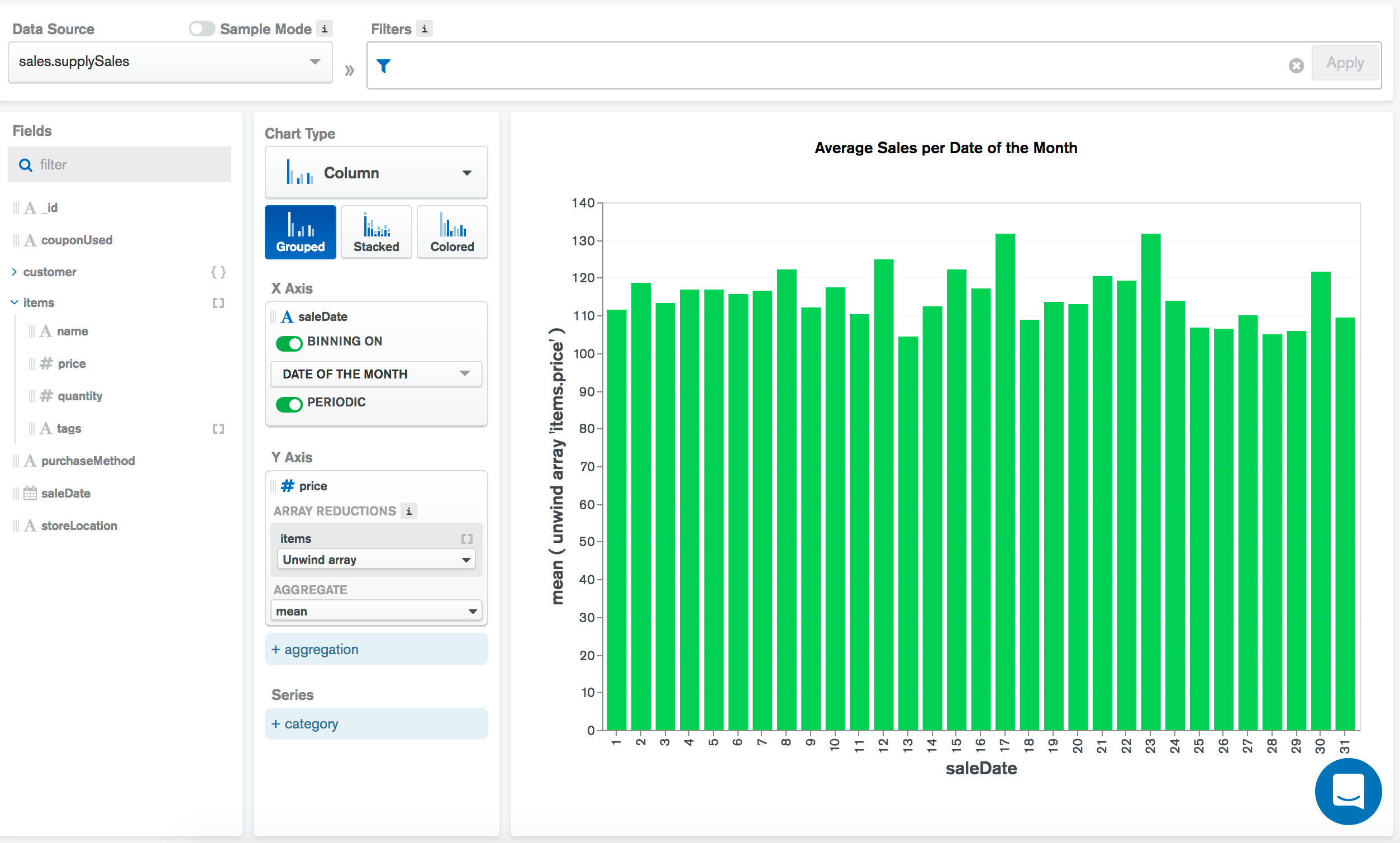
The following chart visualizes historical sales data for an office supply store. Every sale is represented by a document in the supplySales collection. Each document in the collection includes the date of the sale as salesDate and a list of items included in the sale as the items array.
The saleDate field contains continuous timestamp data. The field is binned by Date of the Month with the Periodic setting enabled. This means that over the course of the several years the data spans, Atlas Charts plots the mean value of sales from each individual date of the month:
Compare Periods
When you use binned date data, you have the option to compare data across periods of time. You can display cumulative totals or changes in value.
To use the compare periods feature, a chart must have:
A category channel with a binned, non-periodic date field encoded.
An aggregation channel.
If the conditions are met, the aggregation card has a toggle switch labeled Compare Periods. When toggled on, a dropdown menu appears with options for Cumulative Total and Change in Value.
On a Cumulative Total chart, each successive data point is calculated by adding its own value added to the preceding chronological data point. You can also specify a baseline value to serve as the initial value of the cumulative total. The default baseline value is 0.
On a Change in Value chart, each successive data point shows the difference between it and the preceding chronological data point. The first data point in the chart will always be blank, because there is no previous period to compare against.
The following types of charts can use the compare periods feature:
Note
The cumulative data option is not available with multi-series charts.
Example
The following column chart visualizes yearly sales for an office supply store as a cumulative total across five years. Each document in the collection includes the date of the sale as salesDate and a quantity field with a count of items included in the sale.
The saleDate field is binned by year. The items field is an array in which each item has a quantity field, which is added to the cumulative total with a SUM aggregation operation.

Empty Bins
When binning is enabled, Charts displays entries for empty bins within the minimum and maximum data range a chart displays.
Note
Exception
Charts doesn't display empty bins if including them results in more than 5000 unique bins on a chart.
The value Charts uses for empty bins depends on the aggregation function you choose:
Aggregation Function | Inferred Value |
|---|---|
|
|
All Other Functions |
|
Charts displays bins with null values differently based on chart type:
Chart Type | How Charts Displays null Bins |
|---|---|
Bars with a height of | |
Linear interpolation, with no data marker on the |
Atlas Charts can bin numeric fields from a continuous set into groups of a specified size.
To use binning for numeric fields:
Drag a numeric field (signified by the number sign icon in the Fields section of the Chart Builder) to a category encoding channel.
By default, binning is enabled as indicated by the toggle stating Binning On.
Enter the desired bin size in the Bin Size input.
To disable binning, toggle the Binning setting to off. In this case, each individual value from the field is added to the visualization, rather than being grouped into bins.
Example
The following chart visualizes historical sales data for an office supply store. Every sale is represented by a document in the supplySales collection. Each sale document contains a customer object, which contains information on the customer purchasing the item(s).
The following chart applies binning to the customer.age field. The age field contains continuous numeric data and is binned by decade. Each age value is placed into the appropriate bin and Charts counts the number of ages in each bin to provide a high-level overview of the age distribution of store customers.

Empty Bins
When binning is enabled, Charts displays entries for empty bins within the minimum and maximum data range a chart displays.
Note
Exception
Charts doesn't display empty bins if including them results in more than 5000 unique bins on a chart.
The value Charts uses for empty bins depends on the aggregation function you choose:
Aggregation Function | Inferred Value |
|---|---|
|
|
All Other Functions |
|
Charts displays bins with null values differently based on chart type:
Chart Type | How Charts Displays null Bins |
|---|---|
Bars with a height of | |
Linear interpolation, with no data marker on the |
You can select and bin string categories for greater flexibility over how data is grouped in your chart. When you add categories to a bin, Atlas Charts aggregates data from each selected category to render the data for that bin.
Use Cases
By binning selected categorical strings together, you can group items with a common theme without needing to change your underlying data. You can consolidate a fixed, large set of values into a smaller, more manageable set.
Consider:
A dataset with information pertaining to countries throughout the world, and you want to group countries by continent.
A dataset on various artists throughout history that you want to group by artistic period (for example, Renaissance, Romantic, Modern).
A dataset containing fine-grained version numbers (e.g.
2.3.0,2.3.1,2.3.2-rc1,2.4.0) which you'd like to analyze in coarser-grained groups (e.g.2.3,2.4).
Create a Bin from String Values
Drag a string field to a Category encoding channel.
Toggle Binning for the field to On.
Click Add Bin.
In the Add Bin window, give your bin a title.
At this point you can either create a bin from a list of category strings or define a regular expression to match string values. You can use the list of category strings if you want to choose the exact values for each bin. A regular expression is a better choice if you want to pattern-match a larger range of potential values.
To create a bin from selected category strings:
Click the Select radio button.
Select the categories to include in your bin.
Click Save. The Bins window shows the bins you have created and how many categories belong to each bin.
Note
Each value can only be added to one bin. Any values that have already been added to other bins show as disabled, and are appended with the name of the bin they have been added to.
The list of checkboxes and values comes from a sample of the data and may not include every value that exists in the data. You can manually add additional values to the list.
To create a bin from a regular expression:
Click the Regex radio button.
Enter a regular expression in the Insert regex text box.
Select any desired flags from the dropdown menu to the right of the text box. You can use any combination of the four available flags:
FlagDescriptioniCase insensitive search
mMultiline mode
xExtended mode
sSingle line mode
A sample of matching documents appears. If there are no matching documents, you can still save the bin.
Click Save. The Bins window shows the bins you have created. Bins created from a regular expression are noted with a .* icon.
You can add another bin by clicking the Add Bin link, or close the Bins window by clicking the X in the upper right corner.
Edit and Remove Existing Bins
To edit existing category bins, click the Edit button next to the Binning toggle. The Bins window appears. The badge next to each bin shows how many categories belong in that bin.

To edit a bin, click the Pencil Icon. You can rename the bin and change the categories belonging in that bin.
To remove a bin, click the Trash icon.
Examples
The following chart groups genres from the Movies Sample Data into broader bins:
Historical Movies, which includes the genres Documentary, Biography, History, and War.
Light-Hearted Movies, which includes the genres Comedy, Romance, and Family.
Scary Movies, which includes the genres Drama, Thriller, Horror, and Mystery.
Movies of a genre not included in these bins are grouped into the Other Values bin.
The chart shows the mean imdb.rating rating for movies belonging to each bin. The chart is sorted alphabetically by category name.

The following chart looks through the description field of the sample_airbnb.listingsAndReviews collection for certain words and compares the mean prices. It uses bins to group documents based on whether the description field contains a string matching the pattern specified by the regular expression.

Behavior
Values can only belong to only one category bin, but they can belong to any number of regex bins.
Any values shown on the chart that have not been added to any bins are automatically added to a default bin called Other Values.
The order in which bins appear in the Bins window is significant. Each value is rendered in the chart as part of the highest-ranked bin it appears in.
Note
You can reorder your bins by dragging and dropping them in the Bins window.
Sort Data
Use the Sort By dropdown in the Chart Builder to sort chart data by either:
Category
Value
Series field (for multi-series charts)
If you sort a multi-series chart generically by Value without sorting by a specific series, Atlas Charts sorts your data based on the sum of all values in your series.
To toggle between ascending or descending sort order, click the a-z button to the right of the Sort By dropdown.
By default, Charts sorts data based on Value in descending order.
Sort Multi-Series Charts by Series Value
If you create a multi-series chart using a different field per series, you can sort the chart by a specific series field.
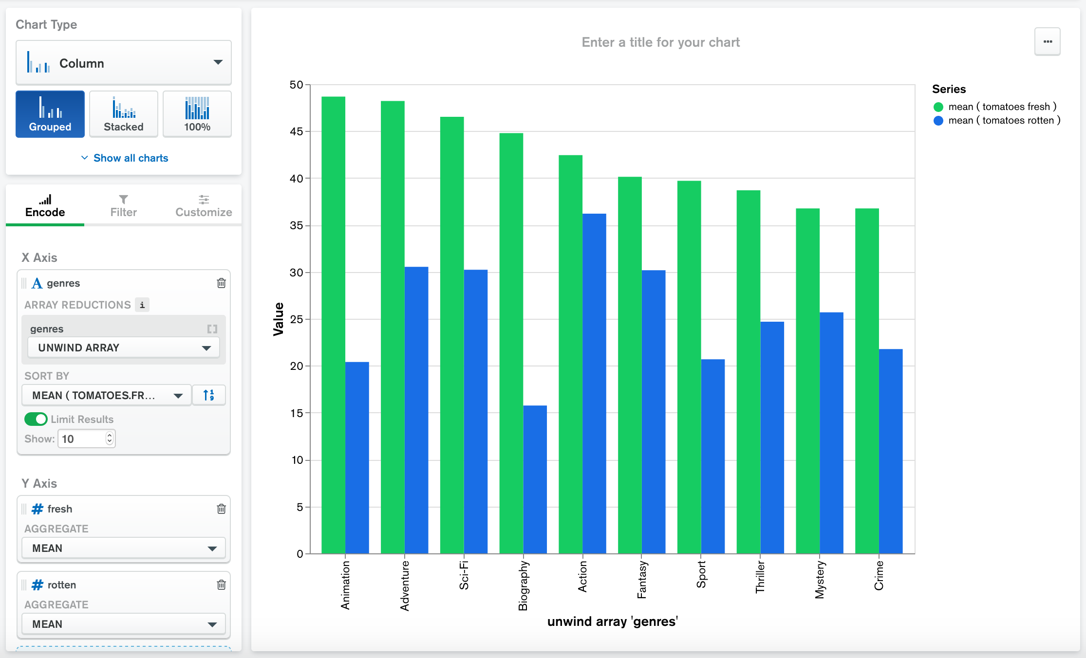
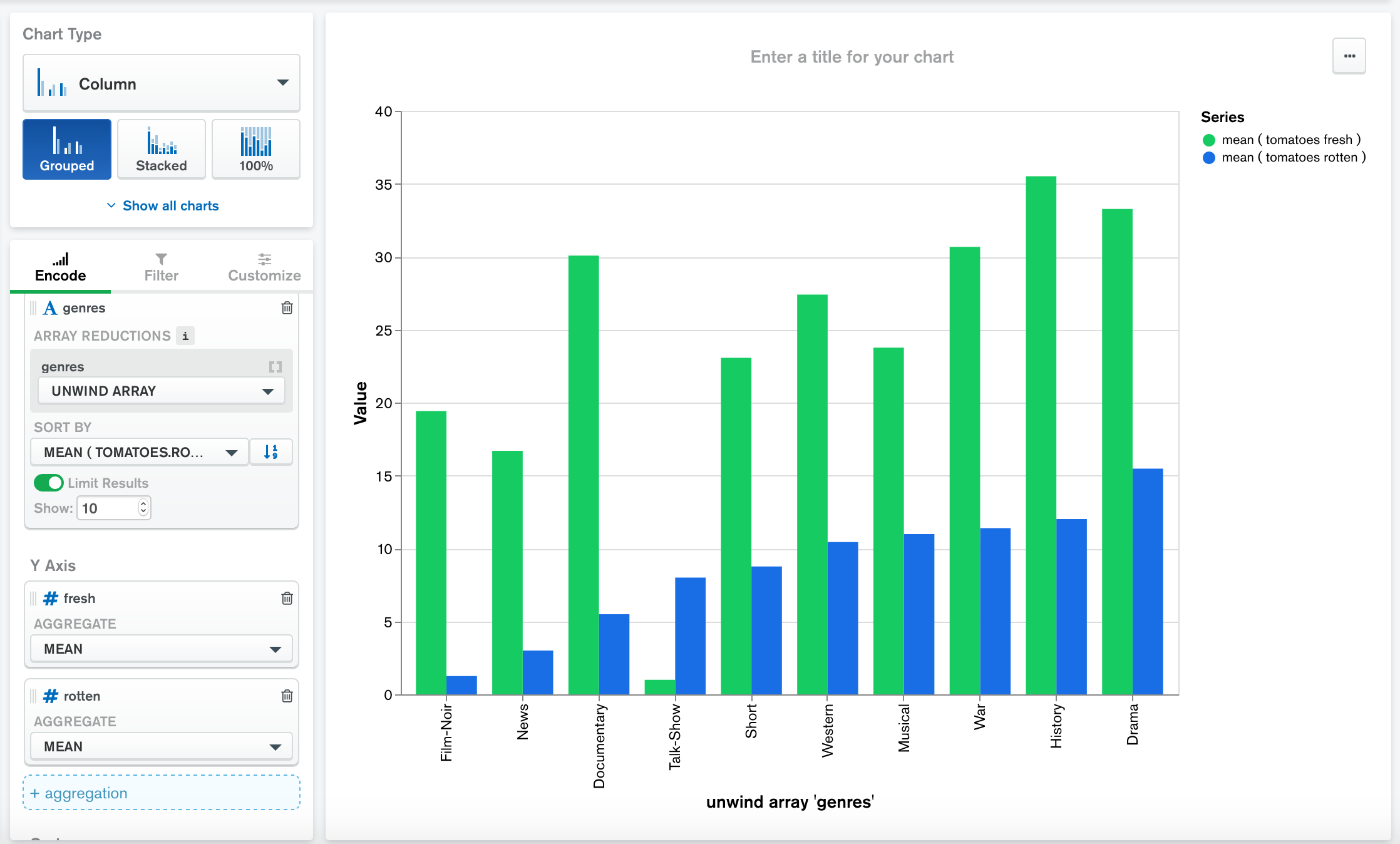
Example
The following charts use the Sample Data: Movies data source to compare the mean number of fresh and rotten Rotten Tomato ratings for movies in each genre.
This chart is sorted by the mean fresh value in descending order:
This chart is sorted by the mean rotten value in ascending order:
Limit Data
You can apply a limit to the Category encoding channel to only include a specified number of categories in your visualization. The categories included are the first matching categories based on the sort order specified. Limiting data can be useful when visualizing data with so many categories it becomes difficult to create a meaningful chart.
When you limit your data, you may additionally enable Show "All Others" to create a new category called "All others" that combines the values of categories omitted by your limit.
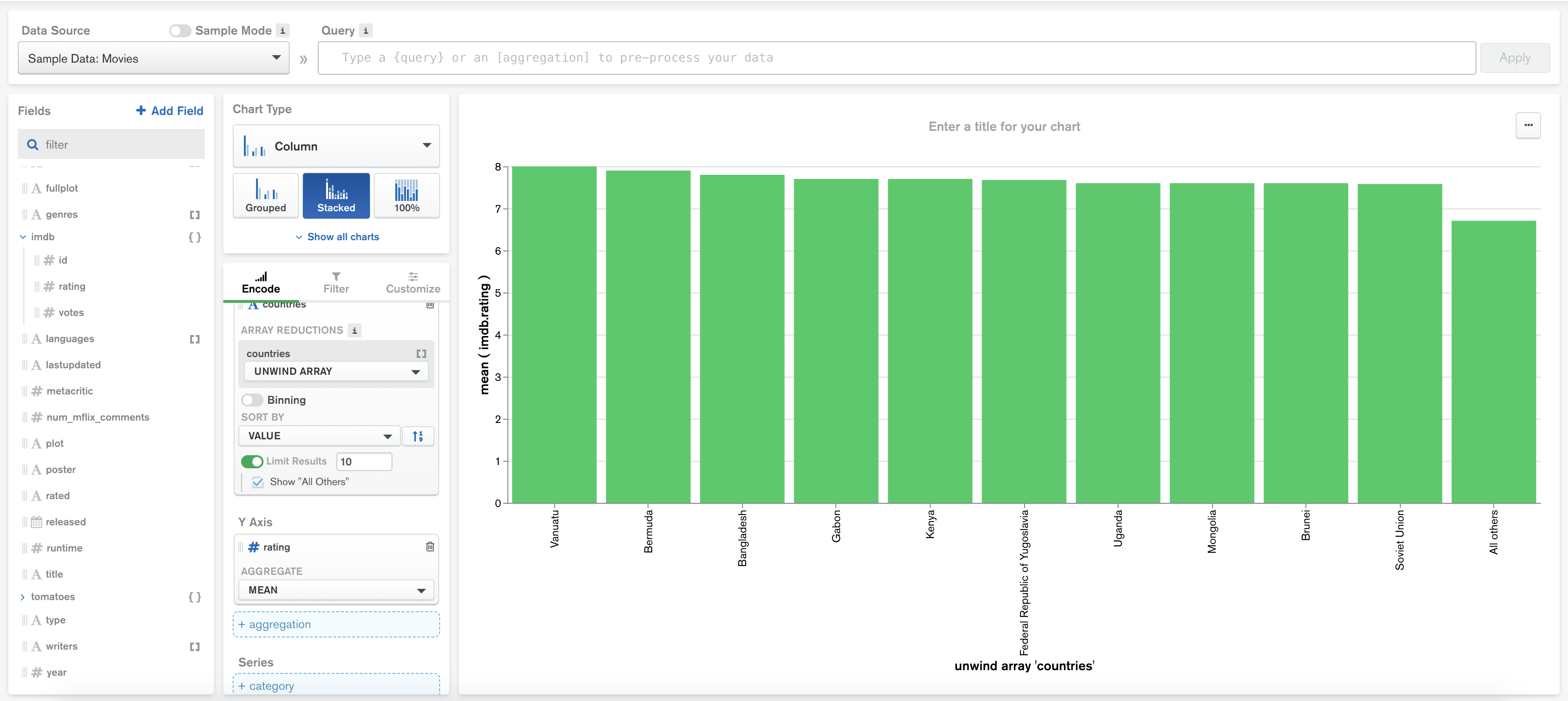
Example
The following chart shows the average IMDb rating of movies from a particular country:
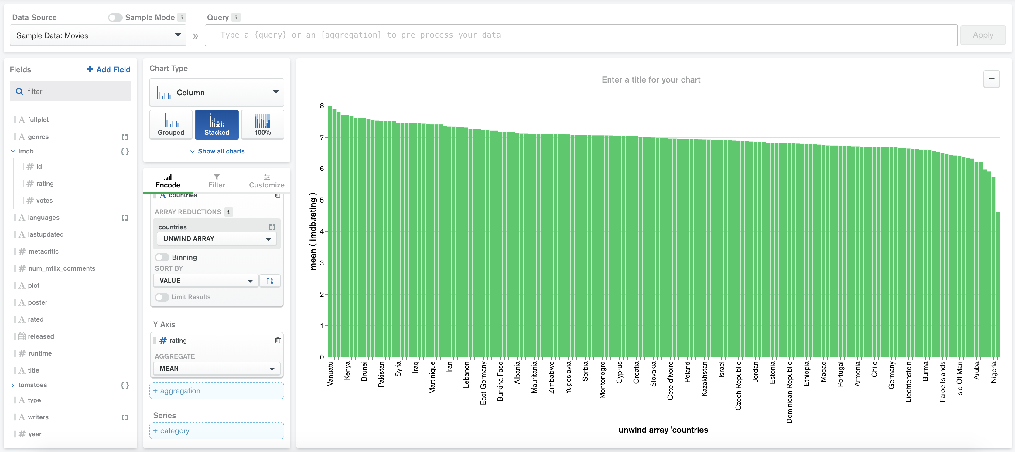
The dataset contains movies from many different countries, but it would be most interesting to see which countries produce the highest-rated movies. We can accomplish this by applying a limit to only show countries with the 10 highest average ratings for movies.
Switch the Limit Results toggle to On and leave the Show input at the default value of 10.
Check Show "All Others" to create an 11th column representing the average rating of movies from countries that aren't in the top 10.
The chart is now much easier to understand, and we have a clear view of the countries with the highest-rated movies: