Geospatial scatter charts distribute data from a data source across geographic locations, and, optionally, color the data points based on the database field of your choice and scale the size of data points. The sample images in the next section demonstrate how to construct a geospatial scatter chart to locate the neighborhoods in NYC with the most rooms available at a specified price.
Geospatial Scatter Chart Encoding Channels
Geospatial scatter charts use the Coordinates, Color and Size encoding channels.
Coordinates
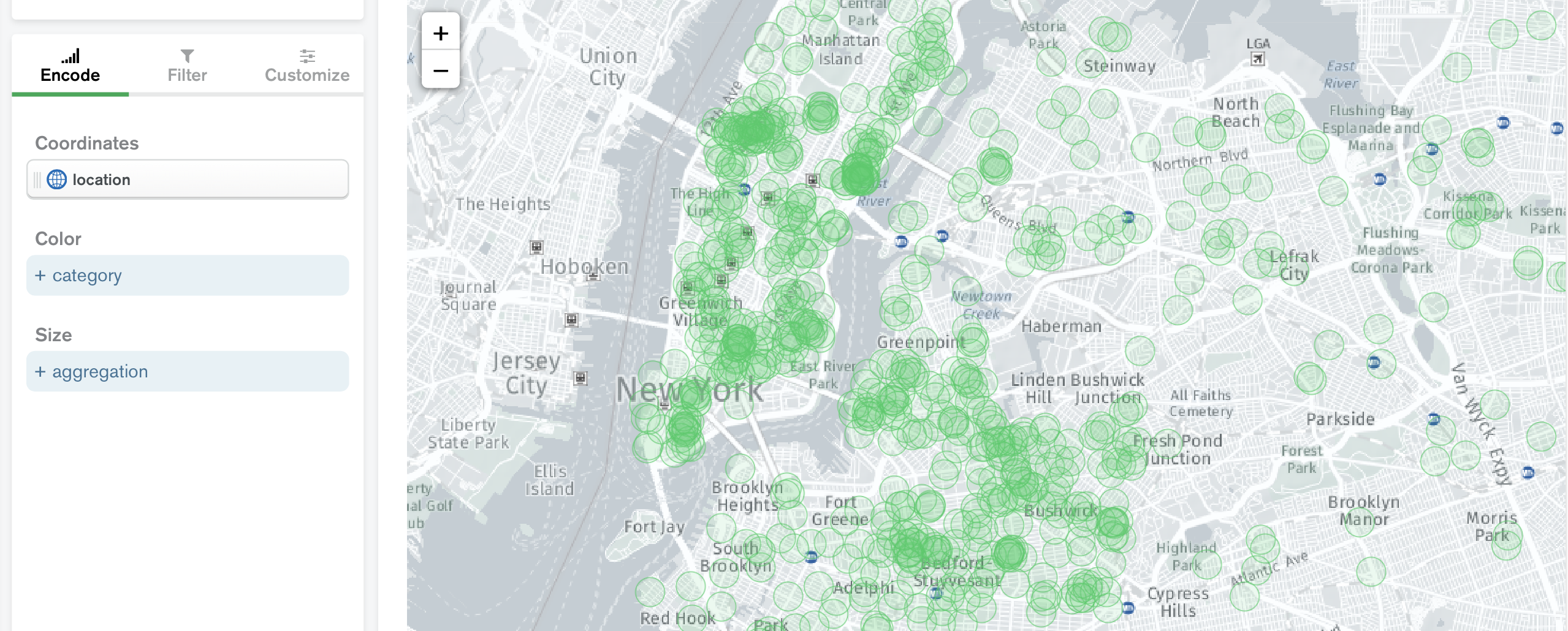
The Coordinates encoding channel defines the map area of geospatial charts. The image below distributes all of the instances of the location geopoint in the Sample AirBnB Listings Dataset. However, all of the circles are green and the same size since we have not yet specified fields for the Size and Color encoding channels.
Note
Atlas provides several sample data sets for download.
See the Geopoint reference page for more information about what types of data you can use in this channel.
Color
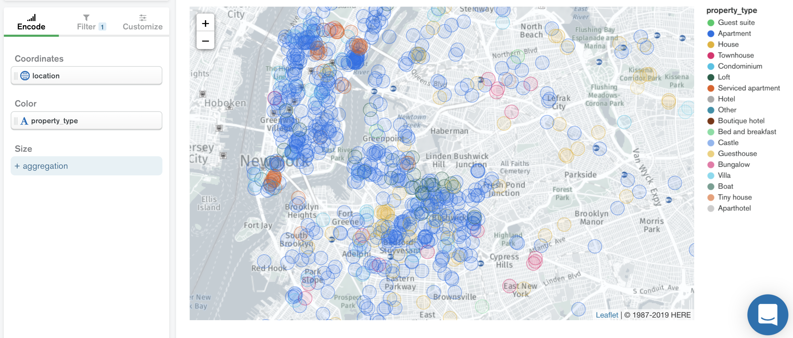
(Optional) The Color encoding channel changes the color of the data points to categorize the displayed geopoints by the value of the selected collection field. Atlas Charts lists the colors used in a key to the right of the chart. In the image below, the property_type distributes the property types in NYC by color. The key to the right of the chart indicates green for guest suites and dark blue for apartments, for example. However, all of the circles are still the same size since we have not yet specified a field for the Size encoding channel.
Size
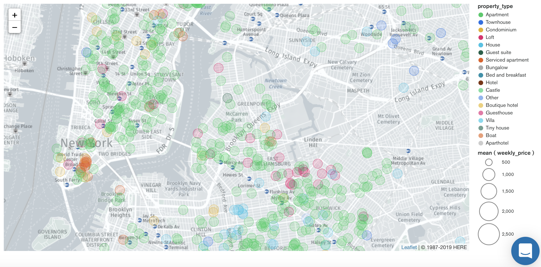
(Optional) The Size aggregation encoding channel changes the size of the data point markers, with larger sizes indicating larger aggregated values. The image below uses the mean of the weekly_price collection field to aggregate all instances of the geopoint that you chose for the Coordinates encoding channel. The key to right of the chart indicates the aggregation value for the different circle sizes.
Note
If no fields are encoded in the Size encoding channel, Charts displays all points with the same size.
Tooltip Detail
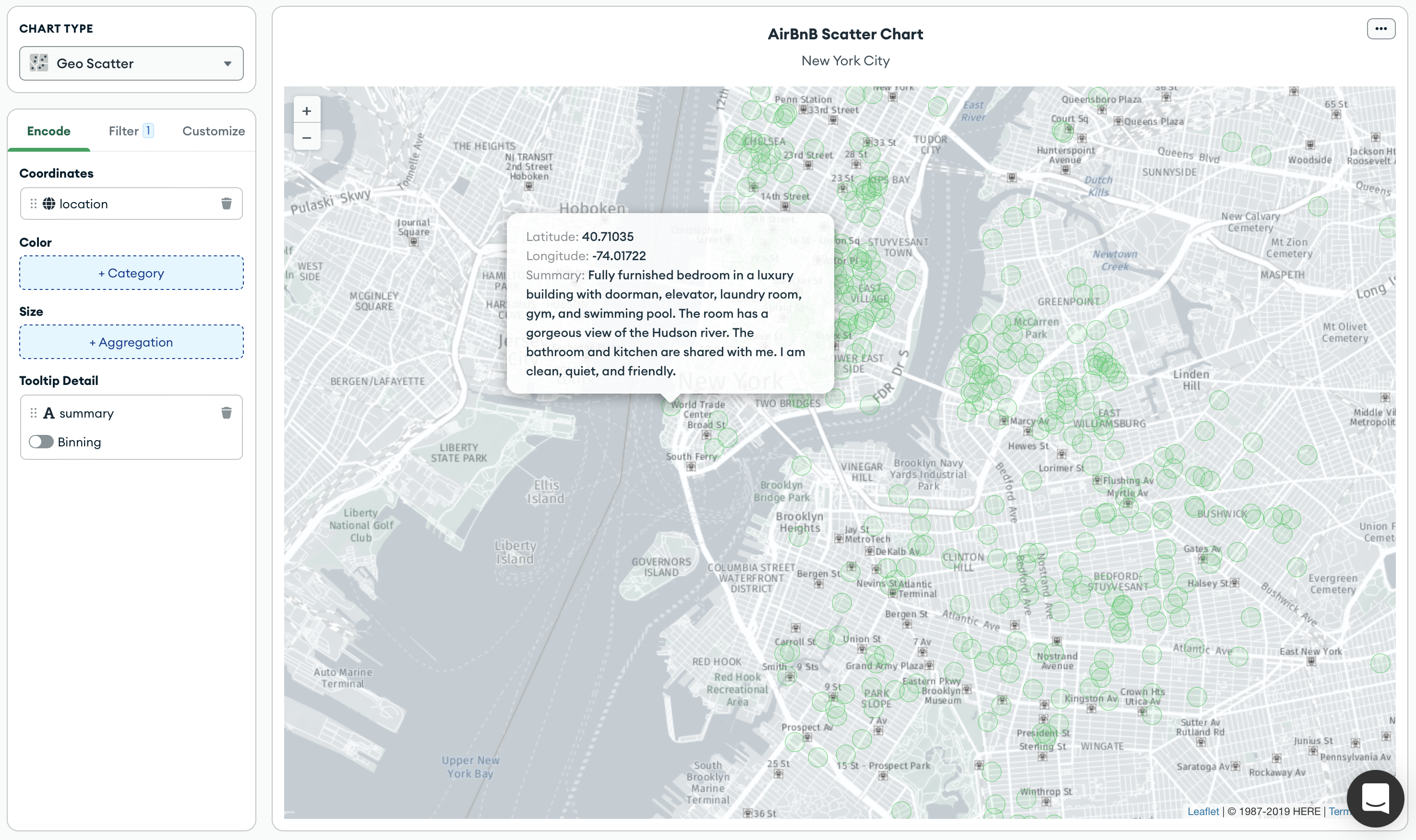
(Optional) The Tooltip Detail encoding channel adds the value of the selected field to each data point's tooltip. To view a data point tooltip, hover over that point in the chart.
In addition to the Tooltip Detail field, the tooltip also shows other fields used to construct the chart.
For example, the following chart encodes the Summary field as a Tooltip Detail:
Customization Options
The following customization options are specific to geospatial scatter charts. For general customization options, see Customize Charts.
Automatically Set Viewport
By default, geospatial charts show a map which includes all the data point markers in your specified collection. You can pan and zoom to change the map view, but if you close the chart and re-open it the map reverts to its default state. This behavior is controlled by the Automatically Set Viewport option.
When you toggle the Automatically Set Viewport switch to Off, the area and zoom level at which the map is saved becomes the new default view.
Note
You can pan and zoom the map area in a chart on a dashboard, but these changes do not affect the default map view.
Opacity
The Opacity level of a map modifies the degree to which the chart's map data shows through the data point markers.
Geospatial scatter charts default to 20%.
Stroke Thickness
You can set the Stroke Thickness, measured in pixels, of the map's data point markers. The default is 2.
Custom Color Palette
The color palette specifies the range of colors that corresponds to relative aggregated values in your map. Geospatial scatter charts use a discrete color picker.
To enable palette customization, toggle the Custom Color Palette switch in the General section.
For more information, see Color Palette Customization.
Tutorials
See the following tutorials to build geospatial scatter charts:
Prerequisites
The tutorials on this page use the sample_airbnb.listingsAndReviews and sample_geospatial.shipwrecks collections. Before starting, you must load the sample data on your cluster. To learn how to load the sample data provided by Atlas into your cluster, see Load Sample Data.
Create a Geospatial Scatter Chart Using GeoJSON Points
This tutorial demonstrates how to create a geospatial scatter chart with fields that are GeoJSON Points. The final chart displays a scatter chart of AirBnB listings in New York.
Note
Charts automatically determines if field types in your collection are GeoJSON Points by displaying the icon. You can map these fields directly to a geopoint channel type in the Chart Builder. For more information, see Geopoint Channel Type.
Go to the Dashboards page.
For instructions, see Dashboards.
Add a geospatial scatter chart to your dashboard.
From the Dashboards page, select the dashboard where you want to add a new chart. For instructions on setting up a dashboard, see Dashboards.
Click Add Chart.
In the Select Data Source modal, click the Project tab.
In the cluster where you loaded the sample data, select the
listingsAndReviewscollection in thesample_airbnbdatabase.In the Chart Type dropdown, click Geo Scatter.
For more details, see Create a Chart.
Add fields to your chart.
Select the Encode tab.
Navigate to the Fields pane on the left side of the Chart Builder. This section lists all available fields in the
listingsAndReviewscollection.Drag the
locationgeopoint field nested in theaddressfield to the Coordinates encoding channel.Drag the
property_typefield to the Color encoding channel.Drag the
pricefield to the Size encoding channel. Then, in the Aggregate dropdown that appears, set the aggregation method to mean.Charts displays a scatter chart of AirBnB listings across the world. The color of each data point corresponds to the property type, and the size of each point corresponds to the mean price.
Note
To customize colors, click the Customize tab. Under General, enable the Custom Color Palette and set your preferred colors. For more information, see Color Palette Customization.
Create a Geospatial Scatter Chart Using Numeric or Numeric Array Fields
This tutorial demonstrates how to create a geospatial scatter chart with numeric or numeric array fields. The final chart displays a scatter chart of shipwrecks across the world.
Go to the Dashboards page.
For instructions, see Dashboards.
Add a geospatial scatter chart to your dashboard.
From the Dashboards page, select the dashboard where you want to add a new chart. For instructions on setting up a dashboard, see Dashboards.
Click Add Chart.
In the Select Data Source modal, click the Project tab.
In the cluster where you loaded the sample data, select the
shipwreckscollection in thesample_geospatialdatabase.In the Chart Type dropdown, click Geo Scatter.
For more details, see Create a Chart.
Add fields to your chart.
Select the Encode tab.
Navigate to the Fields pane on the left side of the Chart Builder. This section lists all available fields in the
shipwreckscollection.Drag the
coordinatesnumeric array field to the Coordinates encoding channel.Note
Alternatively, you can specify the latitude and longitude coordinates separately. First, drag the
latdecnumeric field to the Coordinates encoding channel. Once the Longitude channel appears, drag thelondecnumeric field to the corresponding channel.Drag the
feature_typefield to the Color encoding channel.Drag the
depthfield to the Size encoding channel. Then, in the Aggregate dropdown that appears, set the aggregation method to mean.Charts displays a scatter chart of shipwrecks across the world. The color of each data point corresponds to the shipwreck type, and the size of each point corresponds to the mean shipwreck depth.
Note
To customize colors, click the Customize tab. Under General, enable the Custom Color Palette and set your preferred colors. For more information, see Color Palette Customization.
Limitations
The maximum query response size for a geospatial scatter chart is 1000 documents.