You can use geospatial heatmap charts to visualize how geographic areas of a map compare to one another based on a given criterion.
Geospatial Heatmap Encoding Channels
Coordinates
A geopoint encoding channel which defines the map area of the chart. See the Geopoint reference page for more information about what types of data you can use in this channel.
Intensity
An aggregation encoding channel that changes the shading of the colors in different chart regions to reflect the aggregated values of this field. More intense colors in the visualization reflect greater aggregated values.
The radius customization option dictates the size of the data markers in Geospatial Heatmaps. The color of each data marker reflects the aggregated value of all data points within that marker's radius.
Example
If ten data points exist within the specified radius, the color displayed is based on the aggregated value of those ten data points.
Note
Intensity shading is local to the map's current view. The most intense color is displayed for the most extreme aggregated values currently visible on the map, even if there are points outside the current view that are more extreme.
Legend
Unlike other types of charts, the legend and the chart colors on geospatial heatmaps change when the view changes. The color range is based on the data in the current view, and may change when you pan or zoom the map.
Customization Options
The following customization options are specific to geospatial heatmap charts. For general customization options, see Customize Charts.
Automatically Set Viewport
By default, geospatial charts show a map which includes all the data point markers in your specified collection. You can pan and zoom to change the map view, but if you close the chart and re-open it the map reverts to its default state. This behavior is controlled by the Automatically Set Viewport option.
When you toggle the Automatically Set Viewport switch to Off, the area and zoom level at which the map is saved becomes the new default view.
Note
You can pan and zoom the map area in a chart on a dashboard, but these changes do not affect the default map view.
Radius
You can adjust the radius of your data points. The radius is measured in pixels and defaults to 30.
Opacity
The Opacity level of a map modifies the degree to which the chart's map data shows through the data point markers.
Geospatial heatmap charts default to 100%.
Custom Color Palette
The color palette specifies the range of colors that corresponds to relative aggregated values in your map. Geospatial heatmap charts use a gradient color picker.
To enable palette customization, toggle the Custom Color Palette switch in the General section.
For more information, see Color Palette Customization.
Examples
The following chart is based on AirBnB data for the New York City area. It shows rental rate hot spots in a geospatial heatmap.
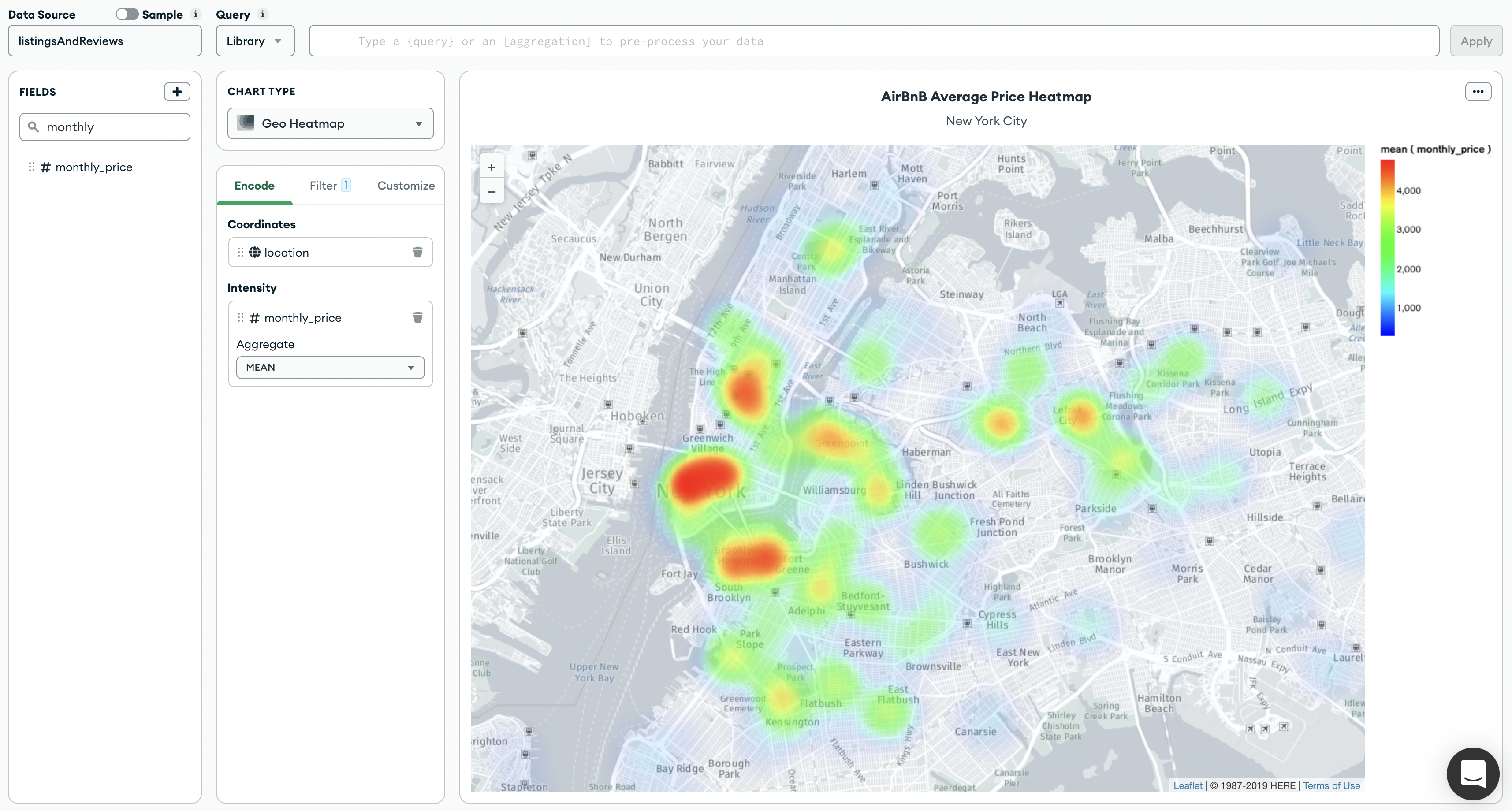
The Coordinates channel uses the location database field, which contains arrays of latitude-longitude pairs. The Intensity field uses the monthly_price database field, which contains monthly rental rates for each property in the database.
Tutorials
See the following tutorials to build geospatial heatmap charts:
Prerequisites
The tutorials on this page use the sample_airbnb.listingsAndReviews and sample_geospatial.shipwrecks collections. Before starting, you must load the sample data on your cluster. To learn how to load the sample data provided by Atlas into your cluster, see Load Sample Data.
Create a Geospatial Heatmap Chart Using GeoJSON Points
This tutorial demonstrates how to create a geospatial heatmap chart with fields that are GeoJSON Points. The final chart displays a heatmap of average AirBnB prices in New York.
Note
Charts automatically determines if field types in your collection are GeoJSON Points by displaying the icon. You can map these fields directly to a geopoint channel type in the Chart Builder. For more information, see Geopoint Channel Type.
Go to the Dashboards page.
For instructions, see Dashboards.
Add a geospatial heatmap chart to your dashboard.
From the Dashboards page, select the dashboard where you want to add a new chart. For instructions on setting up a dashboard, see Dashboards.
Click Add Chart.
In the Select Data Source modal, click the Project tab.
In the cluster where you loaded the sample data, select the
listingsAndReviewscollection in thesample_airbnbdatabase.In the Chart Type dropdown, click Geo Heatmap.
For more details, see Create a Chart.
Add fields to your chart.
Select the Encode tab.
Navigate to the Fields pane on the left side of the Chart Builder. This section lists all available fields in the
listingsAndReviewscollection.Drag the
locationgeopoint field nested in theaddressfield to the Coordinates encoding channel.Drag the
pricefield to the Intensity encoding channel. Then, in the Aggregate dropdown that appears, set the aggregation method to mean.Charts displays the aggregated mean prices of AirBnB listings across the world. The color gradient to the right represents the range of prices in the heatmap. A more intense gradation reflects higher prices in the area.
Note
To customize colors, click the Customize tab. Under General, enable the Custom Color Palette and set your preferred colors. For more information, see Color Palette Customization.
Create a Geospatial Heatmap Chart Using Numeric or Numeric Array Fields
This tutorial demonstrates how to create a geospatial heatmap chart with numeric or numeric array fields. The final chart displays a heatmap of shipwrecks across the world.
Go to the Dashboards page.
For instructions, see Dashboards.
Add a geospatial heatmap chart to your dashboard.
From the Dashboards page, select the dashboard where you want to add a new chart. For instructions on setting up a dashboard, see Dashboards.
Click Add Chart.
In the Select Data Source modal, click the Project tab.
In the cluster where you loaded the sample data, select the
shipwreckscollection in thesample_geospatialdatabase.In the Chart Type dropdown, click Geo Heatmap.
For more details, see Create a Chart.
Add fields to your chart.
Select the Encode tab.
Navigate to the Fields pane on the left side of the Chart Builder. This section lists all available fields in the
shipwreckscollection.Drag the
coordinatesnumeric array field to the Coordinates encoding channel.Note
Alternatively, you can specify the latitude and longitude coordinates separately. First, drag the
latdecnumeric field to the Coordinates encoding channel. Once the Longitude channel appears, drag thelondecnumeric field to the corresponding channel.Drag the
_idfield to the Intensity encoding channel. The aggregation method is set to count by default.Charts displays the aggregated count of shipwrecks across the world. The color gradient to the right represents the range of count values in the heatmap. A more intense gradation suggests that more shipwrecks have occurred in the area.
Note
To customize colors, click the Customize tab. Under General, enable the Custom Color Palette and set your preferred colors. For more information, see Color Palette Customization.
Limitations
The maximum query response size for a geospatial heatmap is 50000 documents.