Choropleth charts are maps that use shading to depict differences across regions. The shading of a region (e.g. states, countries) is based on an aggregated value and is proportional to the corresponding value of other regions.
Unlike other geospatial charts, choropleths do not require coordinate data in your collections. Instead you can have names of regions as strings, so long as the region strings correspond to the names used in a supported Shape Scheme.
Regions
To help define regions, Atlas Charts provides Shape Schemes. For example, with the US States scheme, you can define regions at a state level, and your location field value must be one of the 50 states.
Choropleth Chart Encoding Channels
Choropleth charts use the following encoding channels:
Encoding Channel | Description |
|---|---|
Defines the regions to be shaded on the map. The value must match (case insensitive) a region value for the
selected Shape Scheme. For example, when using the
US States scheme, the region of For a complete list of shape schemes and their expected values, refer to the Shape Schemes page. | |
Defines the Aggregation that determines the shading of the corresponding Location. You can customize the range of colors that corresponds to the relative aggregated values. |
Use Cases
Choropleth charts can be used to depict differences in your selected aggregated field between geographic subregions, such as states or countries. They are useful when you have a dataset with clearly defined subregions compatible with one of the Shape Schemes Atlas Charts provides.
A choropleth chart is a good choice to compare:
Population density across US states.
Annual rainfall across European countries.
Number of cellphone towers across Australian states.
Tip
If you are looking for a chart to depict exact values rather than a high-level comparison, consider using a Table.
Customization Options
The following customization options are specific to choropleth charts. For general customization options, see Customize Charts.
Automatically Set Viewport
By default, geospatial charts show a map which includes all the data point markers in your specified collection. You can pan and zoom to change the map view, but if you close the chart and re-open it the map reverts to its default state. This behavior is controlled by the Automatically Set Viewport option.
When you toggle the Automatically Set Viewport switch to
Off, the area and zoom level at which the map is saved becomes the
new default view.
Note
You can pan and zoom the map area in a chart on a dashboard, but these changes do not affect the default map view.
Opacity
The Opacity level of a map modifies the degree to which the chart's map data shows through the data point markers.
Choropleth charts default to 100%.
Custom Color Palette
The color palette specifies the range of colors that corresponds to relative aggregated values in your map. Choropleth charts use a gradient color picker.
To enable palette customization, toggle the Custom Color Palette switch in the General section.
For more information, see Color Palette Customization.
Examples
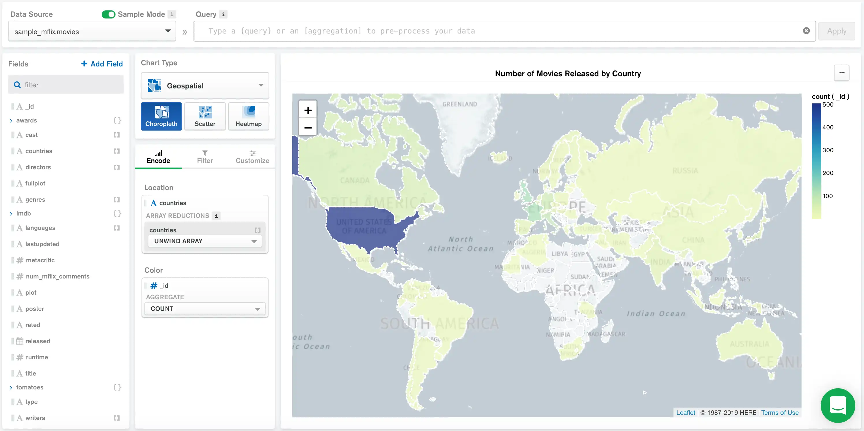
The following choropleth chart visualizes the total count of movie releases across various countries. Each document in the collection contains an array of countries where a particular movie was released.
To build the chart in this example, see the following tutorial:

In this chart, we specify a Shape Scheme of World Countries to divide the map into countries.
The countries array in the Location field contains
an array of elements representing each country where a movie
was released. These elements match the values expected by the
World Countries shape scheme. We unwind the array so
each movie contributes to the count for each country where it was
released.
The Color field of id is aggregated by
Count. As a result, each country is shaded based on its
number of movies released.
The custom color palatte for this chart ranges from yellow for lower ratings to dark red for higher ratings. Based on the visualization, we see that France, India, and Japan have relatively high movie release counts compared with other countries.
Tip
For a complete list of choropleth Shape Schemes and their expected values, refer to the Choropleth Regions page.
Tutorial
Prerequisites
The tutorial on this page uses the sample_mflix.movies collection. Before starting,
you must load the sample data on your cluster. To learn how to load the sample data provided
by Atlas into your cluster, see Load Sample Data.
Create a Geospatial Choropleth Chart
This tutorial demonstrates how to create a geospatial choropleth chart that visualizes the total count of movie releases across various countries.
Go to the Dashboards page.
For instructions, see Dashboards.
Add a geospatial choropleth chart to your dashboard.
From the Dashboards page, select the dashboard where you want to add a new chart. For instructions on setting up a dashboard, see Dashboards.
Click Add Chart.
In the Select Data Source modal, click the Project tab.
In the cluster where you loaded the sample data, select the
moviescollection in thesample_mflixdatabase.In the Chart Type dropdown, click Geo Choropleth.
For more details, see Create a Chart.
Add fields to your chart.
Select the Encode tab.
Navigate to the Fields pane on the left side of the Chart Builder. This section lists all available fields in the
moviescollection.Drag the
countriesgeopoint field to the Location encoding channel.Under the Choose Method drop down for the Location encoding channel, click Unwind Array.
Drag the
_idfield to the Color encoding channel.Under the Aggregate drop down for the Color encoding channel, click Count.
Limitations
The maximum query response size for a choropleth chart is 5000 documents.