Time to Complete: 5 minutes
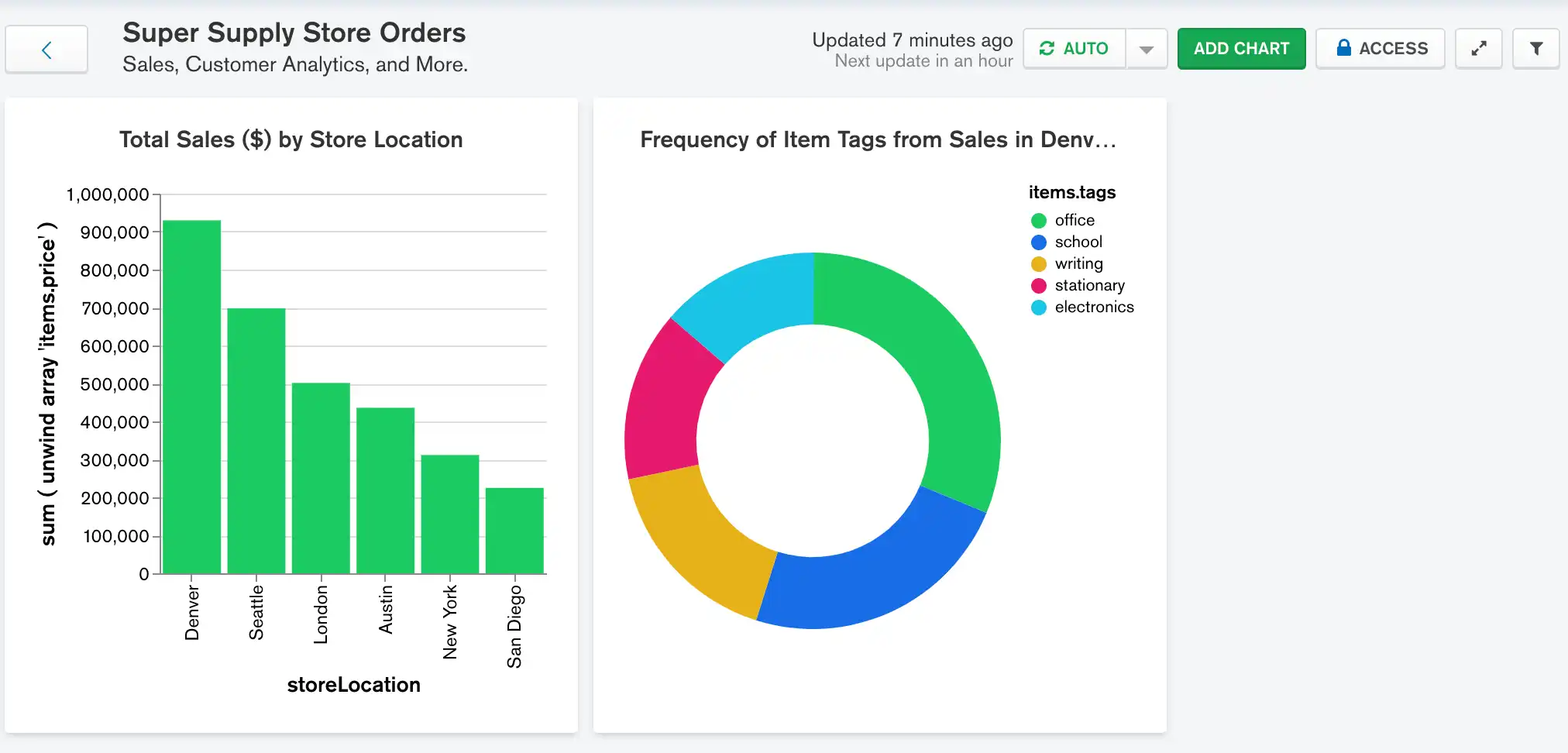
Next we will add a chart where you can quickly see which types of items the company is selling the most of. This information will be helpful for the company marketing team to know how effectively direct advertising.
In this scenario, your manager has expressed interest specifically
in items sold from the Denver and New York store locations.
Additionally, they have requested to only visualize sales which
contain an item costing $1200 or more, in an effort to more closely
examine the new line of laptops being sold at these locations and what
types of items are being bought with them. You can accomplish this
using a filter in your
donut chart, as shown in the following
procedure.
Construct the Chart
Select the dashboard.
From the Dashboards page, select the dashboard where you want to add a new chart. For instructions on setting up a dashboard, see Dashboards.
Select the Chart Type
In the Chart Type dropdown, select Circular.
Click Donut below the dropdown.
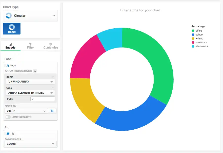
Example
Donut Chart
A donut chart is a good choice for this chart because donut charts show the relationship of parts to a whole. Using this chart type you can easily get an idea of which tags make up the greatest portion of total sales.
Add the desired fields to the proper encoding channels.
In the Fields section click the
itemsfield to expand theitemsobject and view its properties.Drag the
items.tagsfield to the Label encoding channel. The Label encoding channel dictates which field to use when dividing the sections of the chart.In the array reduction dropdown for the
itemsarray select Unwind array.In the array reduction dropdowns for the
tagsselect Array element by index. Using this option you can specify which element of thetagsarray to visualize.Enter
0for the Index input to only visualize the first element of thetagsarray. The first item tag is the most relevant tag to the item, so it should be the main concern in the visualiztion. This is the primary item tag.Note
Selecting an array element by index also ensures the chart does not get overcrowded with less important tags as it would had you chosen to unwind the
tagsarray rather than select a specific element.Drag the
idfield to the Arc encoding channel.In the Aggregate dropdown, select count. This option counts the occurrences of the first tag of each item and adds them to the chart.
Your chart should now look something like this:

Copy the following filter into the Query input above the main chart display.
{ storeLocation: { $in: [ "Denver", "New York" ] }, 'items.price': {$gte: 1200} }
This filter specifies that
Charts only visualizes item tags from items sold from either
the Denver or New York store location where there was an
item in the sale costing $1200 or more.
Click Apply to the right of the filter.
Your chart should now look something like this:

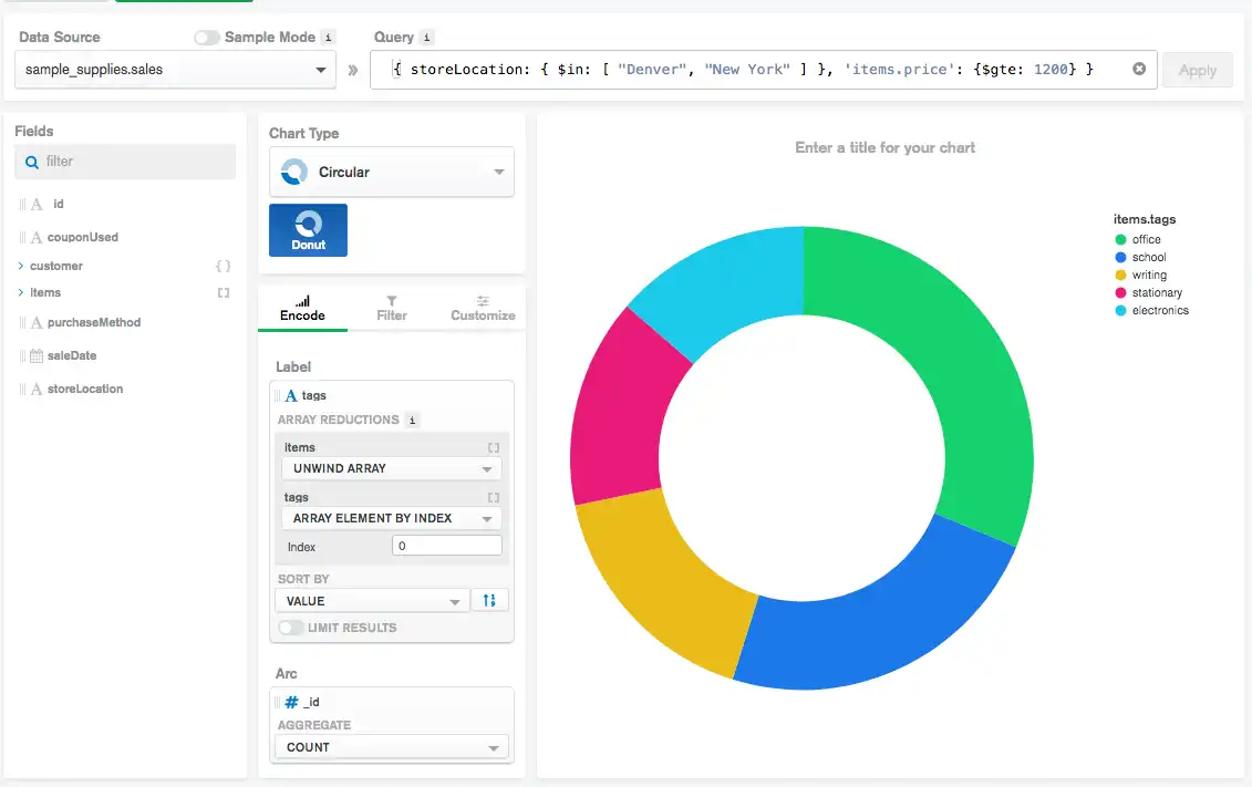
Notice how the electronics tag now takes a larger slice of the
distribution compared to when not using the filter. Based on this
chart, notice that office and school are the two most common
primary item tags from sales matching the filter.

Next Steps
Now that we have a chart showing the tags of the items sold, it would be helpful to know which specific items are most commonly sold at the various store locations. To do so, refer to the next section to see how to implement a grouped column chart showing the most common items sold by store location.