Time to Complete: 5 minutes
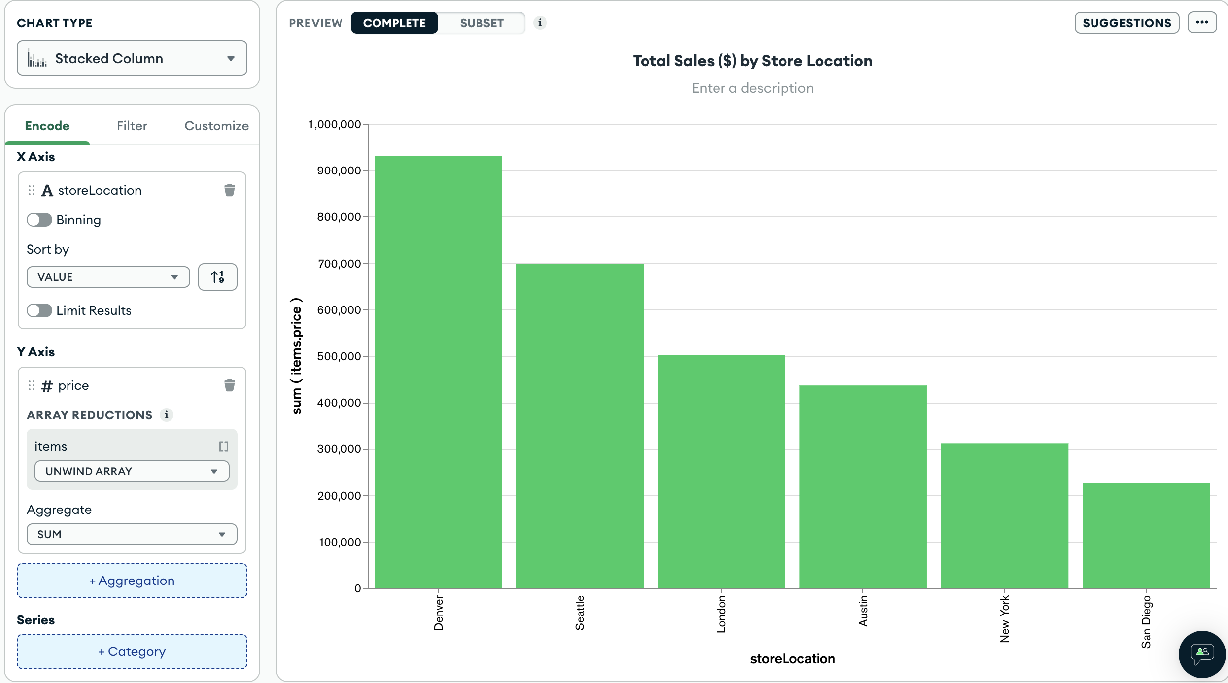
Looking at the data fields available in the schema, some of the most valuable information you can relay revolves around revenue. You may want to know how various stores are performing, specifically if there are any stores significantly under or overperforming compared to others.
A column chart works well for this type of visualization because you can easily compare individual store revenue based on the size of each column.
Construct the Chart
Select the dashboard.
From the Dashboards page, select the dashboard where you want to add a new chart. For instructions on setting up a dashboard, see Dashboards.
Select the Chart Type
In the Chart Type dropdown, select Stacked Column.
To render a stacked column chart, Atlas Charts creates a bar or column for each distinct value in the category encoding channel field.
Add the desired fields to the proper encoding channels.
Drag the
storeLocationproperty from the Fields section of the Chart Builder view to the X Axis encoding channel.This tells Atlas Charts to create a column for each
storeLocationvalue in the dataset.Note
Atlas Charts infers the data type of each field and provides symbols to easily determine these data types when building your chart. These symbols can help ensure your chart renders as expected by using proper data types for each encoding channel. For example, the calendar icon next to the
saleDatefield signifies that this field is a timestamp.In the Fields section click the
itemsfield to expand theitemsobject and view its properties.Drag the
items.pricefield to the Y Axis encoding channel.This tells Atlas Charts to use the
items.pricefield for the chart's aggregation.In the items dropdown below Array Reductions, select Unwind array.
Array reductions dictate how to process an array so its elements can be visualized. The unwind array option creates a new document for each element in the array, so each item's price is added to the total for that store.
In the Aggregate dropdown, select sum.
The $sum aggregation operator adds the prices of all items per store together to display the chart.
Title your chart.
Hover over your chart title above the center of the chart and click the pencil icon.
Copy the following into the chart title input:
Total Sales ($) by Store Location Click the check mark to save your title.
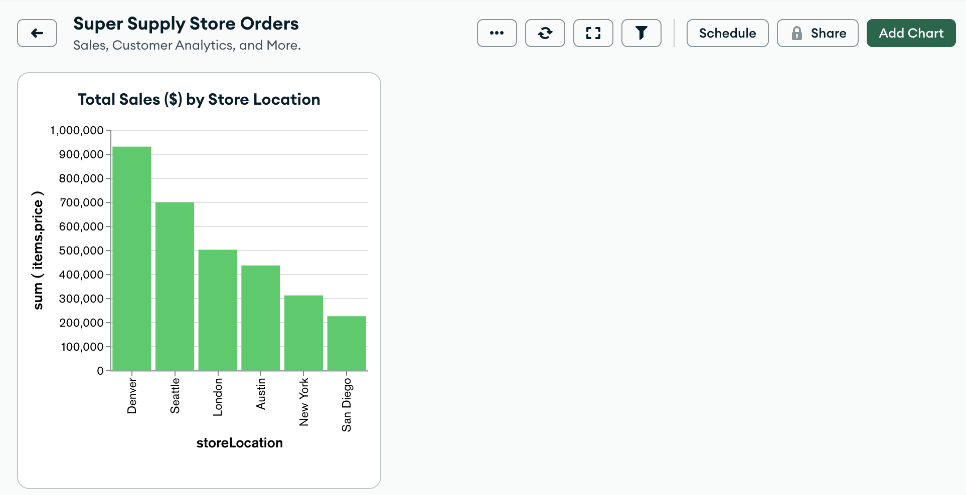
Your chart should now look something like this:
 click to enlarge
Notice that the stores generating the most revenue are the
DenverandSeattlelocations.
Next Steps
Now that we have a visualization showing a high-level overview of store revenue, one might wonder which type of item each store is selling the most of. The following section of the tutorial illustrates how to build a donut chart to analyze the tag names of items being sold.