Estimated Time to Complete: 5 minutes
Construct the Chart
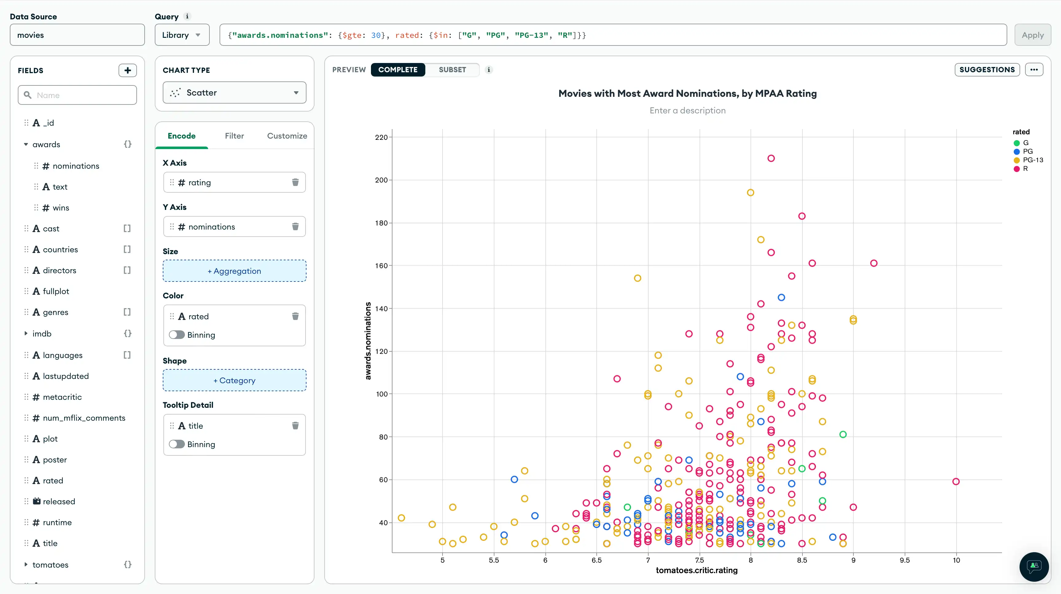
Next, add a chart to your dashboard showing the TomatoMeter rating and MPAA rating of movies with the most award nominations. A scatter chart is a good choice for visualizing how data points cluster together around certain values and allows the representation of several different data dimensions.
Select the dashboard.
From the Dashboards page, select the dashboard where you want to add a new chart. For instructions on setting up a dashboard, see Dashboards.
Add the desired fields to the proper encoding channels.
In the Fields section, click the
tomatoesfield to expand thetomatoesobject and view its properties.Click the
tomatoes.criticfield to also expand that object.Drag the
tomatoes.critic.ratingfield to the X Axis encoding channel.In the Fields section click the
awardsfield to expand theawardsobject and view its properties.Drag the
awards.nominationsfield to the Y Axis encoding channel.
Add a query filter.
You can see now that higher-rated movies have a higher density of awards, but the chart is rather noisy. Add a query filter to only include movies with at least 30 award nominations and marginal MPAA ratings.
In the Filters box, add the following query filter and click the Apply button:
{"awards.nominations": {$gte: 30}, rated: {$in: ["G", "PG", "PG-13", "R"]}}
Differentiate the chart by MPAA rating.
In the Fields section, drag the rated field
to the Color encoding channel.
Example
Additional Data Options
There are three options for adding more data to your chart. You
can use any of your data fields to modify the size, color, and
shape of the markers on the grid. The rated field works well
here because it has low cardinality; there are only four possible
values (G, PG, PG-13, and R). Fields with higher
cardinality may make the chart too noisy to read.
(Optional) In the Fields section, drag the
titlefield to the Tooltip Detail encoding channel. You can now hover over each marker on your chart to view the title of the movie it represents.
Title your chart.
Hover over your chart title above the center of the chart and click the pencil icon.
Copy the following into the chart title input:
Movies with Most Awards Nominations, by MPAA Rating Click the check mark to save your title.
Your chart should now look like this:
![Movies with the most awards by rating]() click to enlarge
click to enlargeClick Save and Close to return to your dashboard.

Next Steps
Follow along to the next section of the tutorial to see how we can rearrange the charts on the dashboard.