NoSQL (aka “not only SQL”) is an umbrella term describing databases that store data in a format different from relational tables. Throughout the article, we’ll use the terms NoSQL and non-relational interchangeably. But where did NoSQL, or non-relational, databases come from?
In the past few decades, the amount of data produced by users and processed by applications has increased tremendously. The rapid growth of data has been counteracted by the decreased cost of storing it. The traditional and tedious data models focused on reducing data duplication and therefore, storage costs, were no longer relevant.
The data gathered by applications for big data analysis and business intelligence analysis could be structured, unstructured, or a combination of the two. This variability of the data required modern database solutions. NoSQL databases, such as MongoDB, were developed. They provide flexible schemas allowing the storage of semi-structured and unstructured data. NoSQL databases also have scale-out architecture which allows the load to be redistributed by adding new nodes to the system.
Data visualization tools translate large amounts of data into visuals, such as charts, graphs, and infographics. These visuals help you discover hidden patterns and derive business insights.
Historically, business intelligence tools were created to work with tabular data using relational databases as a data source. The rise of modern non-relational databases led to the development of new data visualization tools that allow you to pull data from various sources — both relation and non-relational.
In this article, we’ll learn what are the leading tools for visualizing NoSQL data. We’ll focus on those that integrate well with MongoDB, the most popular NoSQL database according to DB-Engines.
Table of contents
- Challenges of Visualizing NoSQL Database
- MongoDB Charts
- MongoDB Compass
- Studio 3T
- Business Intelligence tools
- Conclusion
- FAQ
Challenges of Visualizing NoSQL Database
The industry-leading BI (business intelligence) tools, such as Tableau, predate NoSQL databases. They were designed to work with tabular data coming from SQL databases. This architectural disparity makes it challenging to integrate NoSQL databases as a data source.
Transforming the NoSQL data to a relational format before visualizing it is the oldest approach taken by the data analysis tools. However, this comes with the drawback of moving your data from one source to another or transforming it on the fly which slows down the analysis process. In this article, we will focus only on tools that integrate with NoSQL data sources without transforming the data.
Another solution is using the MongoDB Business Intelligence Connector. The Connector translates SQL queries from the data analysis tool into MongoDB queries which are sent to the database. The results are converted into tabular format and sent back to the data analysis tool for visualization. Tableau is an example of a tool that can be integrated with MongoDB via the MongoDB BI Connector.
Other data analysis tools take a similar approach but use their own connectors. Pentaho Data Integration (PDI) and SAP Lumira belong to this group of tools.
Arguably, the best solution is to not transform or translate queries at all. In this article, we’ll also take a look at tools that natively visualize NoSQL databases—MongoDB Charts, MongoDB Compass, Studio 3T, and Knowi.
MongoDB Charts
MongoDB Charts is a cloud-based tool for data visualizations over your MongoDB data. Charts is built with the document model in mind. You can even unwind embedded objects and arrays and visualize them.
You organize your charts in dashboards. Dashboards can be shared with different permissions which allows you to securely collaborate with others. Additionally, you can embed individual charts in your own applications using iframe or SDK.
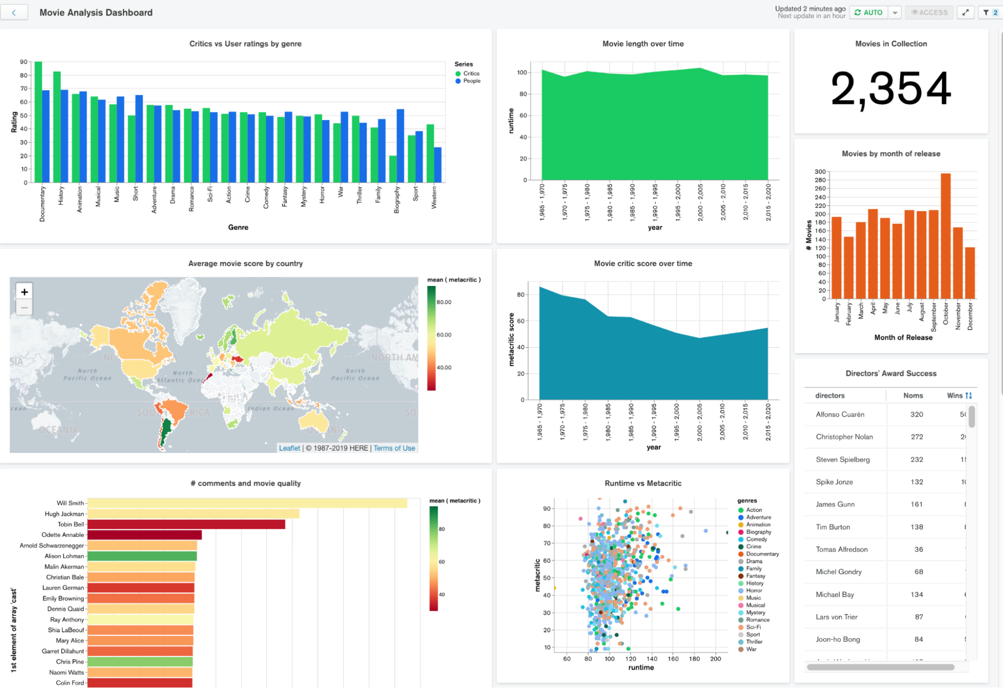
Charts are integrated with MongoDB Atlas, MongoDB’s database-as-a-service offering. You can perform real-time analytics without moving or duplicating data.
MongoDB Compass
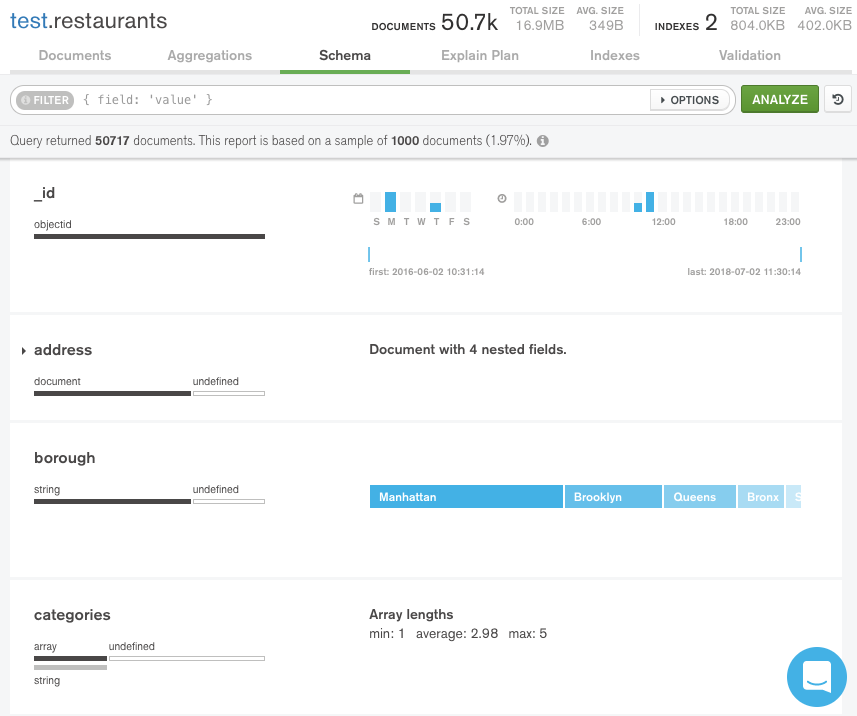
MongoDB Compass provides a GUI (graphical user interface) that enables you to understand the structure of the data in your MongoDB database and perform ad-hoc queries against it.
With Compass’s schema analyzer, you can visualize and explore the structures within your collections. The analyzer displays information about the data type and the range of values for each field in your collection.
Compass uses different ways to visualize fields. Based on its data type and the level of cardinality, a field can be visualized with one of the following:
- histogram
- graded bar
- geographical map
- sample data
Studio 3T
Studio 3T is another GUI tool for MongoDB that allows you to view and manage your data collections.
Among its features is the Schema Explorer that visualizes data distribution and helps you discover missing fields, duplicated records, and other anomalies in your data. You can even export the analysis results to generate documentation for your schema.
Business Intelligence Tools
Business intelligence (BI) tools are applications that retrieve, transform, and analyze big datasets from various sources and produce artifacts used to derive business insights. For more information on BI tools, check out the dedicated article.
Knowi
Knowi is a business intelligence platform that supports unstructured data and integrates natively with many NoSQL databases, such as:
- MongoDB
- MongoDB Atlas
- Apache Cassandra
- Couchbase
Knowi also supports relational databases and Cloud APIs (application programming interfaces). It connects to these various data sources without requiring you to move or transform your data.
Knowi offers three different products for real-time data analysis:
- Knowi HUB is a tool for combining and visualizing your data.
- Knowi ELEVATE allows you to ask questions through Slack and Microsoft Teams and get real-time answers.
- Knowi EMBED allows you to bring your dashboards and charts into your own application by using an iframe or a JavaScript API.
Pentaho Data Integration (PDI)
Pentaho Data Integration (PDI) is a data integration platform that allows you to access, transform, analyse, and derive value from traditional and big data sources.
You can build data pipelines, called transformations, with a no-code graphical user interface. You can import data from some NoSQL databases, including MongoDB, using the Adaption Execution Layer (AEL). AEL translates your Pentaho transformations to operators native to the source engine, such as MongoDB query operators.
Tableau
Tableau is a widely-used data analytics software. The Tableau Desktop application allows you to create interactive dashboards with a simple drag-and-drop interface. Tableau has a wide variety of functionalities—you can perform complex statistical analysis, build interactive maps, and even integrate with popular data analysis languages such as R or Python.
Tableau is SQL-based. However, you can connect your MongoDB data to Tableau with the MongoDB Connector for BI.
SAP Lumira
SAP Lumira is an analytics and data visualization tool for business users. The application offers a drag-and-drop interface which can be used to gather and visualize data from various sources. SAP Lumira has a rich set of built-in UI (user-interface) components such as charts, geo maps, and crosstabs. Additionally, you can combine text, images, and graphic elements to create infographics.
SAP Lumira connects to SAP enterprise data models natively. You can connect to third-party data sources, such as MongoDB, with a Java Database Connectivity (JDBC) driver. JDBC allows you to connect and execute queries to a database.
Conclusion
Data visualization applications are indispensable tools for gathering business intelligence in modern organizations. Despite traditionally being developed to work with the relational database model, the leading data analysis tools nowadays support MongoDB and other NoSQL data sources.
If you want a solution that natively integrates the document model used by MongoDB, look no further than MongoDB Charts.