How to Build an Animated Timeline Chart with the MongoDB Charts Embedding SDK


Rate this tutorial


The Charts Embedding SDK allows you to embed data visualizations in your
application effortlessly, giving users and developers control over
embedded charts. It can be a powerful tool, especially when bound to
user actions. My goal today is to show you the Embedding SDK in action.
This is just scratching the surface of what you can build with the SDK,
and I hope this helps spark ideas as to its use within your
applications. If you want to read more about the SDK, make sure to check the npm package page.
Reading this blog post will give you a practical example of how to build
a timeline chart in your application using the Embedding SDK.
A timeline chart is an effective way to visualize a process or events in
chronological order. A good example might be showing population growth
over time, or temperature readings per second from an IOT device.
At the moment of writing this, we support 23 chart types in MongoDB
Charts, and a timeline chart
is not one of them. Thanks to the Charts Embedding SDK and a bit of
code, we can build similar behaviour on our own, and I think that's a
great example of how flexible the SDK is. It allows us to
programmatically change an embedded chart using filters and setting
different configurations.
We will build a timeline chart in three steps:
- Create the static chart in MongoDB Charts
- Embed the chart in your application
- Programmatically manage the chart's behaviour with the Embedding SDK to show the data changes over time
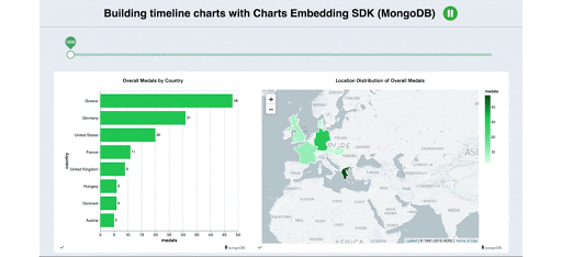
I've done these three steps for a small example application that is
presenting a timeline of the Olympic Games, and it shows the Olympic
medals per country during the whole history of the Olympics (data
sourced from Kaggle). I'm using two charts — a
geospatial and a bar chart. They give different perspectives of how the
data changes over time, to see where the medals are distributed, and the
magnitude of wins. The slider allows the user to move through time.
Watching the time lapse, you can see some insights about the data that
you wouldn't have noticed if that was a static chart. Here are some
observations:
- Greece got most of the medals in the first Olympics (Athens, 1896) and France did the same in the second Olympics (Paris, 1900), so it looks like being a host boosts your performance.
- 1924 was a very good year for most Nordic countries - we have Sweden at 3rd place, Norway(6th), Denmark(7th) and Finland(8th). If you watch Sweden closely, you will see that it was in top 5 most of the time.
- Russia (which includes the former USSR in this dataset) got in top 8 for the first time hardly in 1960 but caught up quickly and is 3rd in the overall statistics.
- Australia reached top 8 in 2008 and have kept that position since.
- The US was a leader almost the entire time of the timeline.
Here is how I built it in more details:
You have to create the chart you intend to be part of the timeline you
are building. The easiest way to do that is to use MongoDB
Atlas with a free tier cluster.
Once your data is loaded into your cluster, you can activate Charts in
your project and start charting. If you haven't used Charts before, you
can check the steps to create a chart in this blog post
here, or
you can also follow the
tutorials in our
comprehensive documentation.
Here are the two charts I've created on my dashboard, that I will embed
in my example application:
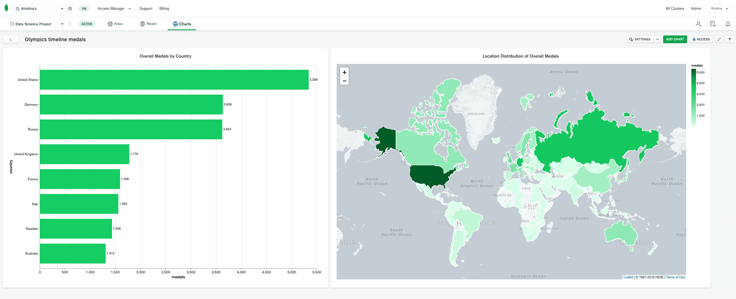
We have a bar chart that shows the first 8 countries ordered by the
accumulated sum of medals they won in the history of the Olympics.
And there is also a geospatial chart that shows the same data but on the
map.
So we have these two charts, and they provide a good view of the overall
data without any filters. It will be more impressive to see how these
numbers progressed for the timeline of the Olympics. For this purpose,
I've embedded these two charts in my application, where thanks to the
Embedding SDK, I will programmatically control their behaviour using a
filter
on the data.
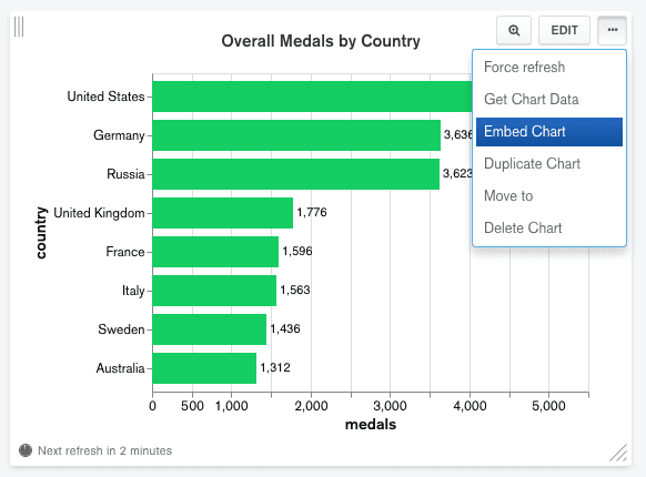
You also have to allow embedding for the data and the charts. To do that
at once, open the menu (...) on the chart and select "Embed Chart":
Since this data is not sensitive, I've enabled unauthenticated embedding
for each of my two charts with this toggle shown in the image below. For
more sensitive data you should choose the Authenticated option to
restrict who can view the embedded charts.
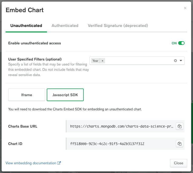
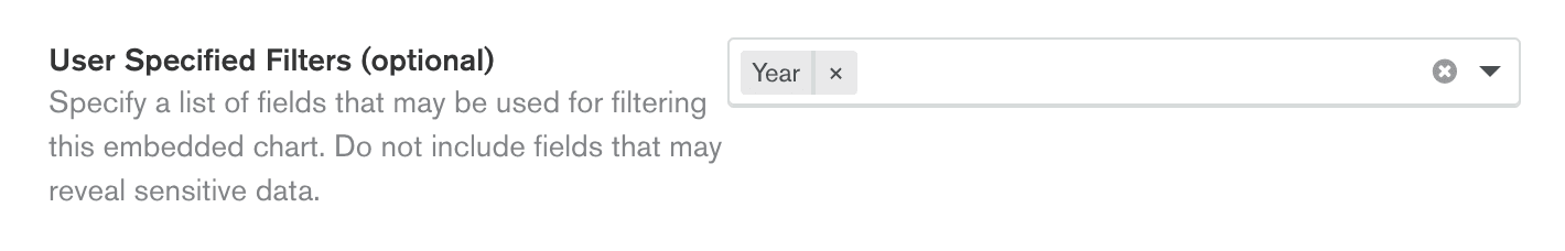
Next, you have to explicitly allow the fields that will be used in the
filters. You do that in the same embedding dialog that was shown above.
Filtering an embedded chart is only allowed on fields you specify and
these have to be set up in advance. Even if you use unauthenticated
embedding, you still control the security over your data, so you can
decide what can be filtered. In my case, this is just one field - the
"year" field because I'm setting filters on the different Olympic years
and that's all I need for my demo.
This is the step that includes the few lines of code I mentioned above.
The example application is a small React application that has the two
embedded charts that you saw earlier positioned side-by-side.
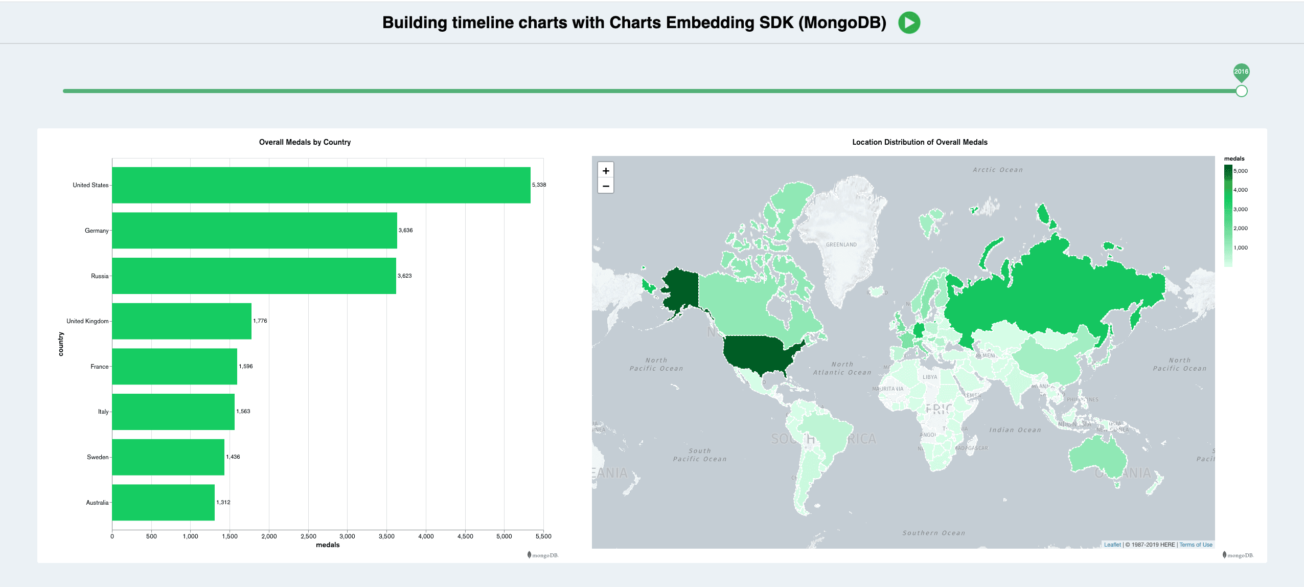
There is a slider on the top of the charts. This slider moves through
the timeline and shows the sum of medals the countries have won by the
relevant year. In the application, you can navigate through the years
yourself by using the slider, however there is also a play button at the
top right, which presents everything in a timelapse manner. How the
slider works is that every time it changes position, I set a filter to
the embedded charts using the SDK method
setFilter. For example, if
the slider is at year 2016, it means there is a filter that gets all
data for the years starting from the beginning up until 2016.
For the play functionality, I'm doing the same thing - changing the
filter every 2 seconds using the Javascript function setInterval to
schedule a function call that changes the filter every 2 seconds.
In the geospatial map, you can zoom to an area of interest. Europe would
be an excellent example as it has a lot of countries and that makes the
geospatial chart look more dynamic. You can also pause the
auto-forwarding at any moment and resume or even click forwards or
backwards to a specific point of interest.
The idea of making this application was to show how the Charts Embedding
SDK can allow you to add interactivity to your charts. Doing timeline
charts is not a feature of the Embedding SDK, but it perfectly
demonstrates that with a little bit of code, you can do different things
with your charts. I hope you liked the example and got an idea of how
powerful the SDK is.
The whole code example can be seen in this
repo.
All you need to do to run it is to clone the repo, run
npm install and
npm start. Doing this will open the browser with the timeline using my
embedded charts so you will see a working example straight away. If you
wish to try this using your data and charts, I've put some highlights in
the example code of what has to be changed.You can jump-start your ideas by signing up for MongoDB
Cloud, deploying a free Atlas cluster, and
activating MongoDB Charts. Feel free to check our
documentation and explore more
embedding example
apps,
including authenticated examples if you wish to control who can see your
embedded charts.
We would also love to see how you are using the Embedding SDK. If you
have suggestions on how to improve anything in Charts, use the MongoDB
Feedback Engine. We
use this feedback to help improve Charts and figure out what features to
build next.
Happy Charting!