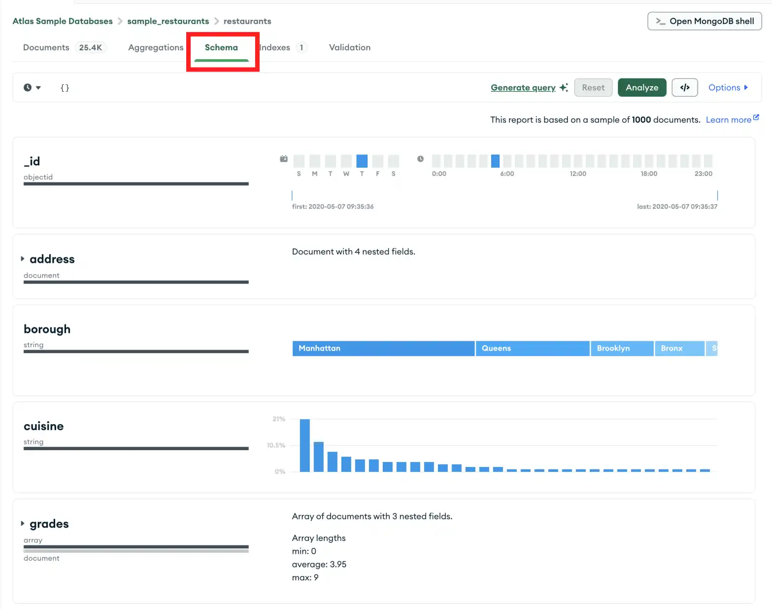
The Schema tab provides an overview of the data type and shape of the fields in a particular collection. Databases and collections are visible in the left-side navigation.
The overview is based on sampling the documents in the collection. The schema overview may include additional data about the contents of the fields, such as the minimum and maximum values of dates and integers, the frequency of occurrence of particular values, and the cardinality of the data.
MongoDB has a flexible schema model, which means that some fields may
contain different types of data from one document to the next. For
example, a field named address may contain strings and integers in
some documents, objects in others, or some combination of all three.
In the case of heterogenous fields, the Schema tab shows a breakdown of the various data types contained within the field with the percentage of each data type represented.
Example
The Schema tab shows size information about the
test.restaurants collection at the top, including the total
number of documents in the collection, the average document size,
and the total disk space occupied by the collection.
The following fields are shown with details:
The
_idfield is an ObjectId. Each ObjectId contains a timestamp, so Compass displays the range of creation times for the sampled documents.The
addressfield contains four nested fields. You can expand the field panel to see analyses of each of the nested fields.The
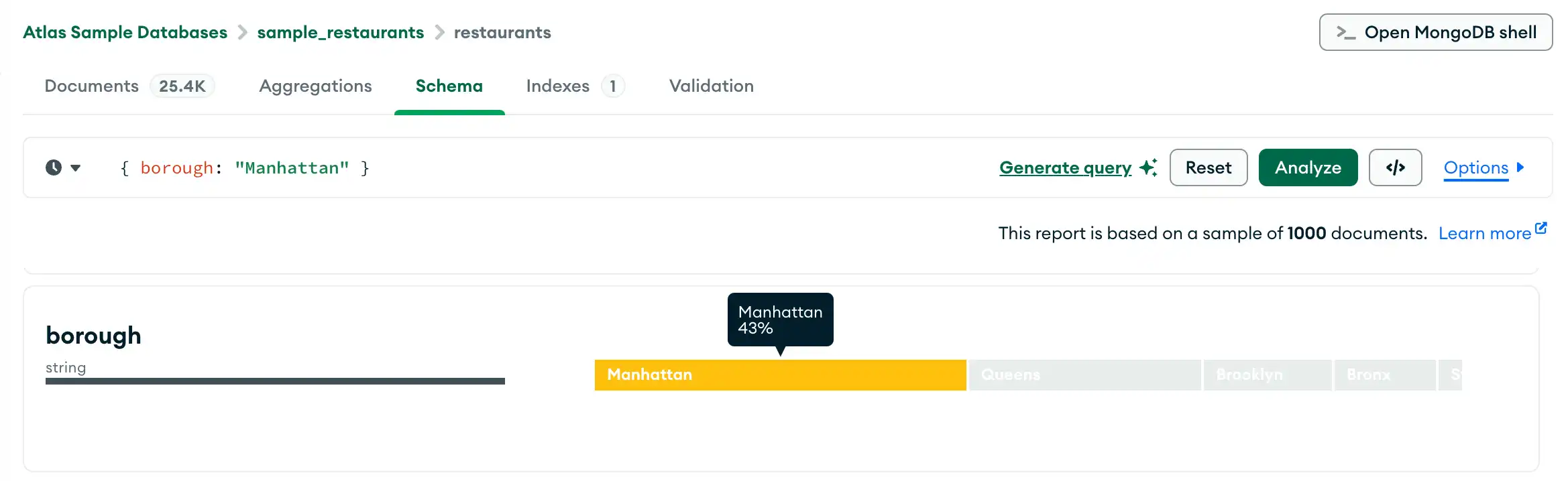
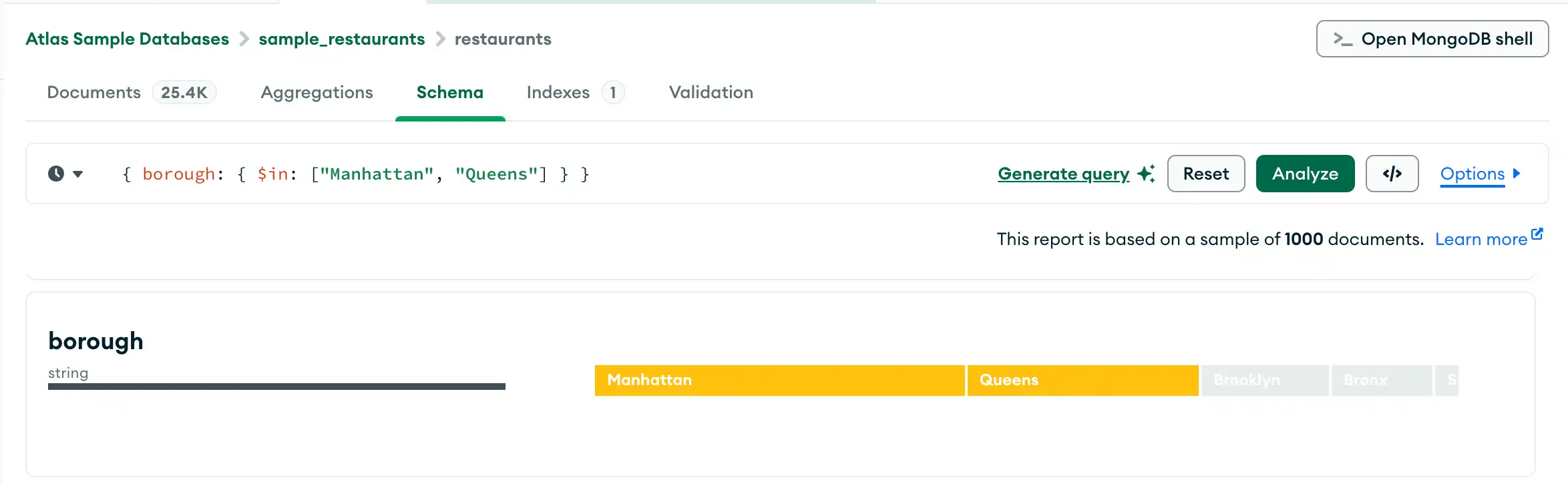
boroughfield contains a string indicating the borough in which the restaurant is located. The cardinality is low enough that Compass can provide a graded bar of the field contents, with the most-frequently occurring string on the left.The
gradesfield contains arrays of strings. The analysis shows the minimum, maximum, and average array lengths.
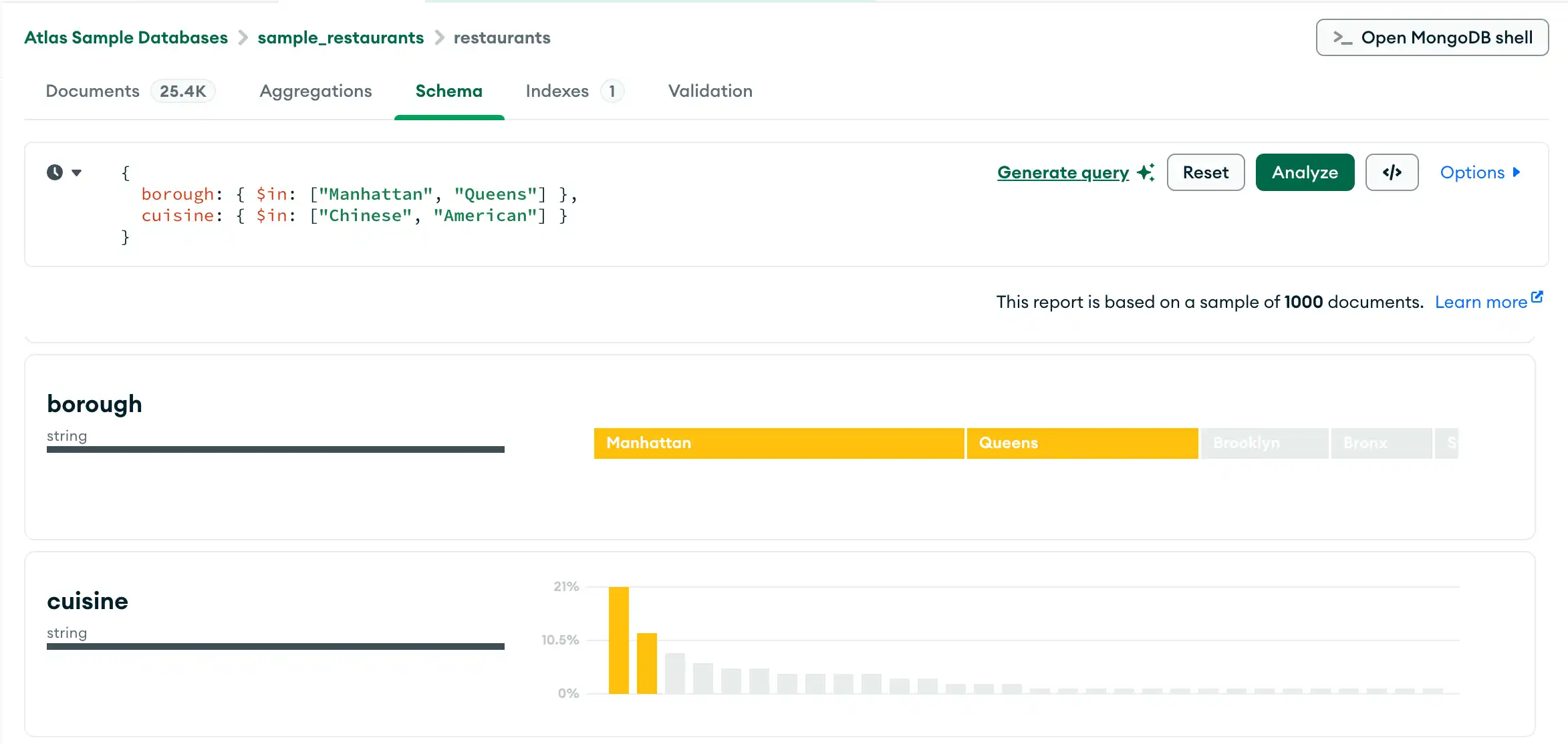
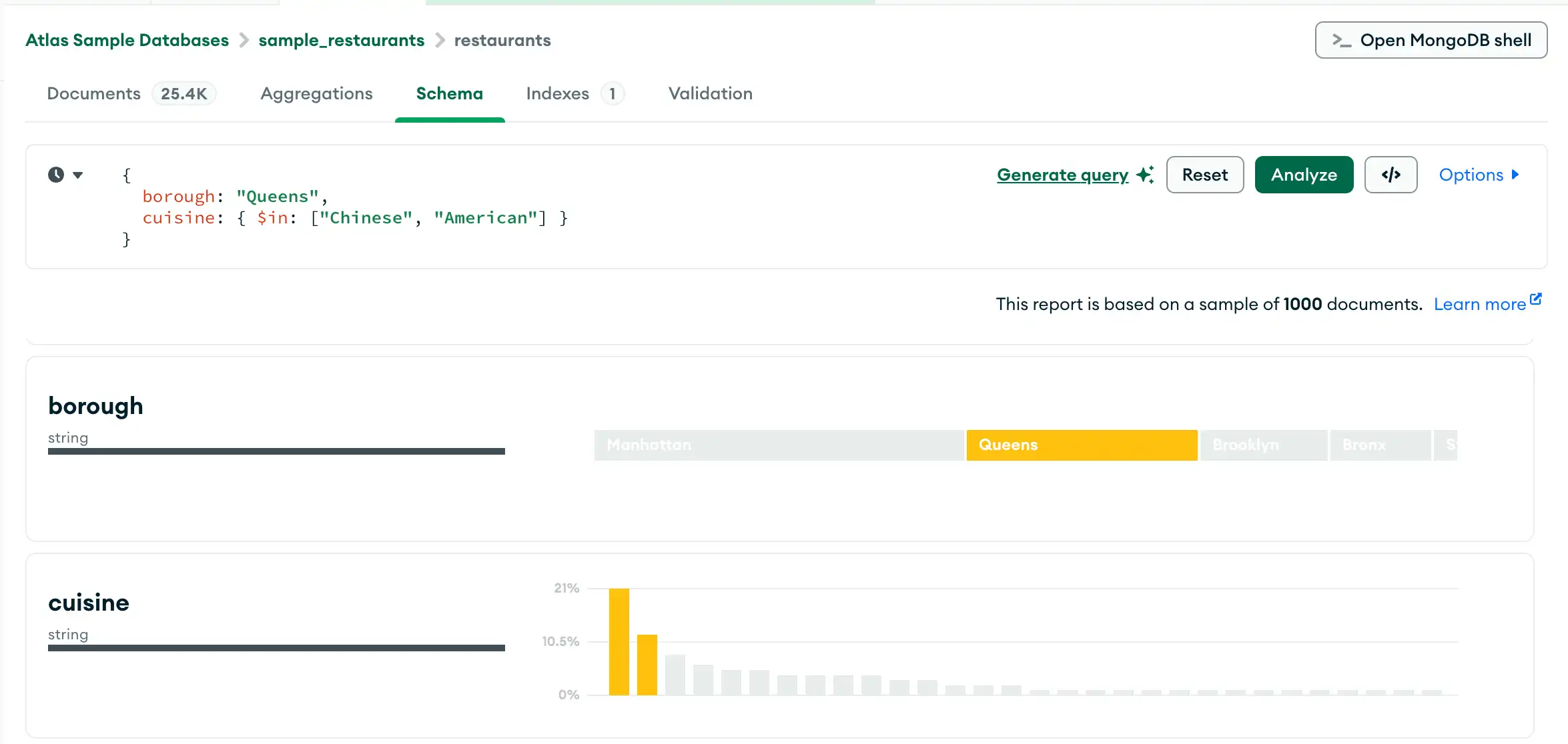
Query Bar
Using the query bar in the Schema tab, you can create a query filter to limit your result set. Click the Options button to specify query options, such as the particular fields to display and the number of results to return.
Note
For query result sets larger than 1000 documents, Compass shows a subset of the results. Otherwise, Compass shows the entire result set.
For details on sampling, see Sampling.

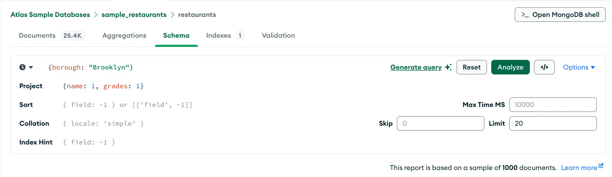
Tip
In the Schema tab, you can also use the Query Builder to enter a query into the query bar.
Field Descriptions
For each field, Compass displays summary information about the data type or types the field contains and the range of values. Depending on the data type and the level of cardinality, Compass displays histograms, graded bars, geographical maps, and sample data to provide a sense of the shape and scope of the data contained in each field.
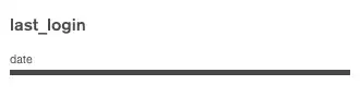
Field with a Single Data Type
Below is an example of the data type summary for a field called
last_login which contains data of type date.

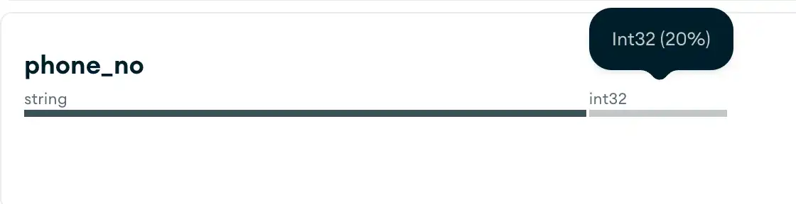
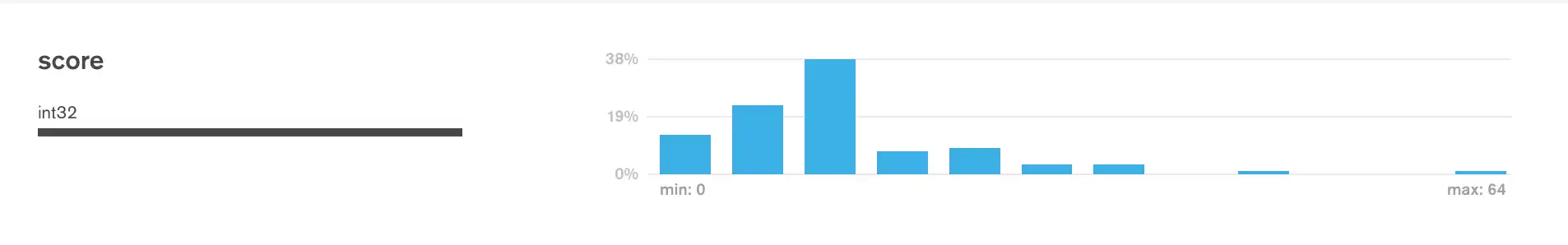
Field with Multiple Data Types
For fields that contain multiple data types,
Compass displays a percentage breakdown of
the various data types across documents. In the example below,
the chart shows the contents of a field called phone_no in which
20% of documents are of type int32, and the remaining 80% are of
type string.

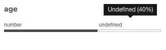
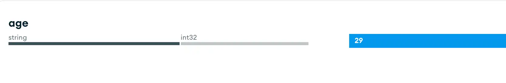
Missing Field
If a collection contains documents in which not all fields contain
a value, the missing values display as undefined. In the example
below, the field age has no recorded value in 40% of the sampled
documents.
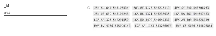
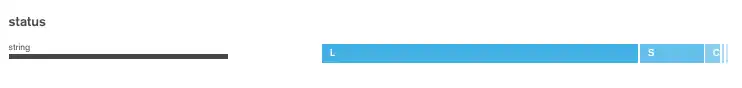
Strings
Strings can appear in three different ways. If there are entirely unique strings in a field, Compass shows a random selection of string values from the specified field. Click the circular refresh icon to see a new set of randomly selected values from the field.

If there are only a few different string values, Compass shows the strings in a single graded bar which shows the percentage of the population of the string values.

If there are multiple string values with some duplicates, Compass shows a histogram indicating the frequency of each string found within the field.


Note
Move the mouse over each bar to display a tooltip which shows the value of the string.
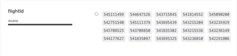
Numbers
Numbers are similar to strings in their representation. Unique numbers are shown in the following manner:

Duplicate numbers are shown in a histogram that indicates their frequency:

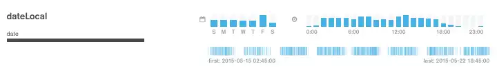
Dates and ObjectIDs
Fields that represent dates (and fields that contain the ObjectID data type, which includes a timestamp) are shown across multiple bar charts. The two charts on the top row represent the day of the week and time of day of the timestamp value.
The single chart on the bottom shows the first and last timestamp value, and the vertical lines represent the distribution of the timestamp across the range of first to last.

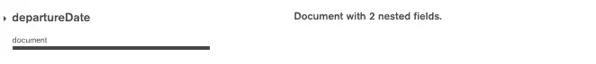
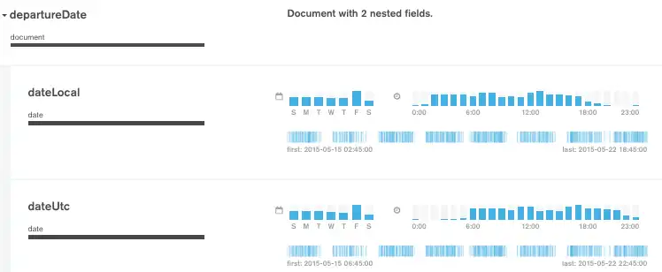
Embedded Documents and Arrays
Fields that contain a sub-document or an array are displayed with a small triangle next to them and a visual representation of the data contained within the sub-document or array.

Click on the triangle to expand the field and view the embedded documents:

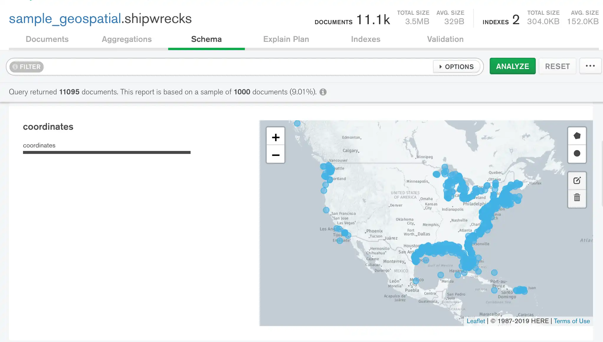
GeoJSON and [longitude,latitude] Arrays
Fields that contain GeoJSON data or [longitude,latitude] arrays are
displayed with interactive maps. For more information on interacting
with location data in Compass, see Analyze Location Data.

Note
Third party mapping services are not available in Compass Isolated Edition.
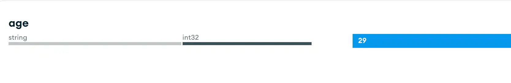
View Charts of Mixed Types
If a field has mixed types, you can view different charts of each type
by clicking on the type field. In the example below, the age
field shows the values that are strings:

Clicking on the int32 type causes the chart to show its numeric
data:
Query Builder
In the Schema tab, you can type the filter manually into the query bar or generate the filter with the Compass query builder. The query builder allows you to select data elements from one or more fields in your schema and construct a query matching the selected elements.
Tip
You can compose the initial query filter by using the clickable query builder and then manually edit the generated filter to your exact requirements.
The following procedure describes the steps involved in building a complex query with the query bar.


Analyze Location Data
In the Schema tab, you can use interactive maps to filter
and analyze location data. If your field contains
GeoJSON data or
[longitude,latitude] arrays, the Schema tab displays
a map containing the points from the field. The data type
for location fields is coordinates.

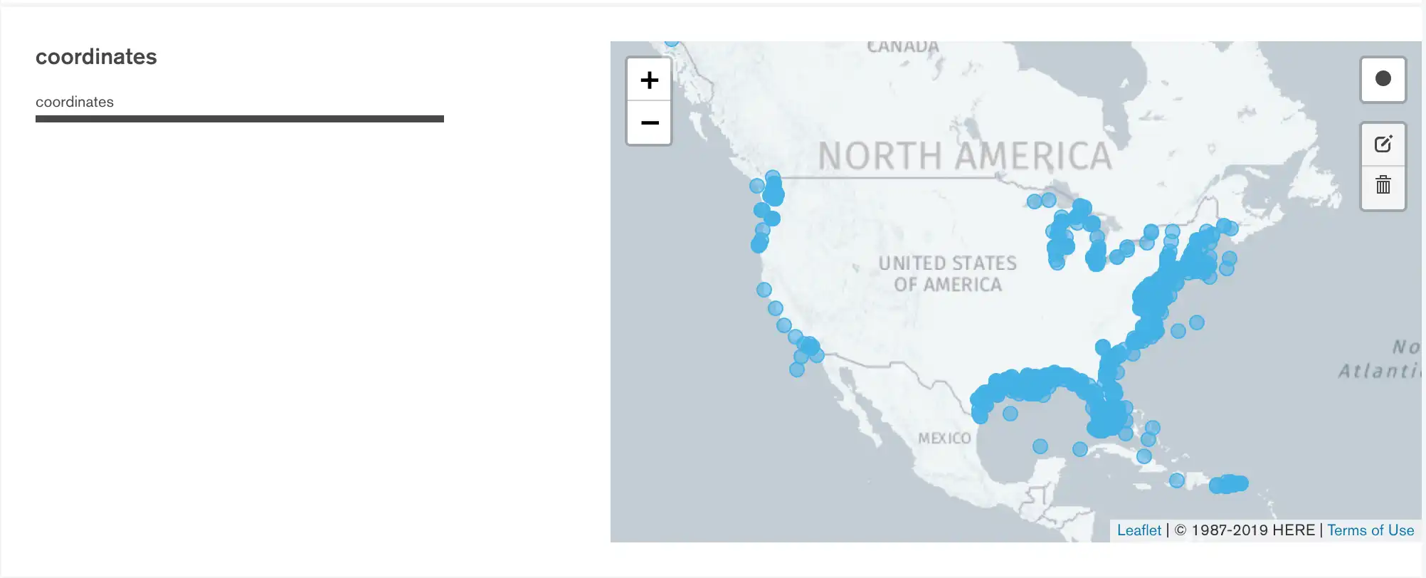
Apply a Location Filter
You can apply a filter to the map to only analyze a specific range of points. To define a location filter:
Click the Circle button at the top-right of the map.
Click and drag on the map to draw a circle containing the area of the map you want to analyze.
Repeat this process as desired to include additional areas of the map in the schema analysis.

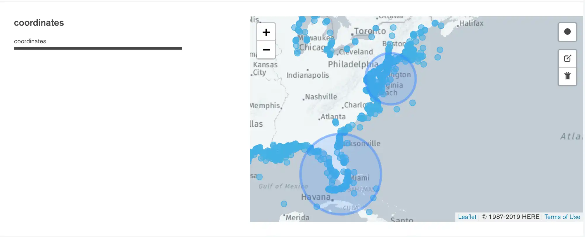
The query bar updates as you draw location filters to show the exact coordinates used in the $geoWithin query applied to the schema analysis.
If you specify multiple location filters, the query becomes
an $or query
with multiple $geoWithin operators.
Edit a Location Filter
To move or resize a location filter, click on the right side of the map. You will enter the filter editing mode, which looks like this:

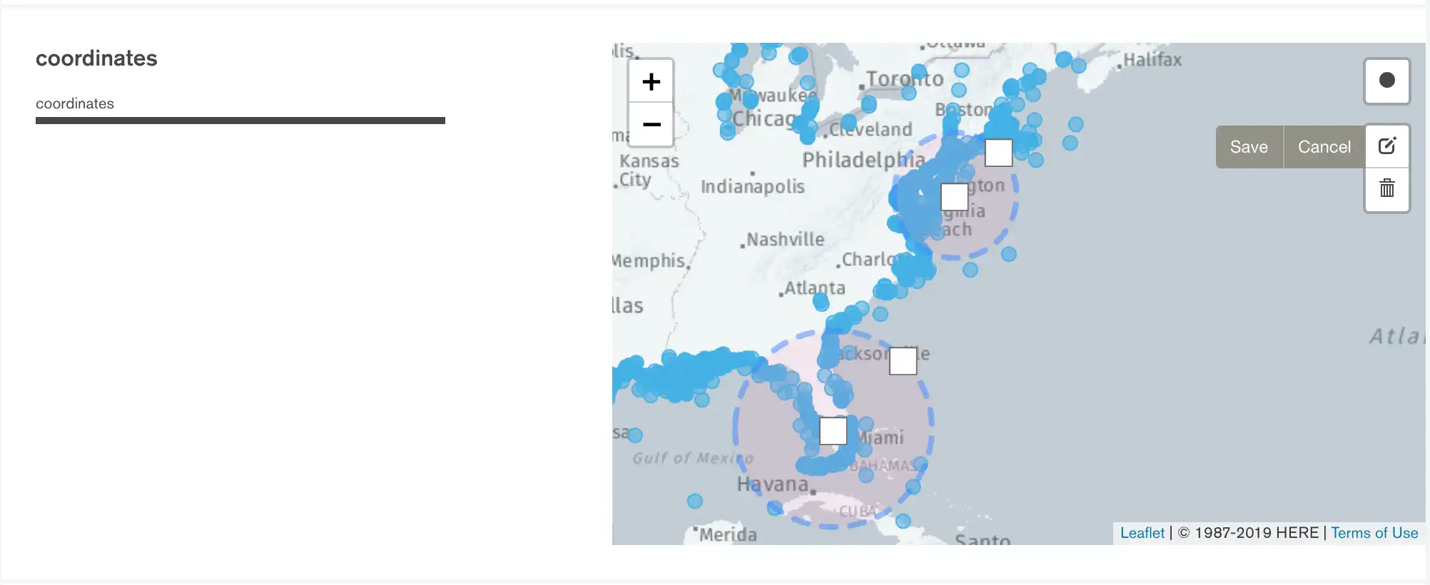
- To move a filter
- Click and drag the square in the center of the circle.
- To resize a filter
- Click and drag the square at the edge of the circle.
After modifying your filters, click Save.
Delete a Location Filter
To delete a location filter from the map:
Click on the right side of the map.
Either click:
A location filter to delete that filter.
Clear All to delete all location filters.
Click Save.
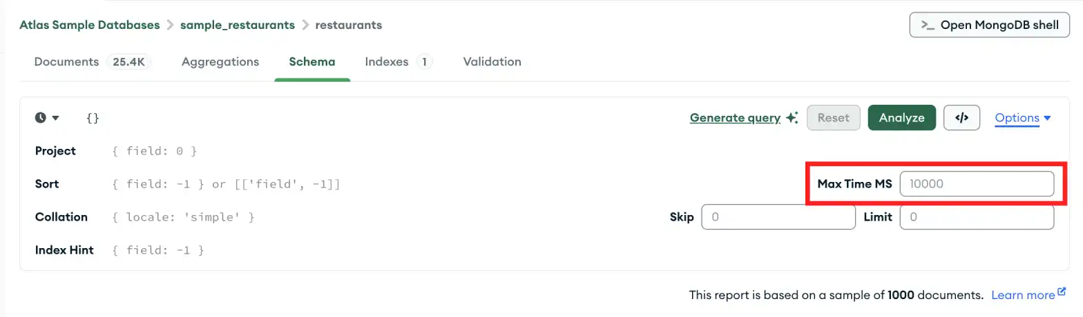
Troubleshooting
If the analysis of your schema times out, it might be because the
collection you are analyzing is very large, causing MongoDB to stop the
operation before the analysis is complete. Increase the value of
MAX TIME MS to allow the operation time to complete.
To increase the value of MAX TIME MS:
In the query bar, expand Options.
![The Options button is on the right side of the query bar,
next to the Analyze button.]()
Increase the value of MAX TIME MS to accommodate your collection. MAX TIME MS defaults to 60000 milliseconds, or 60 seconds, but large collections might take tens of seconds to analyze.

Once you have increased the value of MAX TIME MS, retry your schema analysis by clicking Analyze.