MongoDB Atlas is the leading multi-cloud modern database. We see some of the world’s largest companies in manufacturing, healthcare, telecommunications, and financial services all build their businesses with Atlas at their foundation.
Every company comes to MongoDB with a need to safely store operational data. But all companies also have a need to analyze data to gain insights into their business and data visualization is core to establishing that real-time business visibility. Data visualization enables the insights required to take action, whether that’s on key sales data, production and operations data, or product usage to improve your applications.
The best way to do this as an Atlas user is by using Atlas Charts – MongoDB’s first-class data visualization tool, built natively into MongoDB Atlas.
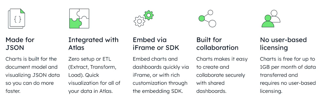
Why choose Charts
First, Charts is natively built for the document model. If you’re familiar with MongoDB, you should be familiar with documents. The document model is a data model made for the way developers think. And with Charts, you can take your data from documents and collections in Atlas, and visualize them with no ETL, data movement or duplication. This speeds up your ability to discover insights.
Second, Charts supports all cluster configurations you can create in Atlas, including dedicated clusters, serverless instances, data stored in Online Archive, as well as federated data in Atlas Data Federation. Typically when you learn about a company’s integrated products and services, you find some “gotchas” or limitations that make any benefits come at a significant cost. In the case of a MongoDB Atlas customer, that could come in the form of someone finding out that a cluster configuration option isn’t supported by Charts. But that will never be the case. If you create and manage your application data in Atlas, you can visualize it in Charts. That’s it.
Third, Charts is a robust data visualization tool with a variety of chart types, extensive customization options, and interactivity. Compared to other options in the business intelligence market, you get the same key benefits, without all the complexity. You can learn how to use Charts in a few hours and you can easily teach your team. It’s the simplest data visualization solution for most teams.
Fourth, the value of Charts can extend beyond individual use cases, with sharing and embedding. This lets you both flexibly share charts and dashboards with your team, as well as embed them into contexts that matter most to your data consumers, such as in a blog post or inside your company’s wiki.
Finally, Charts is free for Atlas users up to 1GB per project per month, which covers moderate usage for most teams. There are no seat-based licensing fees associated with Charts, so no matter how many team members you have, Charts will remain a low-cost, if not zero cost solution for your data visualization needs. Beyond the included free usage, it’s just $1/GB transferred per month. You can check out more pricing details here.
How to use Charts
The best way to learn how to use Charts is to simply give it a try. It’s free to use and we have a variety of sample dashboards you can use to get started. But let’s walk through some basics to help illustrate the kinds of visualizations that Charts can enable.
Charts makes visualizing your data easy by automatically making your Atlas deployments (any cluster configuration) available for visualization. If you’re a project owner, you can manage permissions to data sources in Charts. We could write an entire blog post on data sources, but if you’re just getting started, just know that your data is made easily available in Charts unless your project owner intentionally hides it.
Create a dashboard
Everything in Charts starts with a dashboard and creating a dashboard is easy. Simply select the Add Dashboard button at the top right of the Charts page in Atlas. From there, you’ll fill in some basic information like a title and optional description, and you’re on your way.
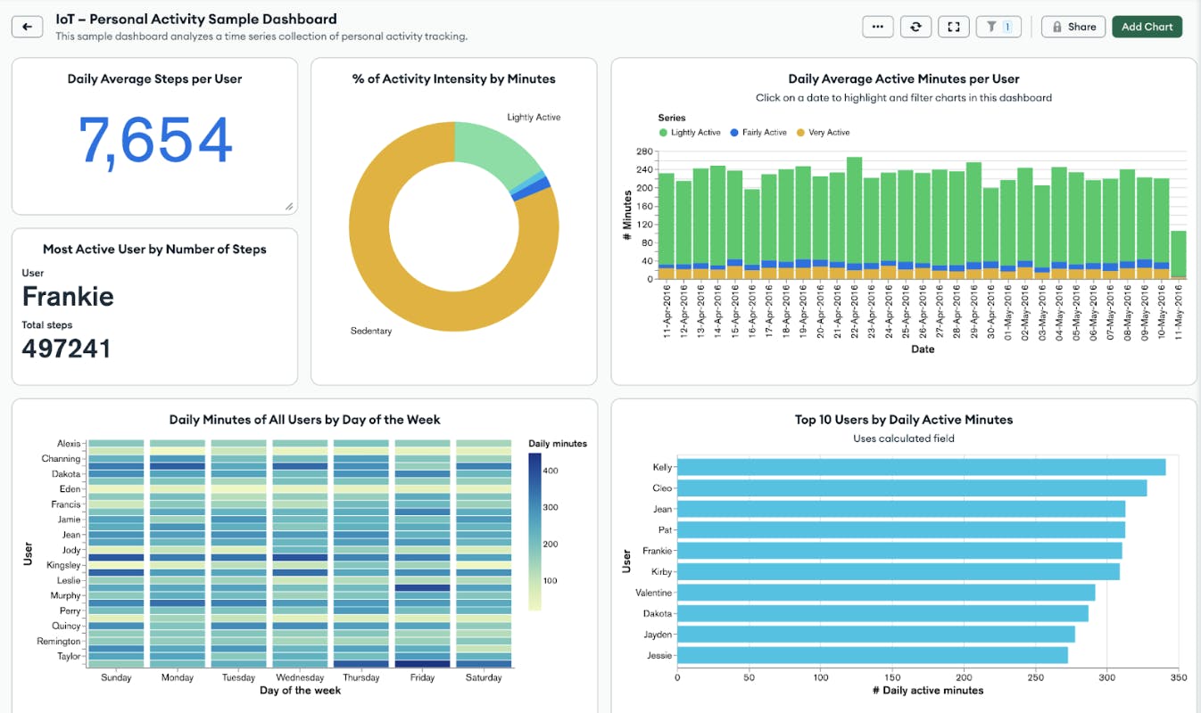
Here’s what one of our new sample dashboards looks like. They are a great place to start:
Build a chart
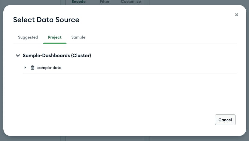
Once you have a dashboard created, you can add your first chart. The chart builder gives you a simple and powerful drag and drop interface to help you quickly construct charts. The first step is selecting your data source:
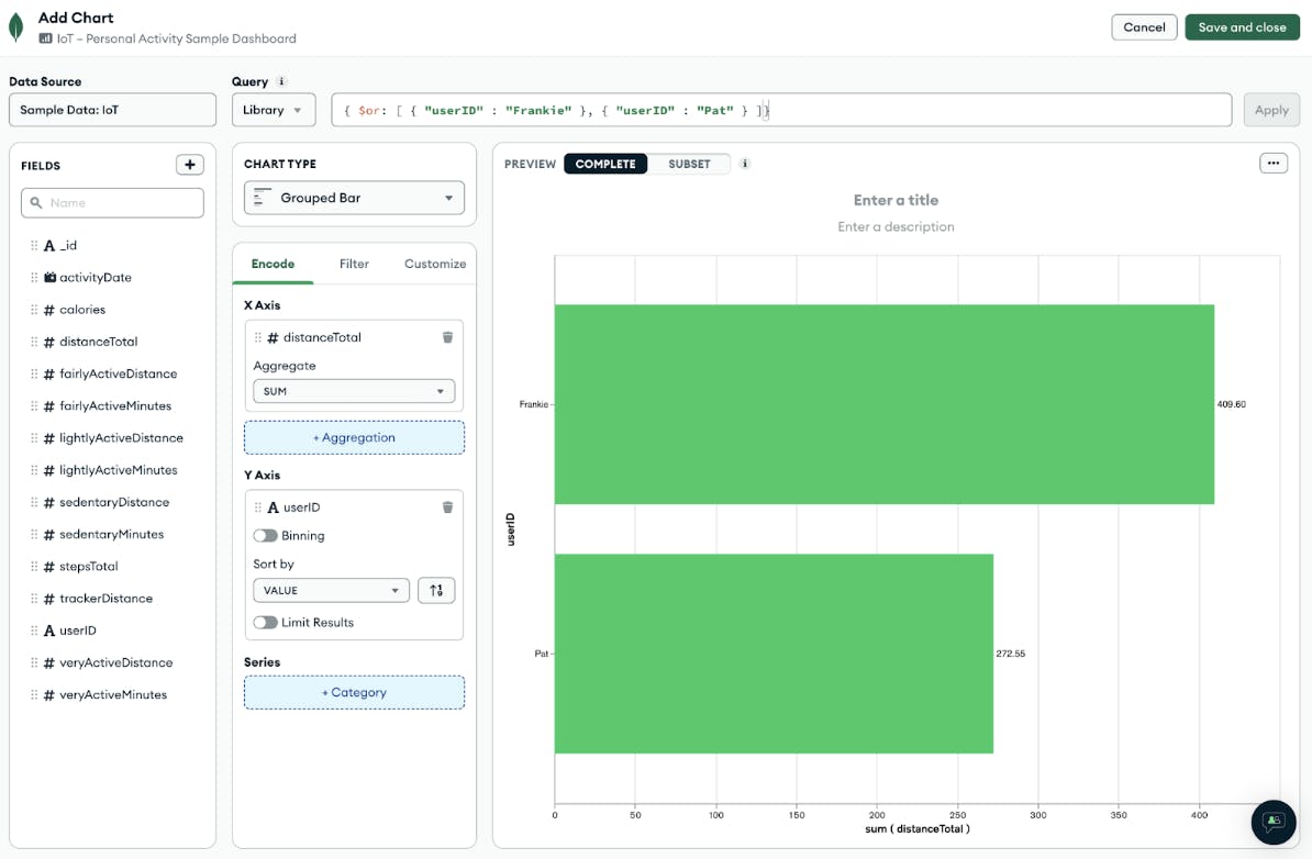
Once you have a data source selected, simply add desired fields into your chart and start customizing. The example below uses our IoT sample dashboard dataset to create a bar chart displaying the total distance traveled by different users. From there you can add filters and further customize your chart by adding custom colors, data labels, and more.
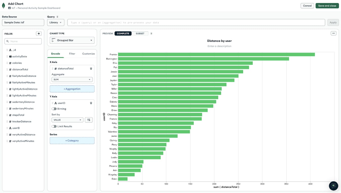
The chart builder even allows you to write, save, and share queries and aggregation pipelines as shown below. You can learn more in our documentation. Play around with the chart builder to get familiar with all of its functionality.
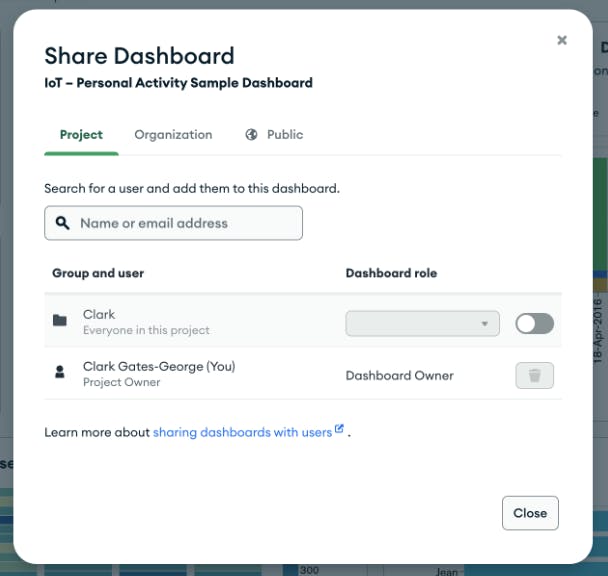
Share and embed
A chart can be useful in itself to individual users, but we see users get the most benefit out of Charts when sharing visualizations with others. Once you have created a dashboard with one or more charts, we offer a variety of options letting you share your dashboards with your team, your organization, or via a public link if your data is not sensitive.
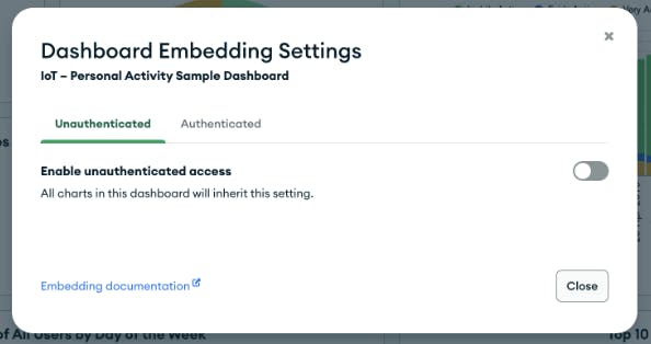
If you would rather embed a chart or dashboard where your team is already consuming information, check out Charts embedding functionality. Charts lets you embed a chart or dashboard via iframe or SDK, depending on your use case. Check out our embedding documentation to learn more.
That was just a brief overview of how to build your first charts and dashboards in Atlas Charts, but there’s a lot more functionality to explore. For a full walkthrough, watch our product demo here:
Atlas Charts is the only native data visualization tool built for the document model and it’s the quickest and easiest way to get started visualizing data from Atlas. We hope this introduction helps you get started using Charts to gain greater visibility into your application data, helping you to make better decisions on your data.
Get started with Atlas Charts today by logging into or signing up for MongoDB Atlas, deploying or selecting a cluster, and navigating to the Charts tab to activate for free.