Atlas Charts is the best data visualization tool for quickly and easily analyzing all your Atlas data. Today, we’re announcing two big updates:
New sample dashboards to give you even more inspiration when getting started
Charts Embedding SDK enhancements: dashboard filters and save as PNG
Let's start with sample dashboards
We took a look at the current experience for new Charts users building their first dashboards. To help reduce the time it takes to experience the power of dashboards, we have always offered a sample dashboard that used a movie database to help explore Charts basics like chart types and understanding how a data source and fields work. While any dataset can be interesting and most of us enjoy watching movies, we knew that most development teams could benefit from some tangible examples of how they might visualize their application data in Charts.
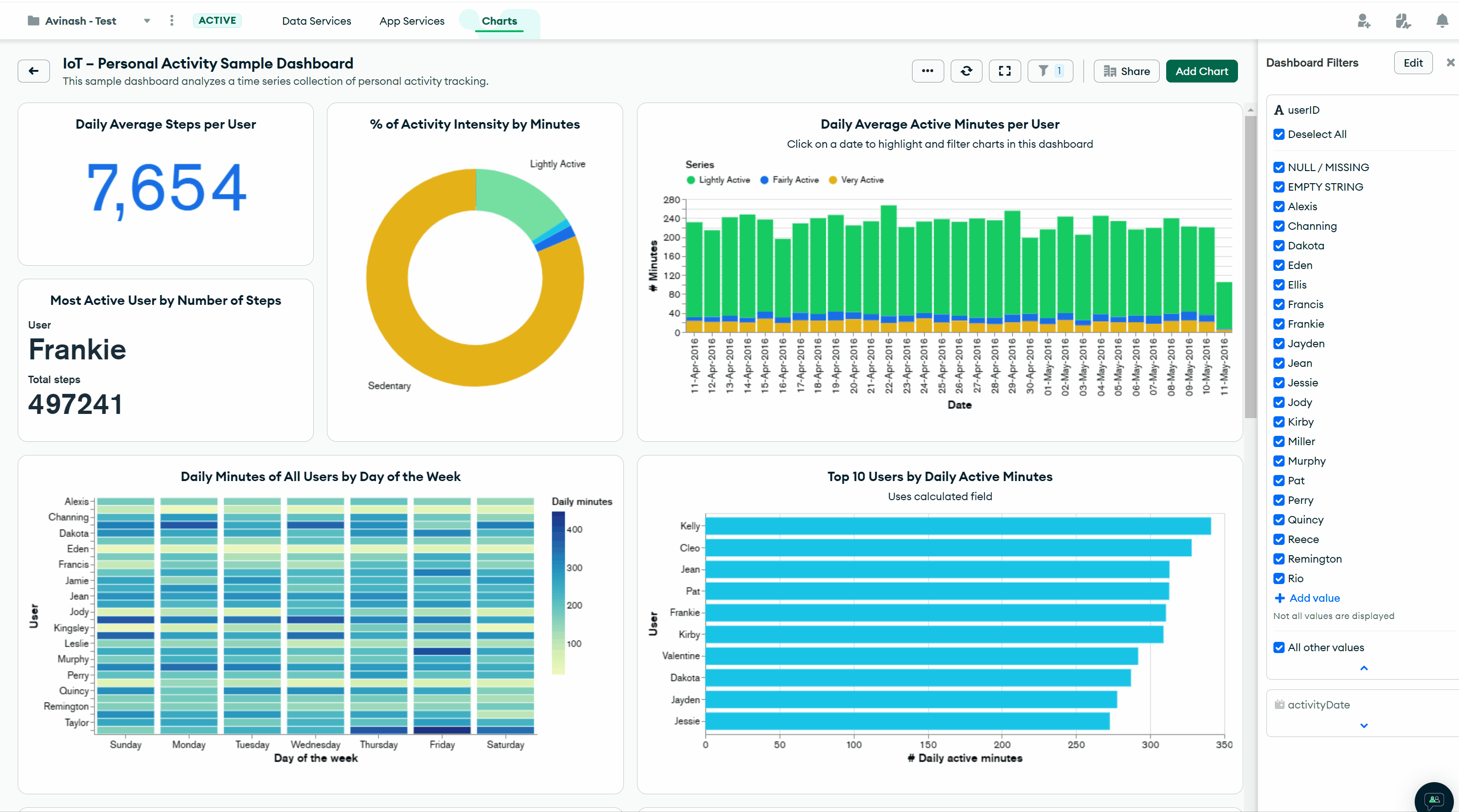
So we thought about a few key use cases that nearly every team must consider and we put together four new sample dashboards analyzing: product usage, sales or general business metrics, IoT sensor data, and finally, observability or log data commonly used to understand a platform’s reliability. All of these new dashboards are now available to every Charts user, and each provides a great starting point for exploring your data in Charts.
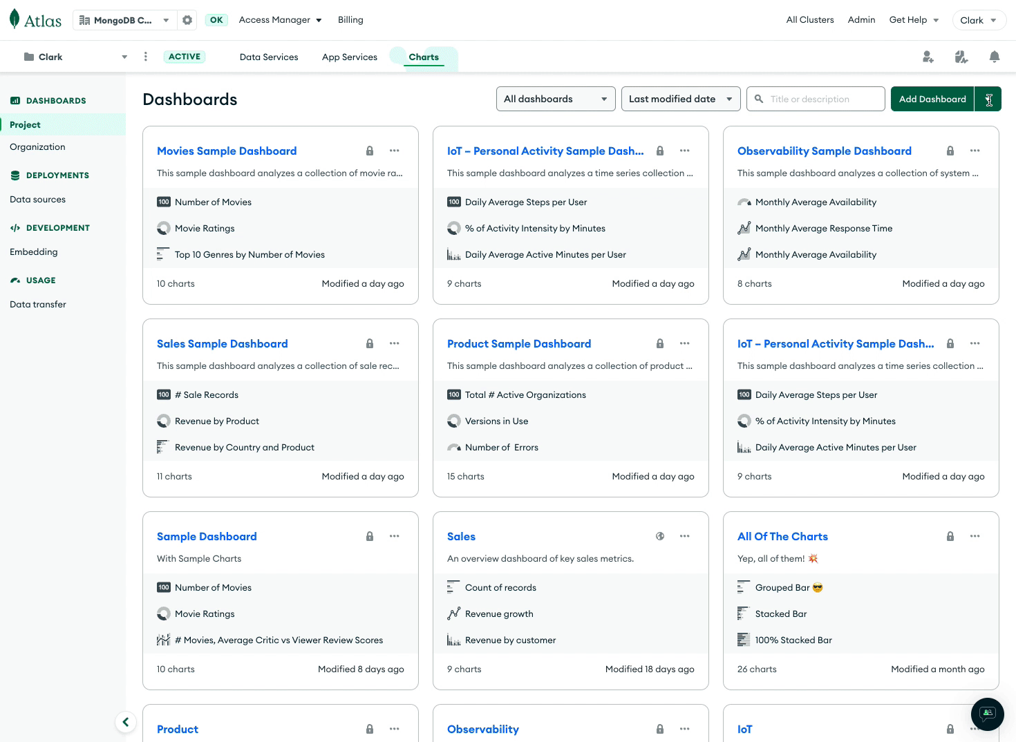
With these new sample dashboards as inspiration, you will be able to quickly see the potential of complex dashboards and customize them to fit your own data and gain valuable business insights.
Embedding SDK enhancements: Dashboard filters and save as PNG
Next, we are continually listening to customers and trying to make our Embedding SDK more useful for diverse use cases. If you’re unfamiliar, the Embedding SDK lets you take charts and dashboards from Charts, and embed them into the contexts that matter most to your users, with rich customization.
Up to this point, dashboard filters have only functioned in dashboards built within the Charts UI in MongoDB Atlas. Dashboard filters can be used to dig a level deeper into your datasets, and with interactive filtering, they are the foundation from which you can add interactivity into embedded dashboards. With this update, users can now seamlessly filter data directly within the embedded dashboard, providing a more interactive experience and enhancing data exploration.
Setting up dashboard filters in the UI is simple, and once they’re enabled, you can either selectively choose the fields allowed for filtering or allow all fields present in the data sources used in the dashboard. You can also allow all fields present in a data source if you use chart embedding.
Taking the field ‘calories’ as an example used in the video above, in the SDK, you can easily set a dashboard filter to plot a chart with users who have spent more than 1000 calories:
You can also use the getFilter method to see what filters have been applied to the embedded dashboard:
Additionally, you can now programmatically save an image of any chart as a PNG, in either base64 or binary formats using the getImage method in the SDK.
We are excited to see how you use the sample dashboards and dashboard filtering in embedded dashboards to achieve your visualization goals using Atlas Charts.
New to Atlas Charts? Get started today by logging into or signing up for MongoDB Atlas, deploying or selecting a cluster, and activating Charts for free.