What's New in Atlas Charts: Summer 2023 Release Roundup
August 21, 2023 | Updated: March 11, 2025
Today, we’re excited to announce a series of updates to Atlas Charts.
The Charts team is constantly adding enhancements to make visualizing data from MongoDB Atlas collections quick, easy, and powerful. With this summer’s release, we are introducing:
-
Expanded chart customization options in the Charts Embedding SDK
-
An out-of-the-box billing dashboard for easily monitoring your Atlas billing data
-
Support for a new chart type with candlestick charts, and
-
Query execution improvements for more reliable visualization of even your largest datasets.
Let’s go through these updates one by one.
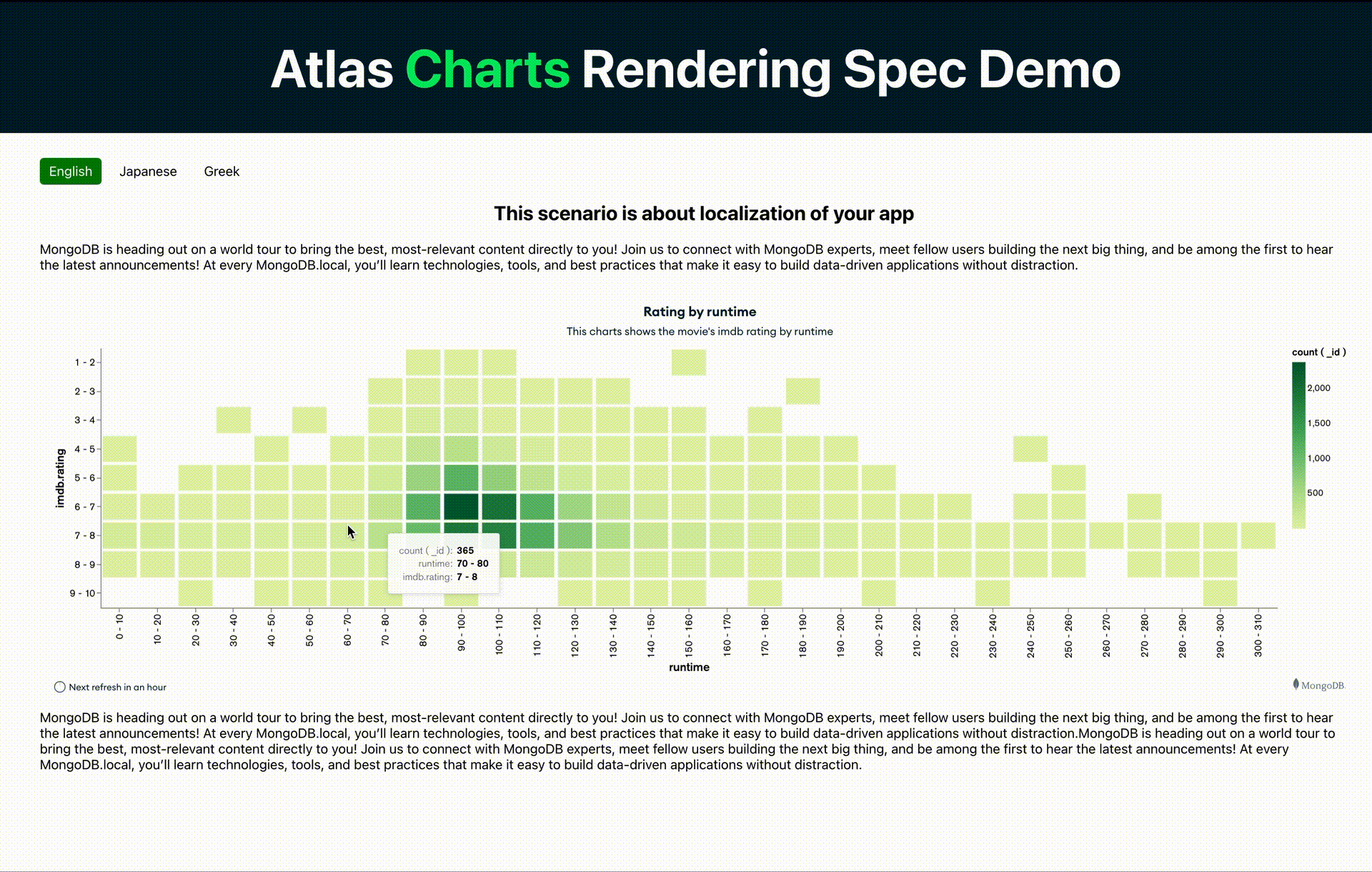
Expanded charts customization options in the Charts embedding SDK
Embedded charts and dashboards can be a useful way to share information across an organization and even with your customers. Over the last year, we have made many improvements to getting started with and implementing embedded charts and dashboards. With this release, we focused on the look and feel of your embedded charts.
The Charts Embedding SDK now allows for greater customization across attributes like chart titles, descriptions, axes options, channel options, chart color palette, and conditional formatting options. Providing access to these chart specifications matches many of the customization options that developers rely on when building charts inside Atlas.
An out-of-the-box Atlas billing dashboard
Next, let’s talk about discovering insights from your Atlas billing data. Over the past two years, MongoDB has made visualizing billing data in Atlas Charts possible. Implementing this dashboard required quite a bit of effort in the past, but we heard from many teams that this dashboard is essential to the monitoring of their Atlas bill. So, we worked to build a more streamlined process for enabling these insights.
Enter the new billing dashboard. The new billing dashboard in Atlas Charts is as simple as a button click on our new Ingestions page.
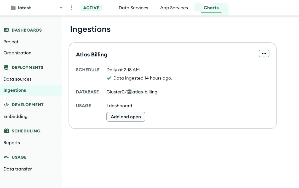
Simply click Add and open and you’ll see a billing dashboard ready for exploration.
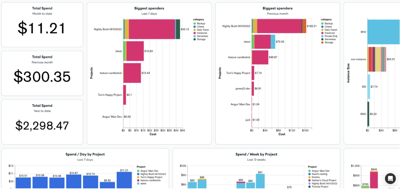
The new billing dashboard allows for customization, adding dashboard filters, and getting new views into your data with the ability to add other charts based on your interests.
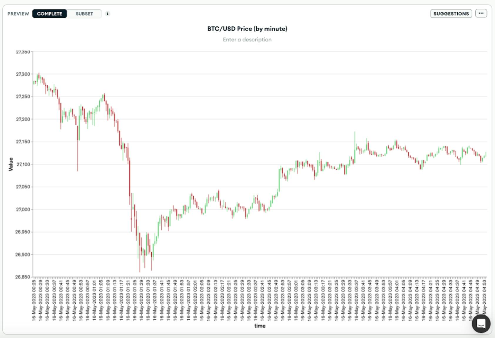
Support for a new chart type: Candlestick charts
The third update in this release is support for candlestick charts. While many developers leverage the wide variety of chart types available in Charts, we are always paying attention to additional chart types that can enable even more use cases for visualizing your Atlas data. This is why we have added candlestick charts with this latest release. Candlestick charts are commonly used for financial data, richly representing financial trading trends and price fluctuations.
Query execution improvements for more reliable visualization of even your largest datasets
Finally, let’s talk about query execution in Charts. One of the key characteristics of Charts is that it works natively with your Atlas data, requiring no data movement or duplication. Developers can simply select a data source to explore and immediately discover insights about application data.
However, that doesn’t mean things are simple on the backend when creating a chart. Charts does a lot of work to efficiently render your visualizations as seamlessly as possible. And depending on your cluster configuration and the complexity of the chart you are creating (and the query driving it), Charts can take some time to render and produce the information you are aiming to visualize. Historically, Charts had a timeout duration of 120 seconds. Queries taking longer than this, would fail and not render the desired visualization.
With this update, Charts users will see:
-
Improved rendering of more complex queries as we have extended the timeout duration to 10 minutes, and
-
More helpful in-product notification that lets you know when a query may take additional time to run, so you can continue either creating other visualizations or doing other work, until your query finishes.
If you have queries requiring a longer timeout duration than 10 minutes, you can contact the Charts team through support.
Note: Query Execution will initially be available through contacting Customer Support, or your existing Customer Success team, to opt-in. The feature will become Generally Available to all accounts in October, 2023.
With that, we hope these enhancements make Charts even easier and more powerful to use. Over the coming weeks, we’ll go a level deeper, diving into some of these features with more detail. In the meantime, go build some visualizations in Charts to get hands-on and see for yourself!
New to Atlas Charts? Get started today by logging into or signing up for MongoDB Atlas, deploying or selecting a cluster, and activating Charts for free.