As you begin your chart building journey, you’ll find there are many ways for you to visualize your data in Atlas Charts. Specific data visualization needs vary by team, and we have a growing collection of chart types with various and specific purposes to help you discover insights and communicate effectively.
Charts are an essential story-telling piece when working with large amounts of data. Another great way to think of it is that visualizations help condense vast data into a coherent format that makes information more consumable to a wide range of data consumers.
When analyzing your data, it's important to recognize that different chart types serve distinct purposes. That is why it's important to choose the right chart type for each potential insight, so that when you put it all together, you have a diverse and all encompassing dashboard.
How to effectively use Charts
Charts was designed with a simple user interface that makes it quick for you to build charts and visualize your data. However, to properly utilize Charts, this guide on chart types can give you extra help on making charts more quickly and efficiently.
Our chart types are split into the following series:
Column and Bar Charts
Line and Area Charts
Combo Charts
Grid Charts
Circular Charts
Text Charts, and
Geospatial Charts
Determining the best chart type can be an overwhelming task when there are so many to pick from, but knowing the specific strengths of each chart type can help you select the right chart for your use case.
Most common chart types in Atlas Charts
1. Data tables
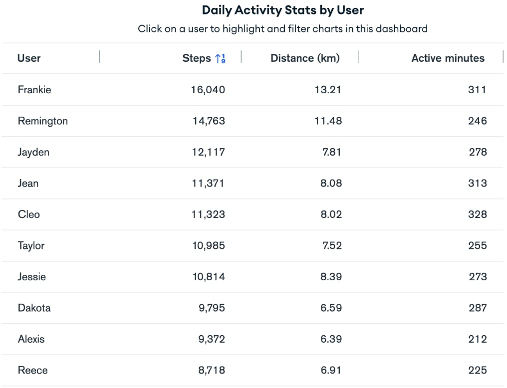
What is a data table?
Data tables are used to organize data in a tabular view, ultimately allowing viewers to quickly read the results of detailed data.
What is an example use case for a data table?
A data table can be used for healthcare system applications, where users can store patient information and records, medical history and treatment plans, and enable healthcare professionals to access patient data more easily and effectively.
2. Number charts
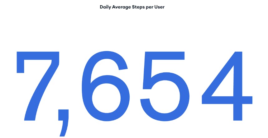
What is a number chart?
Number charts display a single aggregated value from a data field, often representing a grand total or overall state of data.
What is an example use case for number charts?
A number chart can be used for social media analytics, where engagement metrics, subscriber count, and post performance is summarized for users to track account growth.
3. Grouped column and bar charts
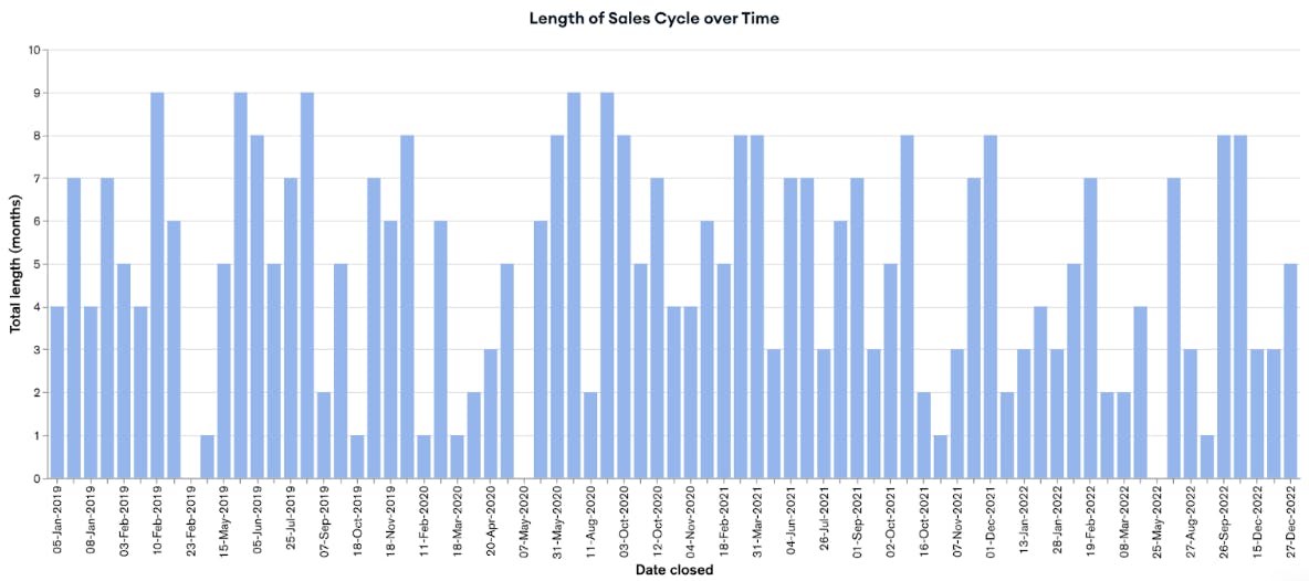
What is a grouped column and bar chart?
Grouped column and bar charts are used to show detailed data distribution across categories instead of a singular category.
What is an example use case for grouped column and bar charts?
To analyze financial performance, a grouped column and bar chart would be useful for viewing revenue, expenses, and profits of multiple business units over a period of time.
4. Donut charts
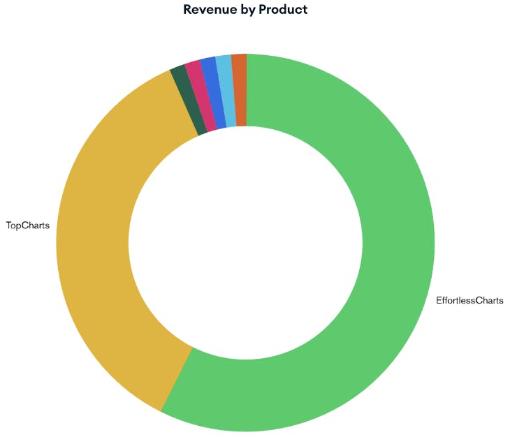
What is a donut chart?
Donut charts display the proportional distribution of a dataset, often used to showcase the general trends of data instead of exact data values.
What is an example use case for donut charts?
To track website traffic or customer churn rates, a donut chart is useful to visualize the proportion of website visitors coming from various sources and the percentage of those visitors who have churned or stayed with the company over a period of time.
These are a few of the most commonly used chart types in Charts. Now let’s walk through some less common chart types to enrich your data visualization toolkit.
Chart types you might have not used in Charts before
1. Line and area charts
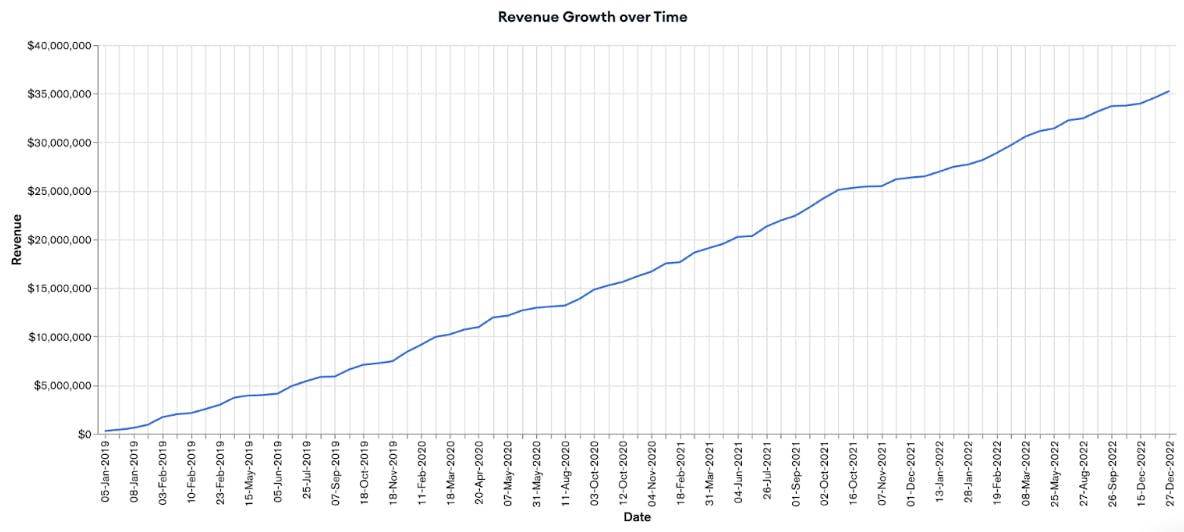
What is a line and area chart?
Line and area charts display a series of data points connected by straight line segments. For area charts specifically, the space beneath the segments are filled with color.. Both of these chart types are used to track trends over time, such as sales and stock prices, or website traffic.
What is an example use case for line and area charts?
A line and area chart can be used for e-commerce applications, to show sales performance, revenue growth, and profitability trends over specific time intervals.
2. Stacked column charts
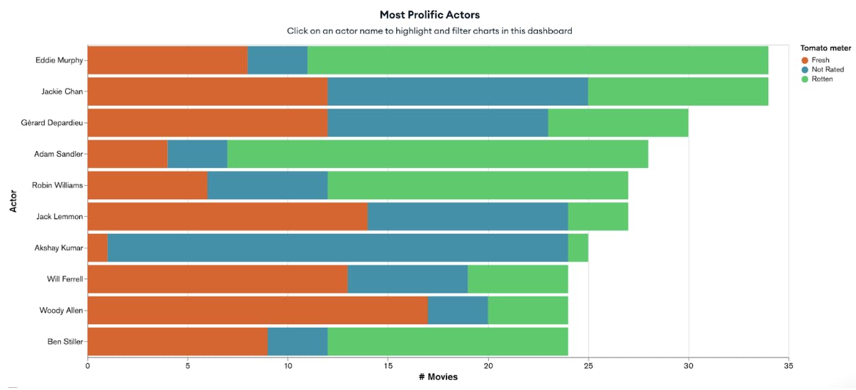
What is a stacked column chart?
Stacked column charts are used to show the composition and comparison of multiple variables over a period of time. They visually look like a series of columns stacked on top of one another, and most useful for analyzing changes across several categories.
What is an example use case for stacked column charts?
A stacked column chart can be used for product comparison, where the features, prices, and user ratings of various products or services are compared to one another side by side.
3. Geospatial charts
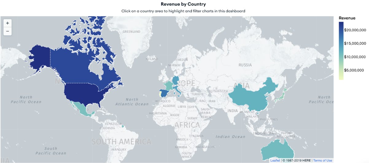
What is a geospatial chart?
Geospatial charts are map-based charts that are created from geospatial data and other forms of data to define specific geographical locations in the form of latitude and longitude coordinates or text fields with country and state names. Atlas Charts allows users to visualize geospatial data in three different chart formats: choropleth, scatter, and heatmap.
What is an example use case for geospatial charts?
A geospatial chart can be used for environmental monitoring, where soil and air quality data, pollution levels, deforestation rates, and other environmental factors are analyzed to locate areas for conservation.
4. Heatmaps
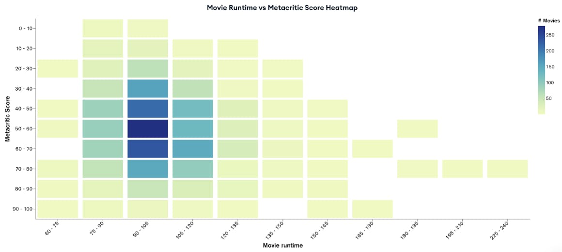
What is a heatmap?
Heatmaps are used to show relationships between two variables, showcased in a tabular format as a range of colors. Darker, more intense shades represent larger aggregated values while lighter shades represent smaller aggregated values across the dataset.
What is an example use case for heatmap charts?
A heatmap chart can be used for user behavior analytics, where user interactions, clicks, and total engagement across different web pages are tracked and monitored to improve customer experience.
Now you have an idea of the many chart types, common and uncommon, that are available to you in Atlas Charts. Now it’s time to give it a try! Use your own data, or some of MongoDB’s sample datasets, to practice what you’ve learned and implement your next charting option!
Log in to Atlas Charts today to create your visualizations! New to Atlas Charts? Get started today by logging into or signing up for MongoDB Atlas.