100daysofcode - Day42
Hi guys  , hope your are doing great
  . we have reached the 42th day in this journey.
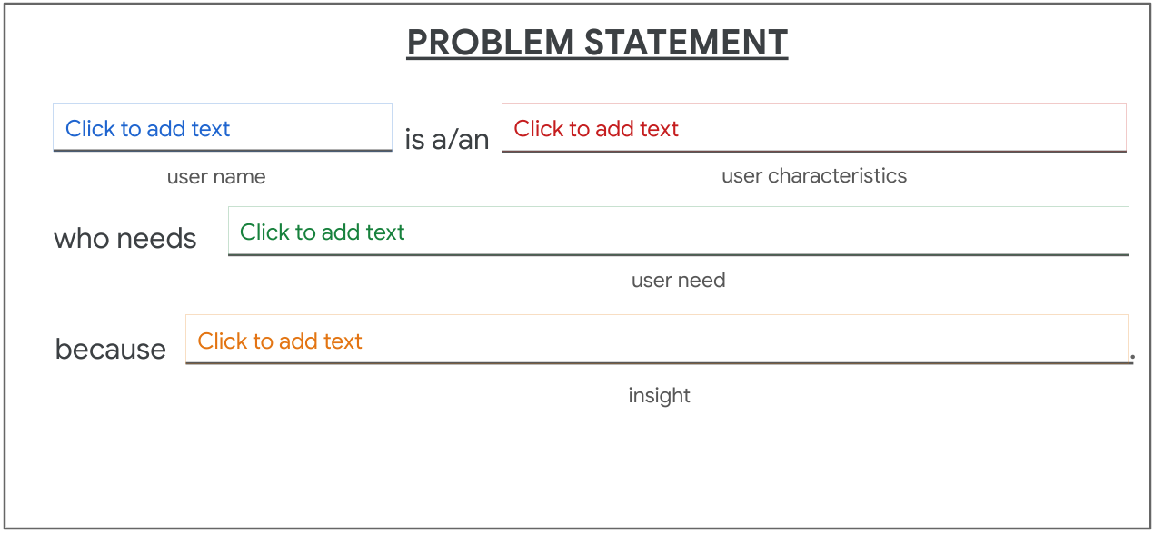
Yesterday we discussed problems statements. 
In today’s post we will talk about value propositions and how to create them. 
what is a Value Proposition 
Value propositions summarize why a consumer should use a product or service.
Value proposition example 
Check out a product you might recognize - Gmail – and ask yourself if you can identify a few of its value propositions. When Google debuted Gmail in 2004, they were entering an already crowded market of free email services.
Gmail offered:
- The ability to send and receive emails for free
- Email sorting, archiving, and starring functions
- Spam filtering for inboxes
- Email conversation views
- 1 gigabyte of cloud storage
Two of the items on that list were unique offerings that no other email services provided at the time:
- Email conversation views, which put individual emails in the context of a larger thread.
- An entire gigabyte of storage, which was 1,000 times the amount of storage that competitors offered.
Those were Gmail’s unique value propositions.
Build value propositions 
Everything that your product has to offer might seem obvious to you, but you have to put yourself in the mind of your users. Users don’t know your product or understand its value yet. That’s where value propositions come in.
To start, you need to do some research in order to answer these two questions : 
-
What does your product do? Clearly explain the offering that your product provides users.
-
Why should the user care? Describe how your product addresses users’ pain points.
Once you’ve answered these questions, you can follow a series of steps to focus in on your product’s unique value proposition.
-
Describe your product’s features and benefits.

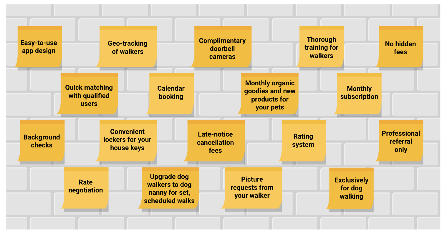
Create a list of all the great features and benefits of your product, big and small. Don’t hold back; list everything that comes to mind and then narrow it down later.
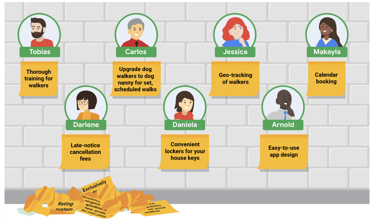
a wall covered in sticky notes of various features. Easy-to-use app design, complimentary doorbell cameras, no hidden fees, quick matching with qualified users, calendar blocking, monthly subscription, background checks, convenient lockers for your house keys, late-notice cancellation fees, rating system, professional referral only, rate negotiation,.
-
Explain the value of the product.

Anything that you identify as a value proposition needs to be beneficial to your users.
-
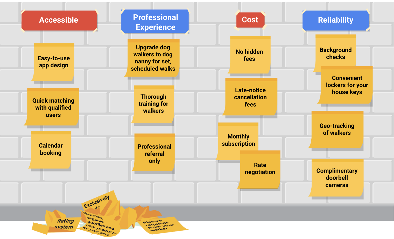
Connect these features and benefits with the needs of your users.

The goal is to identify what’s truly valuable to the user and not just a cool feature that users didn’t ask for. To determine value, take the personas you’ve developed and pair each persona with a value proposition that meets their biggest pain point.
-
Review your official value proposition list.

You’ve narrowed your list down of lots of benefits and features by matching them with actual user needs. Now it’s time to review the list of value propositions your product offers.
One of the most important things to know about value propositions is that they need to be short, clear, and to the point.
Users want to be able to easily identify exactly how your product will meet their unique needs and what sets your product apart in the market.
Sometimes users won’t know what they need until you explain it to them. That’s the real heart of product design innovation. 
 .
.


 , I hope you are enjoying your journey as much as I am doing.
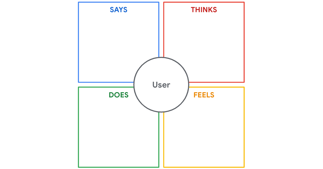


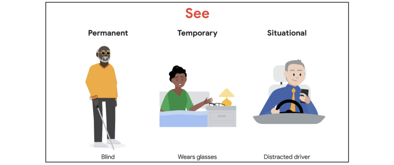
 This process is meant to be a thorough documentation of your observations. If you’re the person performing the interview, you might notice signs of feelings like anger
  , excitement

 , our daily counter, increased by 1
  . And it’s already the 43th / 100
  , So a dose of new knowledge is required to wrap the day successfully.


 . A dose of new information is coming to wrap the day in a fun way.
 . Analyzing the brands and products of competitors, or the companies who offer similar products as you do, can give you a well-rounded foundation of knowledge about the market your product will enter. That knowledge will carry into your designs and help you create a product that’s helpful and unique for users.
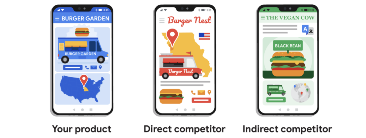


 .
.


 , Hey folks


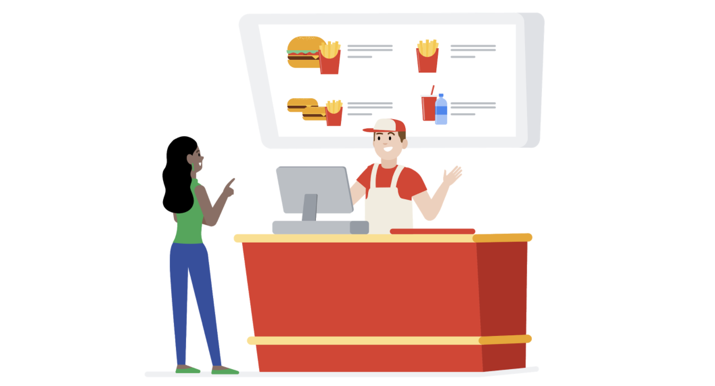
 from a restaurant.
 about condiments for your burger
  , whether you want a side of fries
  , and if you’d like a water or soda to drink.

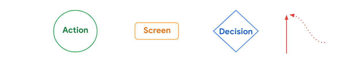
 The actions users take when moving through a product design are represented as circles. In other words, circles show steps that must be taken to complete a task from start to finish.
 Diamonds represent points in the user flow where users must ask a question and make a decision. The decision users make will either move them forward through the flow or back to an earlier part of the flow.
 Lines with arrows tie everything together and display the flow of information. Solid lines indicate forward direction through the user flow, and the dotted lines indicate backward direction or returning to a previous page.


 before any visual considerations, like color
  , are added.
 , headings
  , along with comment of how the interactions will work.
 it will guide builders during the construction
  to be lived in yet.
 means that elements that are close together appear to be more related than things that are spaced farther apart.
 means that elements located within the same closed area are perceived to be grouped together.


 and links
  behaving and acting like the actual app or website.
 , so once all the stakeholders are happy with it, then you can start the development phase and bring your idea into life.


 , As everyday a dose of new information is required to wrap the day.

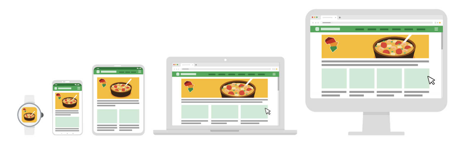
 , TVs
, TVs  , and smart displays.