100daysofcode - Day23
Hello world  , a new day is ending
  and it’s time to take a deep sleep
  , but wait lets share the day progress
  to learn more about CSS and it’s amazing features.
In yesterday’s post we wrapped up the CSS flexbox successfully and now it’s time to extend our knowledge and learn some new stuff , the CSS Grid Layout.
What is the CSS grid layout ?
- CSS Grid Layout excels at dividing a page into major regions or defining the relationship in terms of size, position, and layer, between parts of a control built from HTML primitives. Like tables, grid layout enables an author to align elements into columns and rows. However, many more layouts are either possible or easier with a CSS grid than they were with tables.
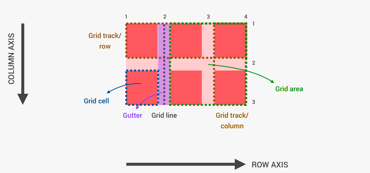
Let’s understand the Grid architecture following this architecture
-
Gutter ? A gutter is the space between columns that helps separate content. Gutter widths are fixed values at each breakpoint range.
-
Grid track? is the space between two adjacent grid lines. They are defined in the explicit grid by using the grid-template-columns and grid-template-rows
-
Grid cell? the smallest unit you can have on your CSS grid. It is the space between four intersecting grid lines and conceptually much like a table cell.
-
Grid area? one or more grid cells that make up a rectangular area on the grid. Grid areas are created when you place an item using line-based placement or when defining areas using named grid areas.
-
Grid line? lines are created when you define tracks in the explicit grid using CSS Grid Layout.