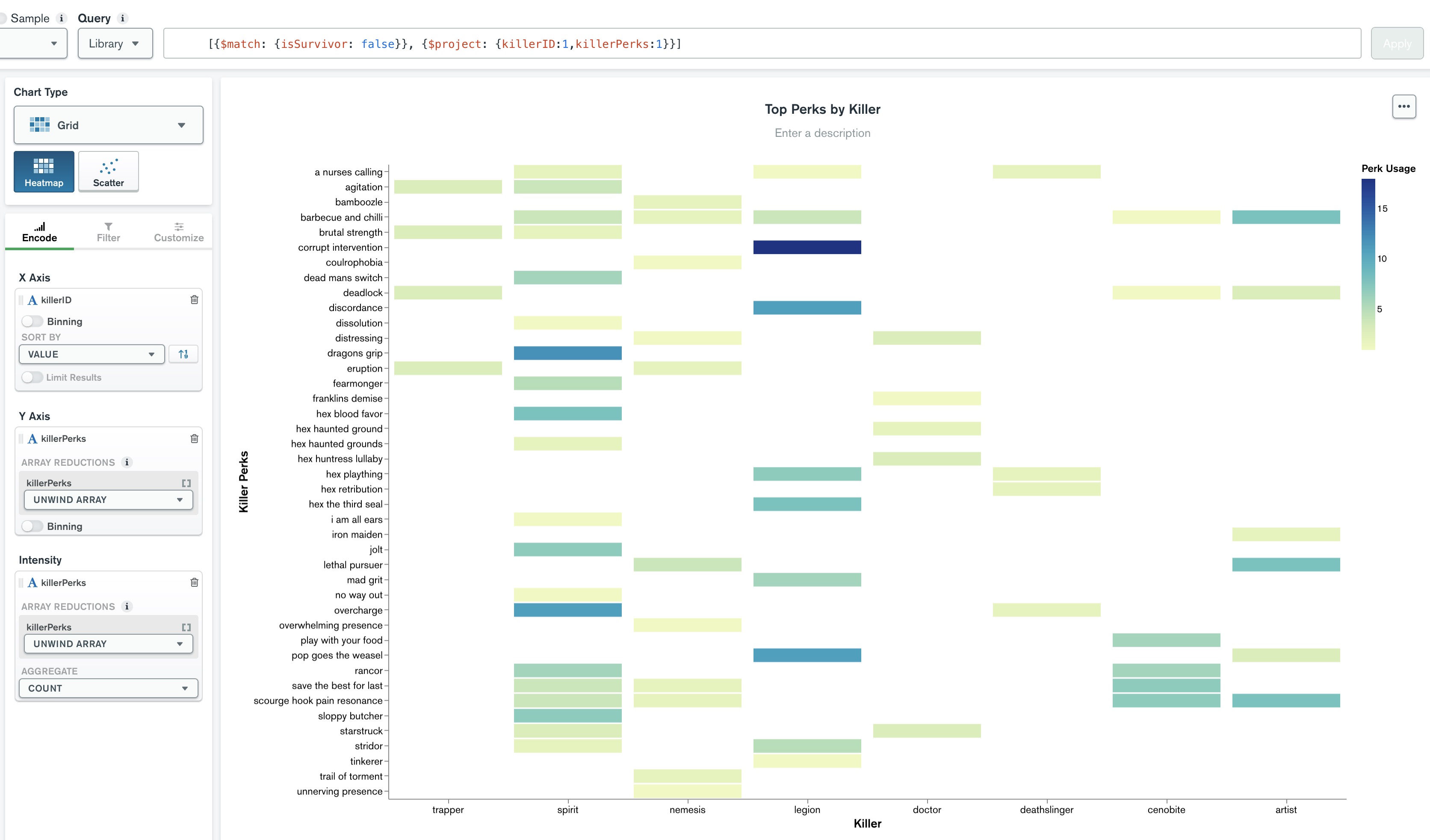
I have a collection of stats for game matches. There are 28 distinct strings for ‘killerID’, each document selecting a single one. Also, each document has an array of 4 strings, ‘killerPerks’, chosen from a pool of 97 choices. For example,
{
_id: ...,
killerID: 'wraith',
  killerPerks: [
    'tinkerer',
    'pop goes the weasel',
    'barbecue and chili',
    'fearmonger'
  ],
...
}
I created a heatmap to plot the intensity of killerPerks per each killerID over a range of all matches; this looks fine.
My issue is the X-Axis only shows a maximum of 8 entries out of 28, and I am unsure how to format this to include more entries, or to create a curated list of killerIDs of my choosing.
Is the 8 items on the x-axis a Mongo Charts default? I don’t see any information in the docs about this.
Would I need to create separate charts and aggregations for 8 distinct killerIDs at a time?
Thanks for reading through this, just started MongoDB University a few weeks ago and trying to learn as I go.