Hi guys,
I am trying to build a combo chart with column bars and line .
The columns bars should be showing the volume of transactions per hour (USD)
The line should be showing price per hour.(USD)
However because the volume per hour is a lot higher than the lowest price per hour, the line chart is basically hardly readable (appears like a flat line at the bottom).
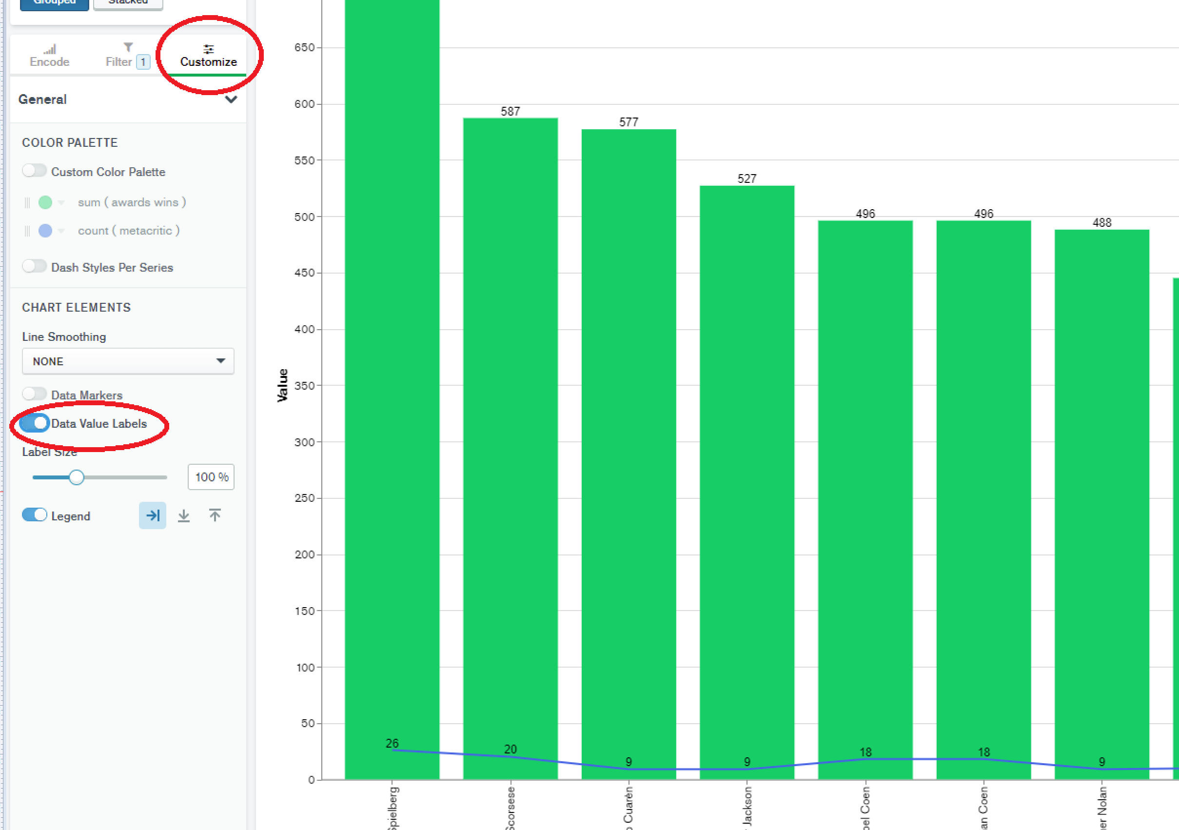
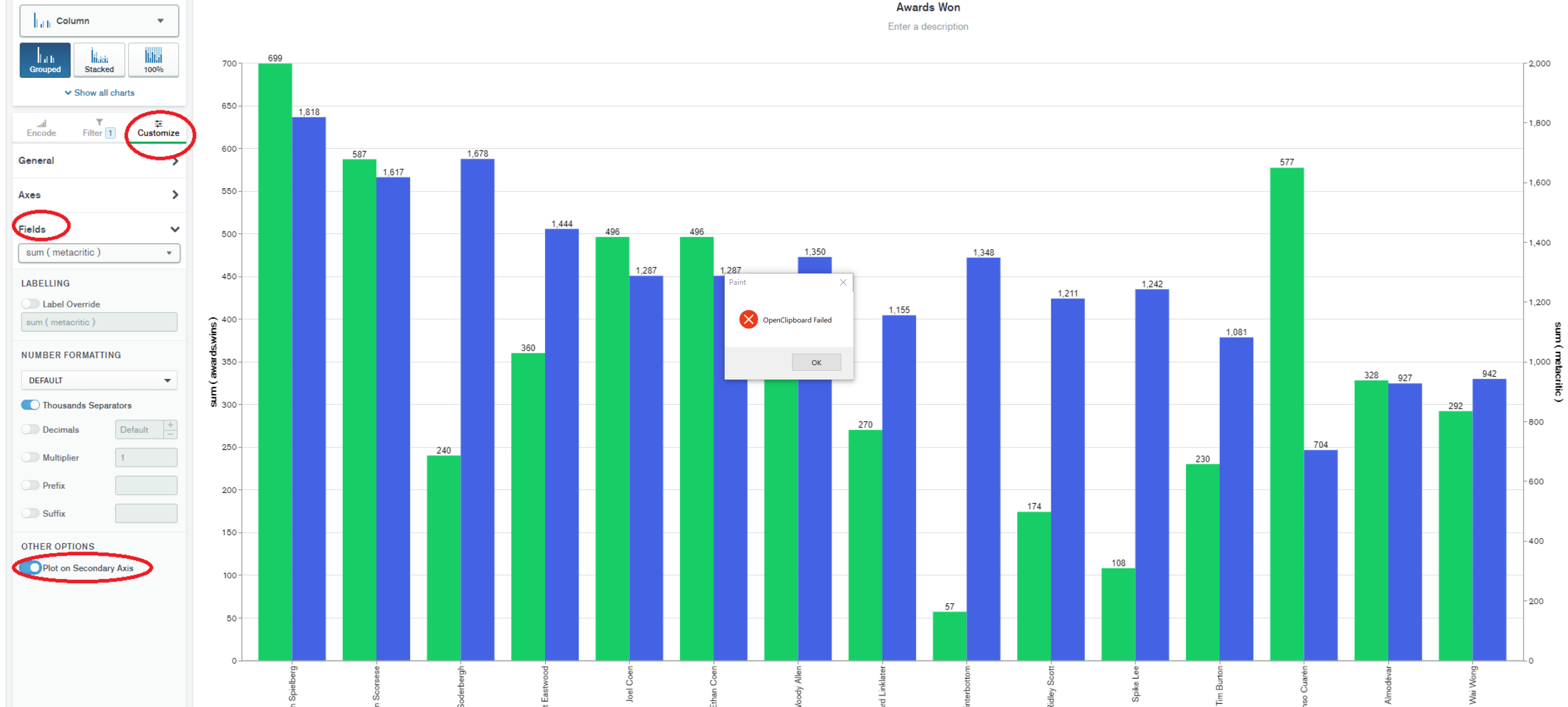
I checked all the properties but couldn’t figure out how to “amplify” the data, something like a second y axis on the right dedicated to the line chart.
How do other people solve this problem?