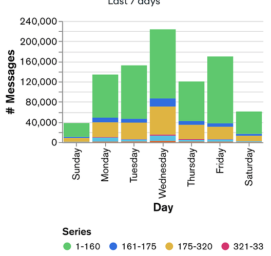
I’d like to be able to modify the ‘series’ label that appears when I build an applicable chart, but there doesn’t seem to be a way to do it. See the example screenshot below, which would make more sense if I could modify ‘series’ to ‘characters’, for example:
Hi, this is a little tricky (and I agree it should be easier), but it is in fact possible to do this.
For context, there are two ways of building a multi-series chart:
- Encoding a single field in the Y axis channel, and a different field in the Series channel.
- Encoding multiple fields in the Y axis channel.
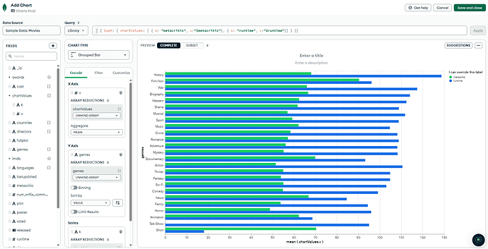
If you go with approach #1, you can override the series title in the Customize tab. But if you go with option #2, the label is always “Series”.
Normally the shape of the data will dictate which approach you use to build the chart, and presumably your data is aligned with the second approach. However you can use an aggregation pipeline to transform the shape of the data, allowing you to use a different approach to encoding the chart.
In this example I’m using the Movies sample data to build a chart showing the average runtime against the average metacrtic scores. The normal way of building this chart would just be to encode those two fields (in my case in the X Axis since it’s a bar chart). But you can see I put a pipeline in the query bar which puts these values in an array, allowing me to build the chart using a Series channel, and I can override the label.
HTH!
Tom
Hi Tom,
Excellent, thanks! I had a multi-stage pipeline in place to get to where I was, so I just added your final stage . ![]()
Regards, Phil
This topic was automatically closed 5 days after the last reply. New replies are no longer allowed.

