Building a Report Made Up of 8 Counts

Hello,

I’m currently learning and evaluationg Mongo Charts andI need help and/or advice in putting a Mongo Charts report together.

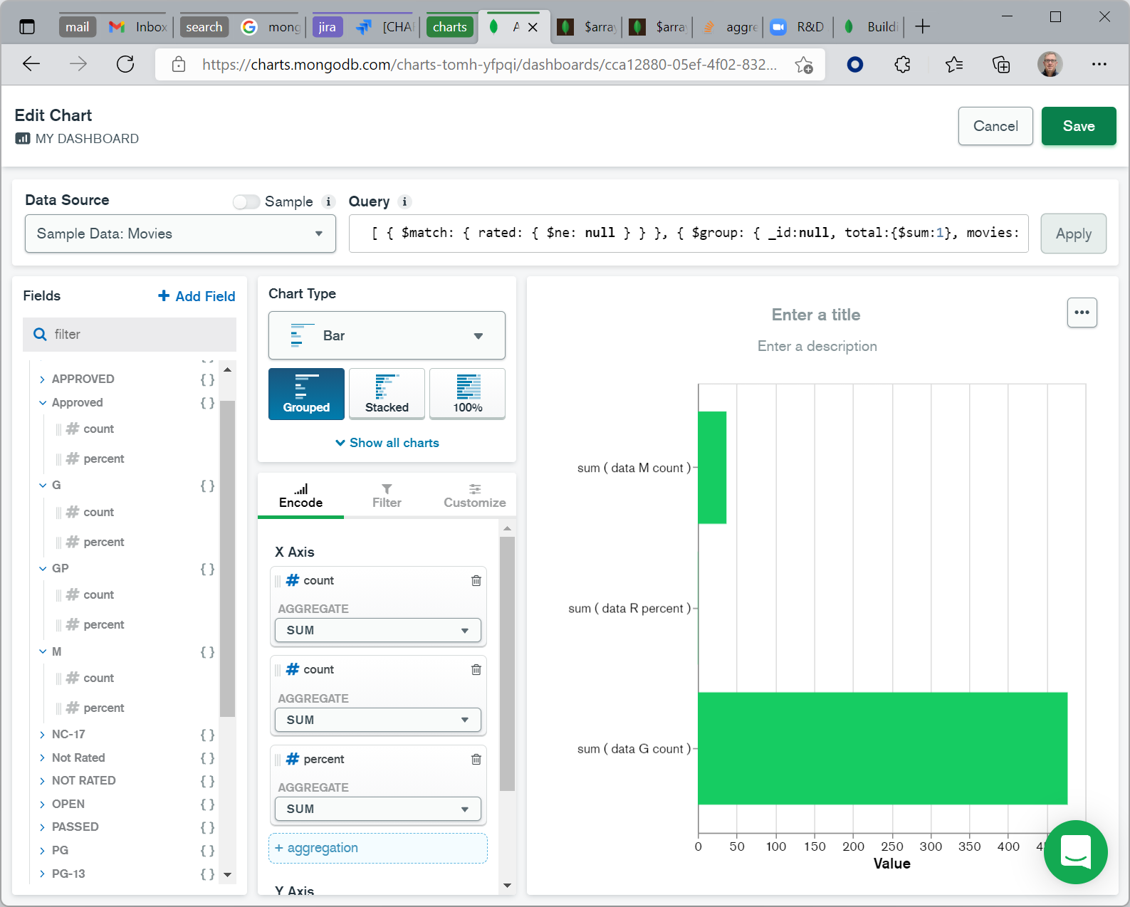
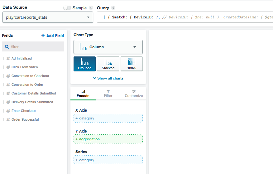
We have a mySql database that I’m now testing in Mongo Atlas. I’ve connected Charts to my collection and I’ve tried to genorate one of our campaign reports using the charts GUI however, I don’t yet understand how to create this report that is made up of 8 count queries.

Here is an example of the SQL that I need to do with Charts (or is there another tool to use first?):

    select
    (select count(StatID) form reports where subject like 'Ad Initialized') as Ad_Initialized,
    (select count(StatID) form reports where subject like 'Click from Video')  as Click_From_Video
    (select count(StatID) form reports where subject like 'Enter_Checkout') as Enter_Checkout
    (select count(StatID) form reports where subject like 'Details Submitted') as Details_Submitted
    (select count(StatID) form reports where subject like 'Checkout') / (select count(StatID) form reports) as 'Conversion to Checkout'
    (select count(StatID) form reports where subject like 'Order Successful') / (select count(StatID) form reports) as Order_Successful

The above SQL response gives me “counts for each sql statement” in one report. I would like to build this in Charts.

Here is the sample data. Values are not listed as the data is only a sample model.

Many thanks for your time and advise.

    {
        "_id" : ObjectId("613858b58bd4a6610a0a6e4d"),
        "StatID" : 93413,
        "SessionID" : "7sf6udr21m1qppa78geci84406",
        "Subject" : "Product Details",
        "SubjectID" : 84,
        "Action" : "View Product",
        "Ref" : null,
        "EventData" : "Pizza PIZZA",
        "DeviceID" : 1,
        "CreatedDateTime" : ISODate("2020-05-17T17:57:53.000Z")
    },
    {
        "_id" : ObjectId("613858b58bd4a6610a0a6eea"),
        "StatID" : 93571,
        "SessionID" : "uvutbu08rd8rvksu4cv328n821",
        "Subject" : "Product Details",
        "SubjectID" : 84,
        "Action" : "View Product",
        "Ref" : null,
        "EventData" : "Gluten Free Foods",
        "DeviceID" : 1,
        "CreatedDateTime" : ISODate("2020-05-17T18:41:02.000Z")
    },
    {
        "_id" : ObjectId("613858b58bd4a6610a0a6f1d"),
        "StatID" : 93622,
        "SessionID" : "uvutbu08rd8rvksu4cv328n821",
        "Subject" : "Product Details",
        "SubjectID" : 84,
        "Action" : "View Product",
        "Ref" : null,
        "EventData" : "Pizza n Burgers",
        "DeviceID" : 1,
        "CreatedDateTime" : ISODate("2020-05-17T18:48:34.000Z")
    }

Hi Daniel -

This was unexpectedly tricky, but I think I’ve figured out how to do it. The report is challenging since some fields are just being counted, while others are being shown as a percentage of the total. This requires an aggrgation pipeline to pre-process the data.

Rather than use your data, I’ve built a chart with the sample Movies data, but hopefuly it’s roughly equivalent to what you are doing.

Here is an annotated query that I pasted into the chart’s query bar:

[
 // Data quality fix: remove movies with no rating
  {
    $match: { rated: { $ne: null } }
  },
 // Calculate the total number of documents, while preserving the invidivual docs  
  {
    $group: {
      _id:null,
      total:{$sum:1},
      movies: {
        $push:{rated:"$rated"}
      }
    }
  },
 // Unwind the array to restore the original documents as well as the total
  {
      $unwind: "$movies"
  },
 // Count the number of documents per Rating, while preserving the total
  {
    $group: {
      _id: { total: "$total", rated: "$movies.rated" },
      count: { $sum: 1 }
    }
  },
 // For each rating, calculate the percentage, while preserving the raw count
  {
    $project: {
      "rated": "$_id.rated",
      "count": "$count",
      "percent" :{ $divide: [ "$count","$_id.total"] }
    }
  },
 // Reshape the data so each rating goes into an array element
  {
    $group: {
      _id: {},
      docs: { $push: { k: '$rated', v: { count: '$count', percent: '$percent' } } }
    }
  },
 // Reshape again so the ratings become keys
  {
    $project: {
      data: { $arrayToObject: "$docs" }
    }
  }
]

Now, for each rating I have both the count and the percentage, and I can drag the ones I want onto my chart.

Let me know if this helps.
Tom

1 Like

Tom Hollander! Wow! I’m a fan! I’ve been watching your Mongo Chart videos! haha brilliant!

Thanks so much for taking the time to help me with this. I can see what you’re doing and I’ll try and do the same on my data. …it’s going to be a long aggregate. lol

I"m a little concerned about the time it will take to run this aggregate. As I’m still learning, can you tell me if I should be setting up indexes on the collection that my charts are connecting to in order to speed up the time it takes for the chart to render?

Thanks again for your time!
Best,
Daniel

1 Like

Thanks Daniel, glad you’ve enjoyed my presentations!

Before you get too concerned about performance, I’d suggest giving it a go. There are always a range of factors that influence performance, as well as differing opinions on how fast things need to be.

Whether you’re using MongoDB or a relational database, indexes will only help improve query performance when you are filtering on that field. The pipeline I sent doesn’t have any $match stages so it won’t use any indexes and will need to scan the entire collection. However the stages themselves shouldn’t add much to the cost of the scan.

I actually suspect it will be more efficient than your MySQL query. While that query does use filters (in the where clauses), you have a lot of those, and the like keyword is likely to prevent the indexes from being used effectivtely.

So - give it a go and let me know how it runs. If it’s too slow, let’s talk more!

Tom

1 Like

Hi Tom!

Thanks again. I spent quite a bit of time last night building out some of the query you sent. At some point I decided to try another solution with the $facet operator/method that Pavel helped me with earlier on this community. Although, I only used a part of it, I ended up with a fairly clean solution.

In this case I used an overall $match and then a facet with that gets me each of the values. …and with indexes setup (currently on my local machine) I managed to run this in 4.35 seconds (8million docs) and I am sure it could be even faster.

Here is what I’ve got. It’s rough and I need to recheck that it’s correct, but for my mongo presentation, I hope it will be enough to show my boss that Atlas is the way to go! (my meeting is a 10am lol)

db.reports_stats.aggregate([
  {
    $match: {
      DeviceID: 7,
      CreatedDateTime: { $gte: ISODate("2021-09-06") },
    },
  },

  {
    $facet: {
       "StatIDCount": [
        { $count: "StatID" },
      ],

      "Ad Initialised": [
        { $match: { Subject: "Ad Initialiased" } },
        { $count: "Ad Initialised" },
      ],

      "Click From Video": [
        { $match: { Subject: "Click From Video" } },
        { $count: "Click From Video" },
      ],

      "Enter Checkout": [
        { $match: { Subject: "Checkout" } },
        { $count: "Enter Checkout" },
      ],

      "Customer Details Submitted": [
        { $match: { Subject: "Customer Details Submitted" } },
        { $count: "Customer Details Submitted" },
      ],

      "Delivery Details Submitted": [
        { $match: { Subject: "Delivery Details Submitted" } },
        { $count: "Delivery Details Submitted" },
      ],

      "Order Successful": [
        { $match: { Subject: "Order Successful" } },
        { $count: "Order Successful" },
      ],
    },
  },

  { $unwind: "$Ad Initialised" },
  { $unwind: "$Click From Video" },
  { $unwind: "$Enter Checkout" },
  { $unwind: "$Customer Details Submitted" },
  { $unwind: "$Delivery Details Submitted" },
  { $unwind: "$Order Successful" },
  { $unwind: "$StatIDCount" },

  {
    $project: {
      "Ad Initialised": "$Ad Initialised.Ad Initialised",
      "Click From Video": "$Click From Video.Click From Video",
      "Enter Checkout": "$Enter Checkout.Enter Checkout",
      "Customer Details Submitted": "$Customer Details Submitted.Customer Details Submitted",
      "Delivery Details Submitted": "$Delivery Details Submitted.Delivery Details Submitted",
      "Order Successful": "$Order Successful.Order Successful",
      "Conversion to Checkout": { "$multiply": [ { $divide: ["$Enter Checkout.Enter Checkout","$StatIDCount.StatID"] }, 100 ] },
      "Conversion to Order": { $divide: ["$Order Successful.Order Successful","$StatIDCount.StatID"] },
    },
  },
]);

The output this gives me is:

{
    "Ad Initialised" : 1123924,
    "Click From Video" : 59,
    "Enter Checkout" : 241,
    "Customer Details Submitted" : 62,
    "Delivery Details Submitted" : 54,
    "Order Successful" : 31,
    "Conversion to Checkout" : 0.0214342063251365,
    "Conversion to Order" : 2.75709707916693e-05
}

The problem I now have is that my chart skills are a bit out of data (excel 2010) haha. I’m currently in the chart interface and need to decide what chart type and then figure out ‘how’ to best lay this out.

Your input on this would be most helpful as I cram to get this ready in time to show it off.

I also realise, just now, that I have not included any dates in the data. Rather, the dates are only in the query restraint. Should I had the dates? I’m not sure because the report is giving me numbers from Sept. 6th to the 24th.

Thanks again for your time and consideration.

Best,
Daniel

Awesome, glad you’ve made some progress. I was also considering $facet as a possible solution, nice to see it works!

Regarding your question on chart types, most data visualisations are designed to make it easy to compare multiple measurments of the same values against different dimensions (such as categories or date ranges). Looking at your query result, you seem to have multiple different measurements and no dimensions. This information can’t really be displayed meaningfully on a graphical chart. You could consider a Table or Top Item chart if you simply want the raw values to be visible.

Alternatively if you want to do some kind of comparisions over different time periods or categories, you’ll need to rework your query so that it returns mulitple results (e.g. one per category/period). Then you could use a chart like a line or grouped column to show how the values change.

HTH
Tom

1 Like