Atlas Charts is the native data visualization tool for quickly and easily analyzing your data in MongoDB Atlas. Today, we’re announcing a collection of updates that further streamline the Charts experience:
Suggested charts: a quicker way to build visualizations
More contextual help in the chart builder
Automatic Charts activation for all project members
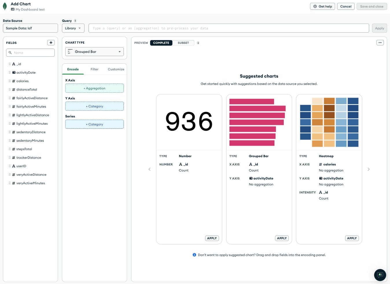
Suggested charts
Charts has always offered a simple UI with an easy to use, drag and drop interface that lets you quickly build charts and visualize your application data. However, we still found that some users could benefit from extra help when building out new charts. Rather than starting from an empty screen where you need to drag appropriate fields into the chart type selected, what if you could simply select an automatically suggested chart, and start applying customization from there?
That’s exactly what suggested charts offer. We experimented with this feature late last year and now we have turned it on for everyone! Simply add a chart into one of your dashboards to try it out today.
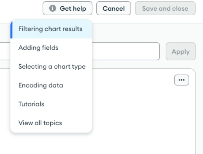
Help button in the chart builder
As you might expect, the chart builder is where you do your chart creation. Similar to suggested, last year we experimented with ways to provide more contextual help for users when building new charts. Now, we are surfacing helpful docs articles to educate users on key chart building topics like: filtering, adding fields, selecting the right chart type, and more.
Sometimes it can be intimidating to know exactly what chart to use and how to achieve the style and customization you want – the help button in chart builder will make this much easier. Building a chart and have a question? Just click into the Get help button and check out one of our highlighted topics, or choose View all topics to read the main Charts documentation.
Streamlining Charts activation
We’re constantly looking for ways to help Atlas users with data visualization quicker. So starting with this latest release, when you click into the Charts tab from the Atlas UI, you will automatically be set up to start visualizing your data – no activation required.
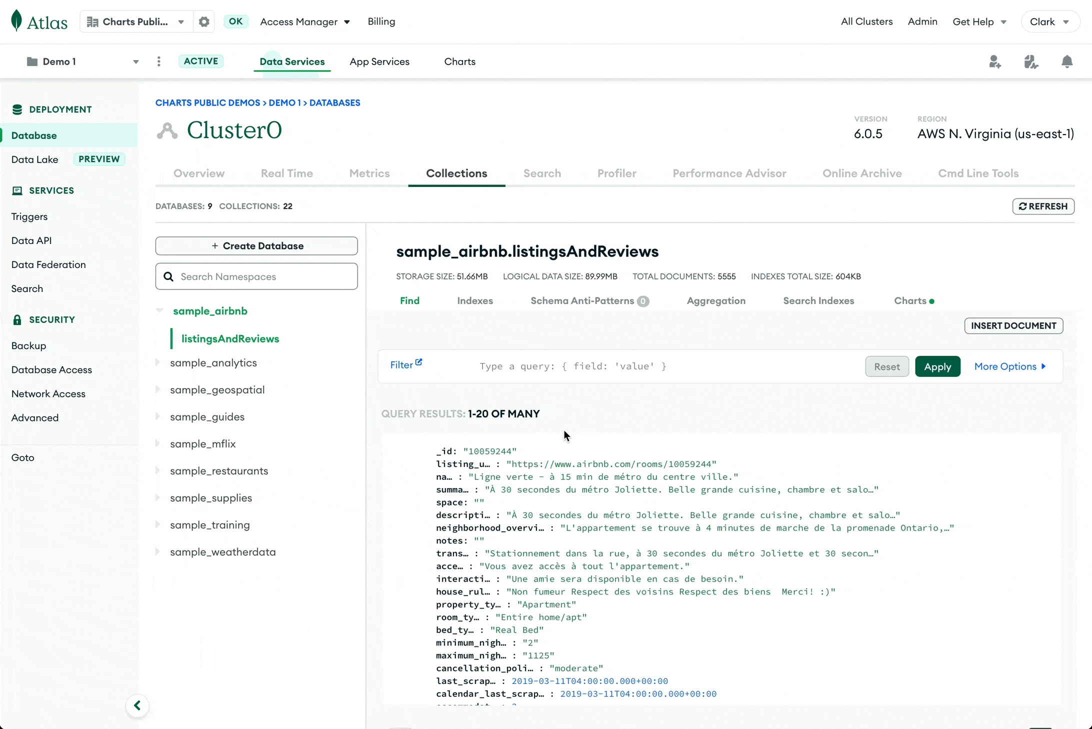
Additionally, Atlas users browsing collections within a specific cluster, can now more quickly navigate directly into Charts for quick visualization. When viewing a collection, the Visualize your data button, seamlessly opens in the chart builder with the current collection selected as the chart’s data source. Paired with the new suggested chart, users see a list of chart suggestions to quickly and easily build a relevant chart based on their collection data.
Note: you may see a “Charts” tab in the collection view instead of the Visualize your data button, as shown below. This is due to an experiment we are currently running.
This is a continuation of our effort to optimize the overall Charts experience. Last year we made strides in this area by introducing features like streamlined data sources and org-wide sharing. Keep on the lookout for more Charts features that further simplify your experience visualizing Atlas data across your team.
New to Atlas Charts? Get started today by logging into or signing up for MongoDB Atlas, deploying or selecting a cluster, and activating Charts for free.