Taking on a product redesign is always a lofty, ambitious goal for any company, but fundamentally MongoDB wanted to remedy some pain points we’ve been hearing from our customers and internal users around the hierarchy of our products. Over the past year and a half, we have been working on a redesign of our MongoDB Cloud platform that aims to solve customer problems and give us room to scale in the future when we release new products and features.
Problems
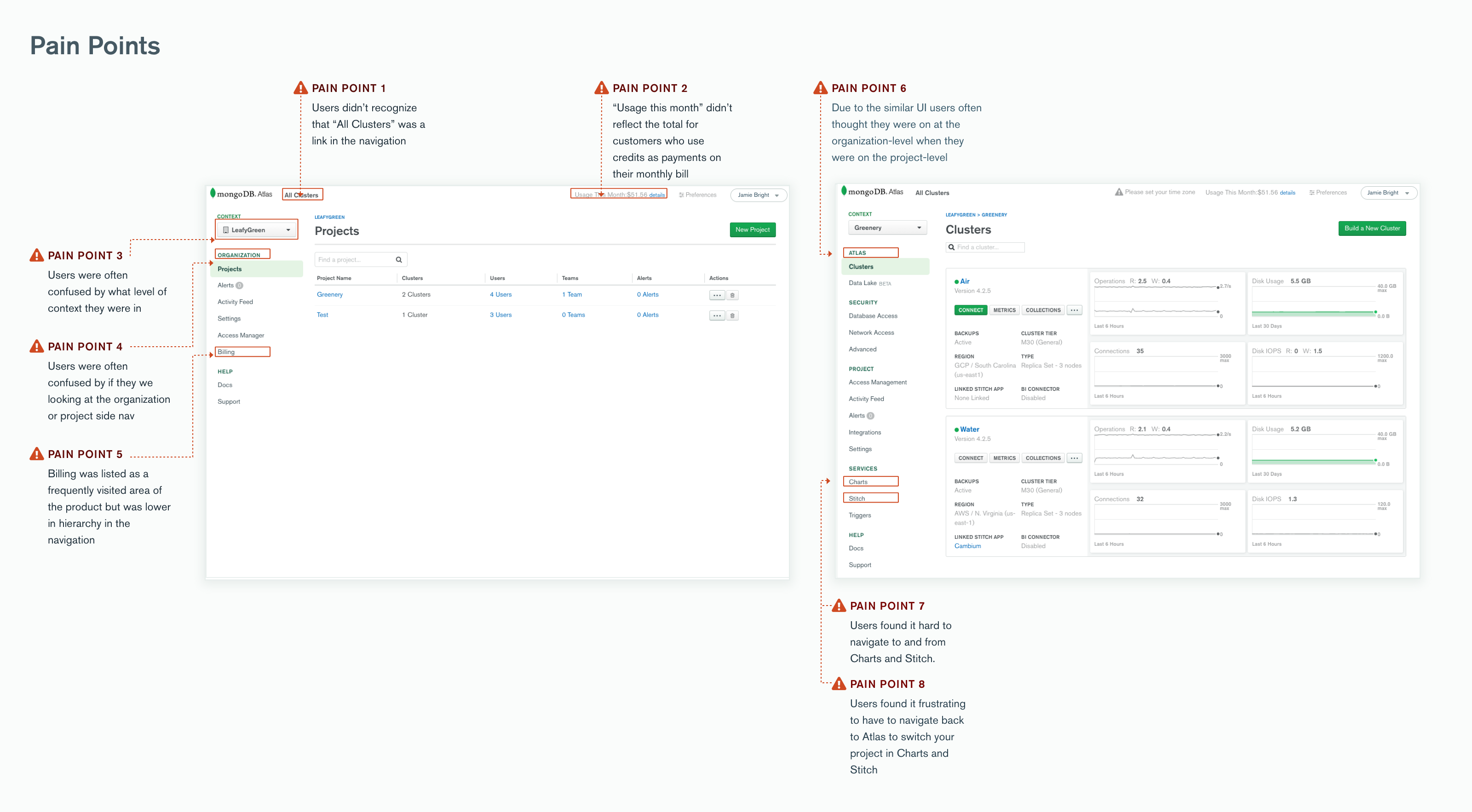
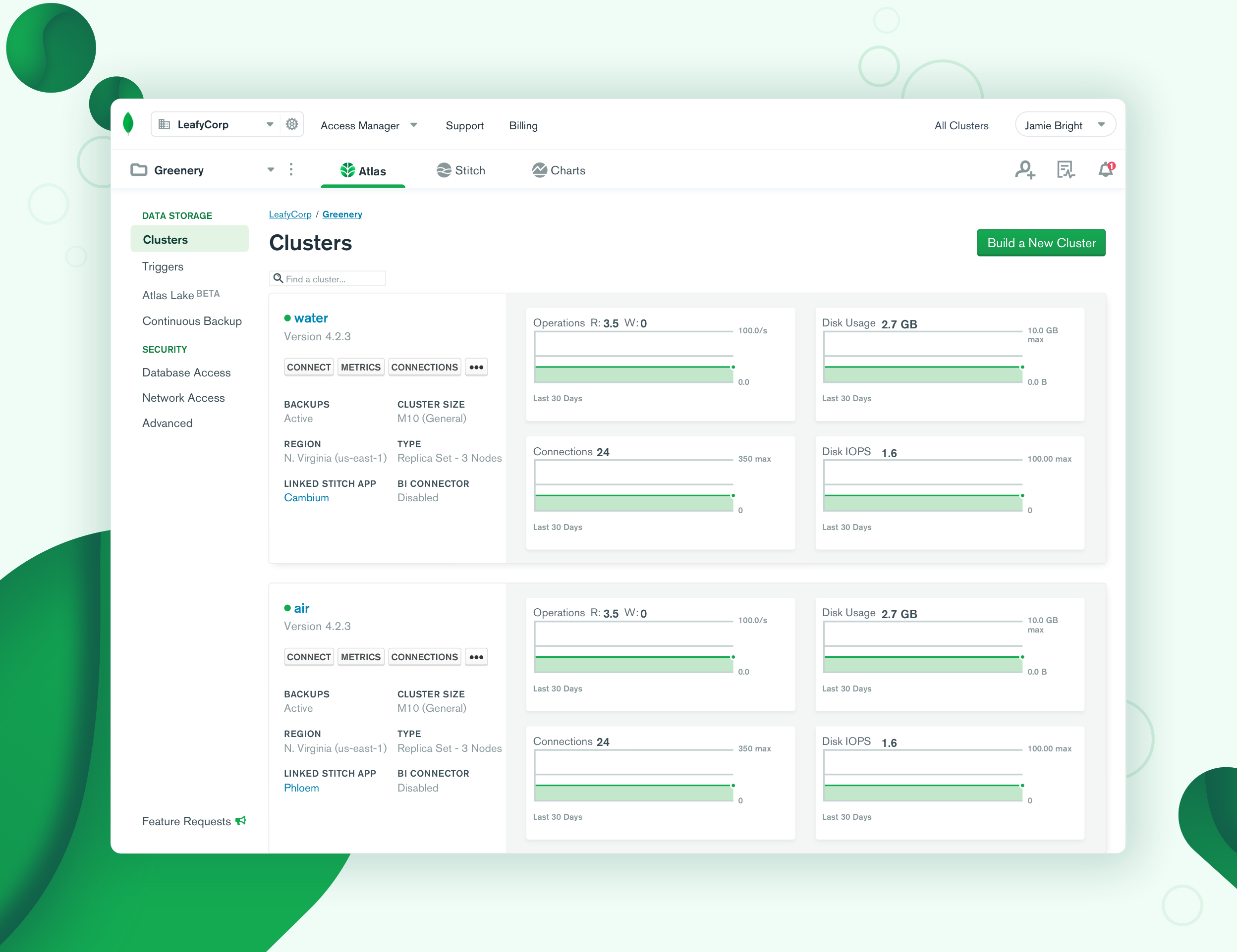
In the previous version of MongoDB Cloud, we had a single sidebar menu with content that would change depending on what level (organization or product) you were currently on. While that worked for a while, we heard from customers as well as from internal users that they were often confused by whether they were on an organization- or project-level page.
We also heard that it was difficult for users to find Stitch or Charts in the Atlas UI and that it was annoying to switch projects once they were in a Charts dashboard or Stitch app. Given these areas of friction, we decided in 2018 that it was time to take a hard look at the information architecture (IA) and navigation of our Cloud products.
Motivations & Goals
Our VP of Design, Sean Kelly, often reminds us that the goal of designing products for developers is to “get out of the way” so that we can enable our customers to do what they are here to do: build elegant software using MongoDB. And while we recognize that the MongoDB Cloud platform serves many types of users, for this project we focused primarily on our Full-Stack Developer customer persona. This persona wants a sophisticated data platform and a tool that is easy, convenient, and straightforward to use.
There is also something to be said about having to design for multiple customer personas. In my own experience, this is one of the meatiest problems a designer will face and there is no simple answer for what to do. What we found is that we had to design for the platform as a whole by focusing on a single persona, and then we would focus on the most frequent persona for each of the constituent products: Atlas, Stitch, and Charts.
We had several goals for the first phase of our redesign, including:
- To enable customers to easily discover all products in the MongoDB Cloud platform: Atlas, Stitch, and Charts
- To enable customers to easily and quickly switch contexts between Atlas, Charts, and Stitch
- To establish a product hierarchy that can scale for future product and feature releases
- To clearly indicate the navigational hierarchy of each page in the platform
Constraints
People often say “Design without constraints is Art,” and I’ve heard it repeated in different ways at conferences, in blog posts, and even on Design Twitter. For this navigation redesign, we were constrained by the existing visual design and design systems of our Cloud products. We were already taking on a huge challenge of redesigning and unifying many different products, and our team didn’t have the bandwidth nor the resources to create a new visual design language and re-launch all of our design components at the same time
In addition, even today some of our components are built on legacy code that is really tough to change. So we had to find fresh ways to use our color palette, shadows, and spacing to make things feel new. Fortunately, our Visual & Brand team was growing and with more people, we were able to create a whole new system of logos and icons for Atlas, Charts, Stitch, Cloud, University, and Cloud Manager.
The redesign would have to take into consideration our future product vision and roadmap. Through close collaboration with our Product, Engineering, Design, and other key stakeholders we evaluated each proposed solution through that lens. We had to prioritize what we believed were the most important improvements to roll out: a new top navigation that clearly represents the hierarchy of organizations, projects, and products within MongoDB Cloud.
Furthermore, the final deliverable needed to be a set of reusable components that could live across the suite of MongoDB services and products. At MongoDB, we rely upon our Design Systems team to develop and ship these components to all of the engineering teams, so the future components from this project would also be used in MongoDB Cloud Manager and MongoDB Ops Manager.
Design Process
Combining our MongoDB Cloud products under a single platform has been on designers and product leaders' minds for a long time. It is thus difficult to summarize the full scope of the process that led to this point, or the events that lead to our navigation redesign officially kicking off. Even before I started working at MongoDB and on this project in particular, many other product designers had designed, researched, and tested early concepts for a new navigation for our Cloud products and services.
Concept Testing
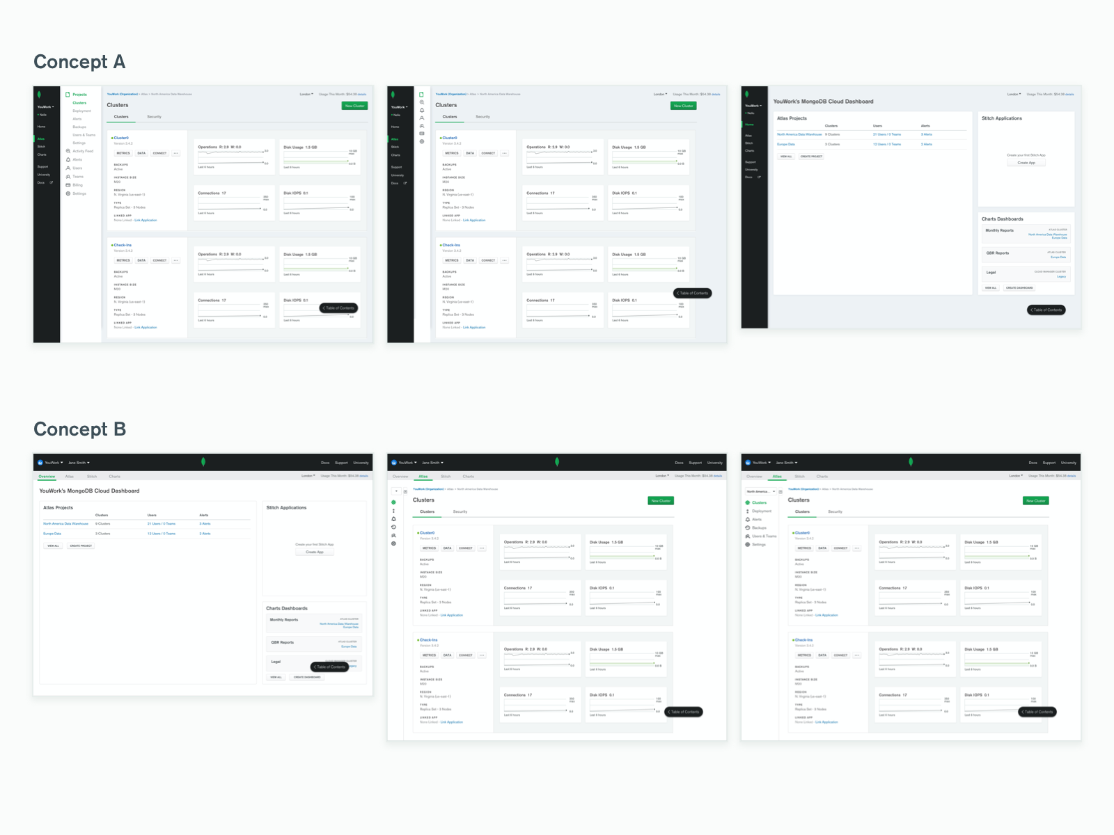
In 2018, the Cloud organization was eager to pick the effort back up again. So ambitiously we created two high-fidelity conceptual prototypes of the new navigation and tested them at our MongoDB London event with participants on the conference floor. Looking back, those designs, while grand, gave us answers to initial questions such as:
- What is easier for users to use, a top-level navigation or a side navigation?
- What type of navigation gives the user the most context as to where they are in the hierarchy of products?
- Would users understand that they could switch between products?
- Did users expect to have to login each time they switched between products?
From there we took a step back, realizing that however exciting it is to jump into Sketch and UI design, we needed to understand the priority of use cases in MongoDB Cloud for different customers and our internal stakeholders. We brought in Julie McGehee, a UX Researcher here at MongoDB, to conduct an open card sort with follow-up, in-depth customer interviews, followed by a closed card sort online. From that study, we were able to discover the natural groupings our customers created for MongoDB products and services.
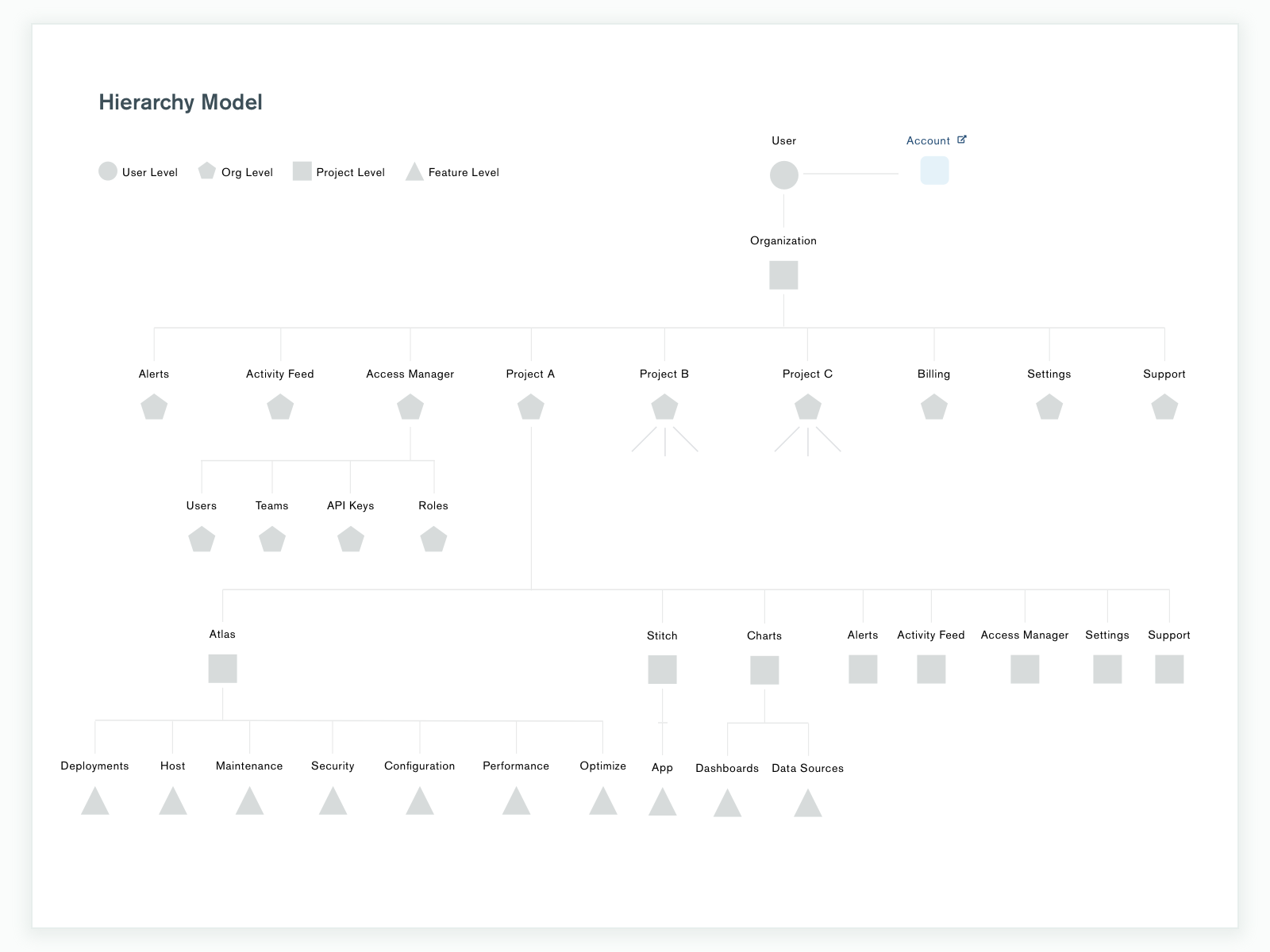
Data Model Ideation
After that study, we shifted gears to focus our energies on all of the new possible data models for this new Cloud navigation. We wanted to understand what the limitations and benefits of one data model would be over another. We projected what the platform would look like after introducing future features to ensure that our data model would scale to our product vision. After multiple rounds of iterations, meeting with stakeholders, and large format print outs from our handy in-house plotter, we landed on a final data model for a new information architecture.
UI/UX Workshops and RITE
Once we had a data model, we could return to focusing on the UI and UX. We formed a core group of design stakeholders that were used to collaborate with, brainstorm, and solve nitty-gritty edge case problems with each design. There were many "can I grab you for a moment?" whiteboarding sessions during this phase that looking back were so much fun. I'm very thankful to the amazing, supportive product design team at MongoDB who made themselves irreplaceable resources.
At this point, we were ready to start RITE (Rapid Iterative Testing Evaluation) user research. Pairing with our UX Research team, we created low-fidelity concepts that we tested with one user, captured the findings, iterated on, and then tested with another user, and so forth. This iterative testing method allowed us to quickly capture findings and make changes to the designs while being in constant communication with our customers.
Visual Design
From the low-fidelity prototype, we were finally ready to start the visual design phase. Relying upon the talents across the MongoDB Design team, we held design “jam” sessions and invited product designers to take the low-fidelity concept and make it beautiful. This collaborative approach allowed us to utilize the diversity of the product designers at MongoDB who's strengths span across all skillsets of design.
Task Analysis
Once we had the visual design polished, we were ready for the last research phase: task analysis across MongoDB Atlas, Stitch, and Charts. We asked 28 participants to go through a clickable prototype with 22 tasks and report if they believe they completed each task, how hard they would rate them, and their thoughts around the way. This fine-grained method of testing enabled us to pinpoint areas of the design that were successful and areas that needed further iteration. We then took those learnings and made even more improvements to the final design.
Lessons Learned
Over the course of this past year and a half, we spoke to a total of 101 customers across 5 continents and countless time zones. This effort could not have been done without our wonderful UX Research team and their willingness to take late-night or early morning calls to make sure we were capturing the point of view of our truly global audience.
What we learned throughout our multiple rounds of user research and testing was that nailing a user’s “mental model,” that is, a mapping of a product’s hierarchy in their mind, enables us to roll out new features and products more easily in the future. Once you can set up a clear mental model, customers can better expect and predict what will happen when they go a page deeper into your platform. And after everything, we had a design that met the goals of the project, created a simpler mental model, and was easy to use. It was then ready to be broken down into components by Design Systems and shipped to our customers.
Conclusion
We are a 1,500+ person company with dozens of teams, working on different projects, in different timezones, that are often on their own release timelines. This navigation redesign required collaboration across Engineering, Design, Product, and Marketing to align on and execute our vision.
I am so very grateful for everyone at MongoDB who worked on this year-and-a-half-long effort. This project would not have come to fruition without their tireless efforts, thoughtfulness, and imagination. We aim to keep improving MongoDB Cloud and continue to listen and learn from our customers, so if you have comments, suggestions, or ideas to further improve this new navigation and hierarchy please feel free to drop them in feedback.mongodb.com, underneath the “UI” section.
Special Thanks To:
Brooke Yalof, Design Systems Engineer
Sean Hanson, Full-Stack Engineer
Michelle Chiu, Product Designer
Diancheng Hu, Product Designer
Dave Hastwell, Product Designer
Jimmy Santill, Product Designer
Rashmi Srinivas, Product Designer
Tan Hsiao, Product Designer
Dan Zhu, Product Designer
Julie McGehee, UX Researcher
Thomas Tran, Design Lead
Andrea Morales, Design Lead
Harry Wolff, Lead Engineer
Sarah Kasch, Design Operations Lead
Kalie Patterson, Lead, Visual & Brand Design
Dan Brown, UX Researcher Lead
Dave McCarter, Design Systems Lead
Ben Cefalo, Director of Product Management
Eliane Kabkab, Director of Product Design
Fred Truman, Director of Product Design
Sean Kelly, VP of Design