Atlas
Charts. Visualize real-time application data.

- Real-time business intelligence
- Powerful, in-app visualizations
- No user-based licensing
_Spot.png?auto=format%252Ccompress)
Use natural language to build visualizations
Now in public preview, building complex charts in Natural Language Mode is as easy as asking a question in plain English!Try Now
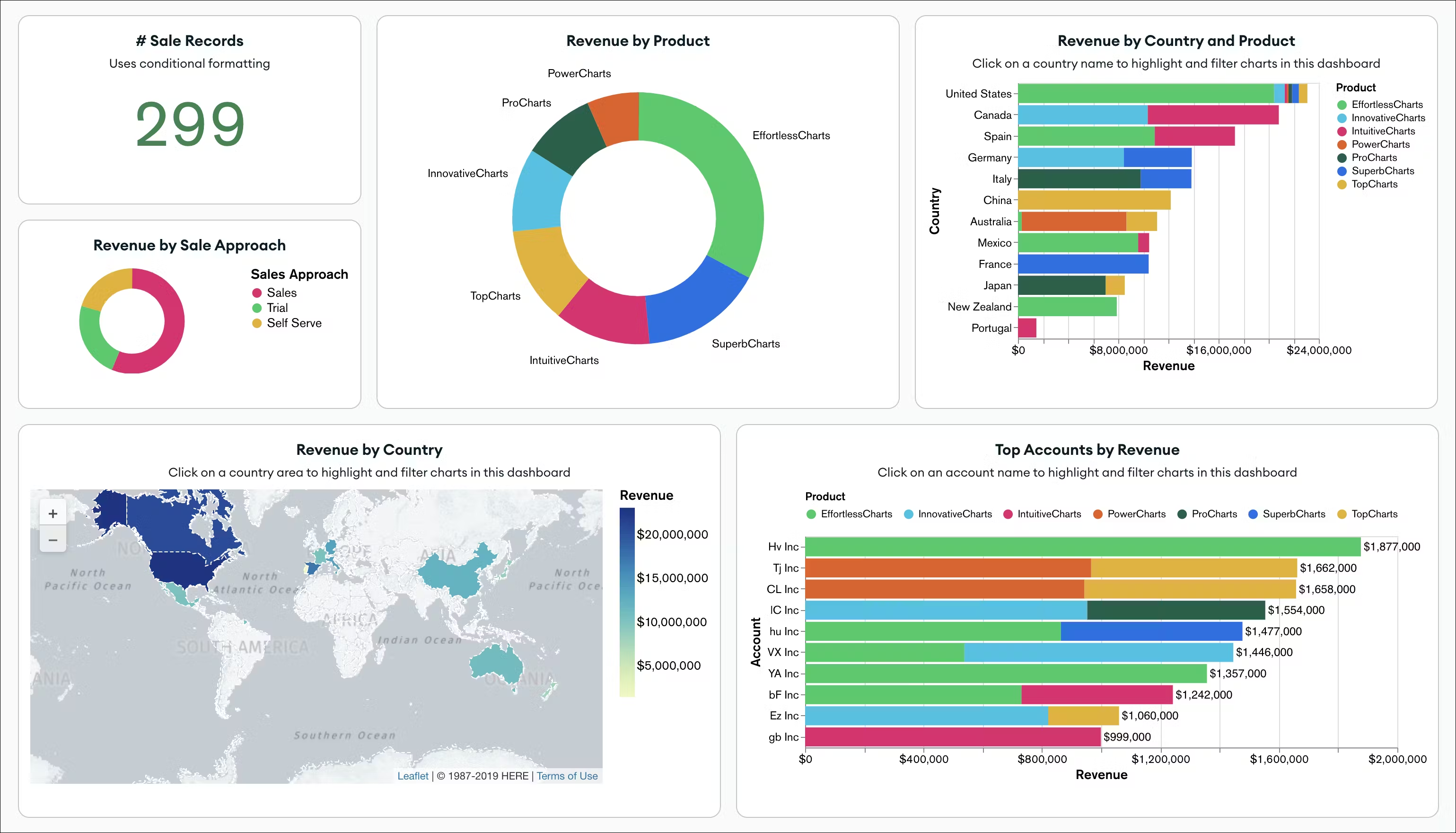
Quick, easy, real-time business insights
Charts makes it easy to create dynamic dashboards in just a few clicks; you can even render charts using natural language. All deployments from your Atlas project are available by default, dashboards can be configured to refresh automatically, and you can easily share dashboards across your team.
Make decisions based on complex data with less effort
Charts works directly with JSON data, making your analytics workflow simpler. By natively supporting the document model, you will spend less time searching for insights, and more time making decisions. No more flattening data into tabular structures like with traditional business intelligence tools.
Create modern data experiences with embedded analytics
With embedded analytics in Atlas Charts, embed charts and dashboards into any application. Use an iframe to quickly embed a chart, or use our embedding SDK for greater control and customization. Deliver powerful insights and relevant data to users where they need it._Spot_Charts.svg?auto=format%252Ccompress)
Power insights across your organization
With powerful functionality like granular sharing with individual team members, flexible organization-wide sharing, and scheduled reporting, Charts provides a powerful platform for sharing insights across your team.Explore Charts features with our sample dashboard
.svg?auto=format%252Ccompress)
"We hadn’t looked at it before, but in 15 to 20 minutes, I was producing charts of real-time data and dashboards. We were able to bridge the gap with real-time data straight from MongoDB and package it in a way that was relevant and immediately actionable."

Feature overview
Made for Atlas
Built for the document model, Charts streamlines visualization of JSON data with zero setup or ETL (Extract, Transform, Load).
No user-based licensing
Already integrated into the Atlas experience, Charts is available to customers free of any licensing fees.
Embed via iFrame or SDK
Embedded analytics empowers seamless integration of charts and dashboards via iFrames, or with rich customization through the embedding SDK.
Built for collaboration
Charts makes it easy to create and collaborate securely with shared dashboards.
Scheduled reports
Keep team members regularly informed about key business insights with email reports.
Org-wide sharing
With a single click, provide dashboard access to your entire organization.
Natural Language Mode
Render charts using natural language queries to get from inquiry to insight faster.
Get more out of Charts with embedded analytics
iFrame support enables simple chart and dashboard embedding
The Charts Embedding SDK enables rich customization
Add / Create chart interactivity with the embedding SDK
iFrame support enables simple chart and dashboard embedding
The Charts Embedding SDK enables rich customization
Add / Create chart interactivity with the embedding SDK
_Thunbnail.png?auto=format%252Ccompress)
Getting Started with Atlas Charts
Learn how Atlas Charts can create engaging data experiences that drive actionable insights for your business and its customers.Search
Build fast, relevance-based full-text search in minutes. Eliminate the need to run a separate search engine alongside your database.
Data Federation
Analyze rich data easily across Atlas or cloud object storage. Combine, transform and enrich data from multiple sources without complex integrations.
Atlas SQL Interface
Query and analyze document data with SQL and SQL-based business intelligence tools like Tableau and Power BI.
Get started with Charts today
- Rich JSON visualization
- Integrated with Atlas
- Embedded analytics
- Sharing and collaboration
- No user-based licensing
- Natural Language Mode