Is it Safe to Go Outside? Data Investigation With MongoDB
Rate this tutorial
This investigation started a few months ago. COVID-19 lockdown in Scotland was starting to ease, and it was possible (although discouraged) to travel to other cities in Scotland. I live in a small-ish town outside of Edinburgh, and it was tempting to travel into the city to experience something a bit more bustling than the semi-rural paths that have been the only thing I've really seen since March.
The question I needed to answer was: Is it safe to go outside? What was the difference in risk between walking around my neighbourhood, and travelling into the city to walk around there?
I knew that the Scottish NHS published data related to COVID-19 infections, but it proved slightly tricky to find.
Initially, I found an Excel spreadsheet containing infection rates in different parts of the country, but it was heavily formatted, and not really designed to be ingested into a database like MongoDB. Then I discovered the Scottish Health and Social Care Open Data platform, which hosted some APIs for accessing COVID-19 infection data, sliced and diced by different areas and other metrics. I've chosen the data that's provided by local authority, which is the kind of geographical area I'm interested in.
There's a slight complication with the way the data is provided: It's provided across two endpoints. The first endpoint, which I've called
daily, provides historical infection data, excluding the latest day's results. To also obtain the most recent day's data, I need to get data from another endpoint, which I've called latest, which only provides a single day's data.I'm going to walk you through the approach I took using Jupyter Notebook to explore the API's data format, load it into MongoDB, and then do someanalysis in MongoDB Charts.
This blog post assumes that you have a working knowledge of Python. There's only one slightly tricky bit of Python code here, which I've tried to describe in detail, but it won't affect your understanding of the rest of the post if it's a bit beyond your Python level.
If you want to follow along, you should have a working install of Python 3.6 or later, with Jupyter Notebook installed. You'll also need an MongoDB Atlas account, along with a free MongoDB 4.4 Cluster. Everything in this tutorial works with a free MongoDB Atlas shared cluster.
If you want to give MongoDB a try, there's no better way than to sign up for a *free* MongoDB Atlas account and to set up a free-tier cluster.
The free tier won't let you store huge amounts of data or deal with large numbers of queries, but it's enough to build something reasonably small and to try out all the features that MongoDB Atlas has to offer, and it's not a trial, so there's no time limit.
Before starting up Jupyter Notebook, I set an environment variable using the following command:
That environment variable,
MDB_URI, will allow me to load in the MongoDB connection details without keeping them insecurely in my Jupyter Notebook. If you're doing this yourself, you'll need to get the connection URL for your own cluster, from the Atlas web interface.After this, I started up the Jupyter Notebook server (by running
jupyter notebook from the command-line), and then I created a new notebook.In the first cell, I have the following code, which uses a neat trick for installing third-party Python libraries into the current Python environment. In this case, it's installing the Python MongoDB driver,
pymongo, and urllib3, which I use to make HTTP requests.The second cell consists of the following code, which imports the modules I'll be using in this notebook. Then, it sets up a couple of URLs for the API endpoints I'll be using to get COVID data. Finally, it sets up an HTTP connection pool manager
http, connects to my MongoDB Atlas cluster, and creates a reference to the covid database I'll be loading data into.The first thing I did was to request a sample page of data from each API endpoint, with code that looks a bit like the code below. I'm skipping a couple of steps where I had a look at the structure of the data being returned.
Look at the data that's coming back:
The data being returned looked a bit like this:
Note that there's a slight difference in the format of the data. The
daily_url endpoint's DailyPositive field corresponds to the latest_url's NewPositive field. This is also true of DailyDeaths vs NewDeaths.Another thing to notice is that each region has a unique identifier, stored in the
CA field. A combination of CA and Date should be unique in the collection, so I have one record for each region for each day.I set up the following indexes to ensure that the combination of
Date and CA is unique, and I've added an index for CAName so that data for a region can be looked up efficiently:I'm going to write a short amount of code to loop through each record in each API endpoint and upload each record into my
daily collection in the database. First, there's a method that takes a record (as a Python dict) and uploads it into MongoDB.Because the provided
_id value isn't unique across both API endpoints I'll be importing data from, the function removes it from the provided record dict. It then parses the Date field into a Python datetime object, so that it will be recognised as a MongoDB Date type. Then, it renames the NewPositive and NewDeaths fields to match the field names from the daily endpoint.Finally, it inserts the data into MongoDB, using
replace_one, so if you run the script multiple times, then the data in MongoDB will be updated to the latest results provided by the API. This is useful, because sometimes, data from the daily endpoint is retroactively updated to be more accurate.It would be great if I could write a simple loop to upload all the records, like this:
Unfortunately, the endpoint is paged and only provides 100 records at a time. The paging data is stored in a field called
_links, which looks like this:I wrote a "clever" generator function, which takes a starting URL as a starting point, and then yields each record (so you can iterate over the individual records). Behind the scenes, it follows each
next link until there are no records left to consume. Here's what that looks like, along with the code that loops through the results:Next, I need to load all the records at the
latest_url that holds the records for the most recent day. After that, I can load all the daily_url records that hold all the data since the NHS started to collect it, to ensure that any records that have been updated in the API are also reflected in the MongoDB collection.Note that I could store the most recent update date for the
daily_url data in MongoDB and check to see if it's changed before updating the records, but I'm trying to keep the code simple here, and it's not a very large dataset to update.Using the paged wrapper and
upload_record function together now looks like this:Woohoo! Now I have a Jupyter Notebook that will upload all this COVID data into MongoDB when it's executed.
Although these Notebooks are great for writing code with data you're not familiar with, it's a little bit unwieldy to load up Jupyter and execute the notebook each time I want to update the data in my database. If I wanted to run this with a scheduler like
cron on Unix, I could select File > Download as > Python, which would provide me with a python script I could easily run from a scheduler, or just from the command-line.After executing the notebook and waiting a while for all the data to come back, I then had a collection called
daily containing all of the COVID data dating back to February 2020.The rest of this blog post could have been a breakdown of using the MongoDB Aggregation Framework to query and analyse the data that I've loaded in. But I thought it might be more fun to look at the data, using MongoDB Charts.
To start building some charts, I opened a new browser tab, and went to https://charts.mongodb.com/. Before creating a new dashboard, I first added a new data source, by clicking on "Data Sources" on the left-hand side of the window. I selected my cluster, and then I ensured that my database and collection were selected.
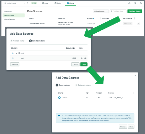
With the data source set up, it was time to create some charts from the data! I selected "Dashboards" on the left, and then clicked "Add dashboard" on the top-right. I clicked through to the new dashboard, and pressed the "Add chart" button.
The first thing I wanted to do was to plot the number of positive test results over time. I selected my
covid.daily data source at the top-left, and that resulted in the fields in the daily collection being listed down the left-hand side. These fields can be dragged and dropped into various other parts of the MongoDB Charts interface to change the data visualization.A line chart is a good visualization of time-series data, so I selected a
Line Chart Type. Then I drag-and-dropped the Date field from the left-hand side to the X Axis box, and DailyPositive field to the Y Axis box.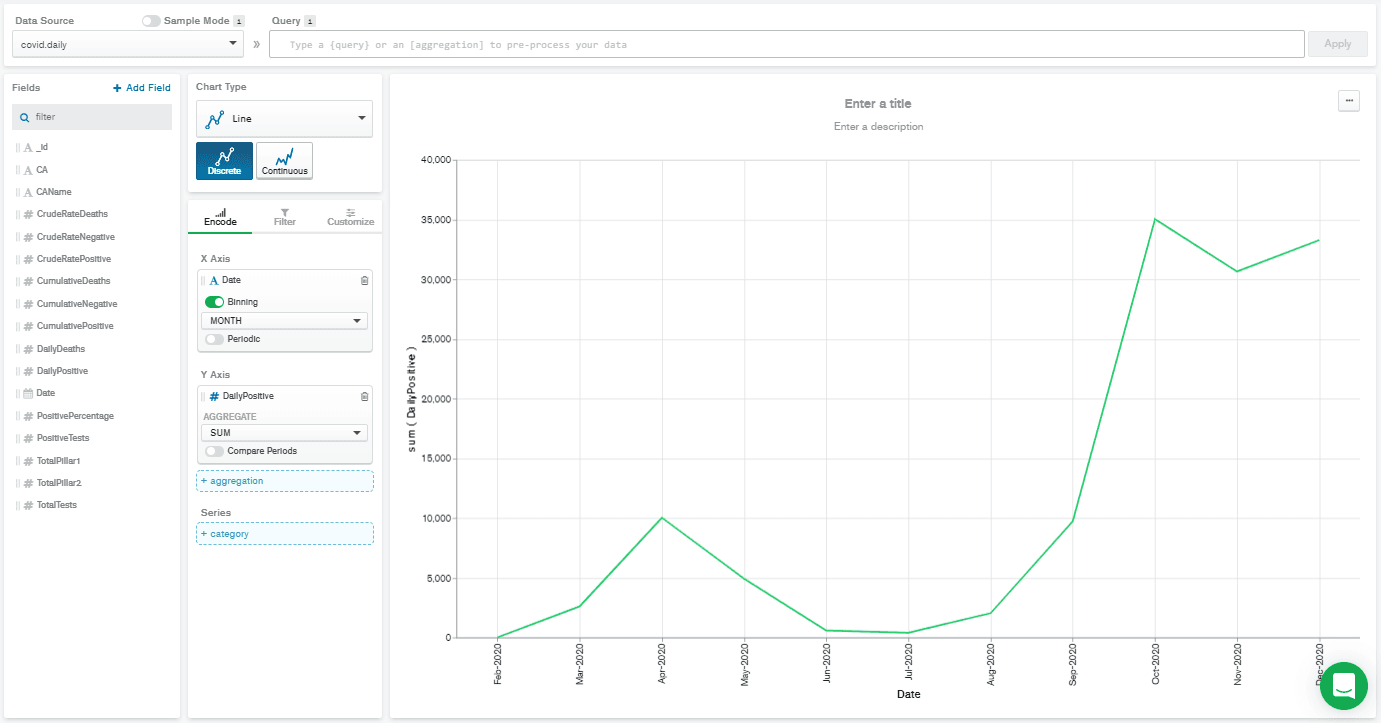
This gave a really low-resolution chart. That's because the Date field is automatically selected with binning on, and set to
MONTH binning. That means that all the DailyPositive values are aggregated together for each month, which isn't what I wanted to do. So, I deselected binning, and that gives me the chart below.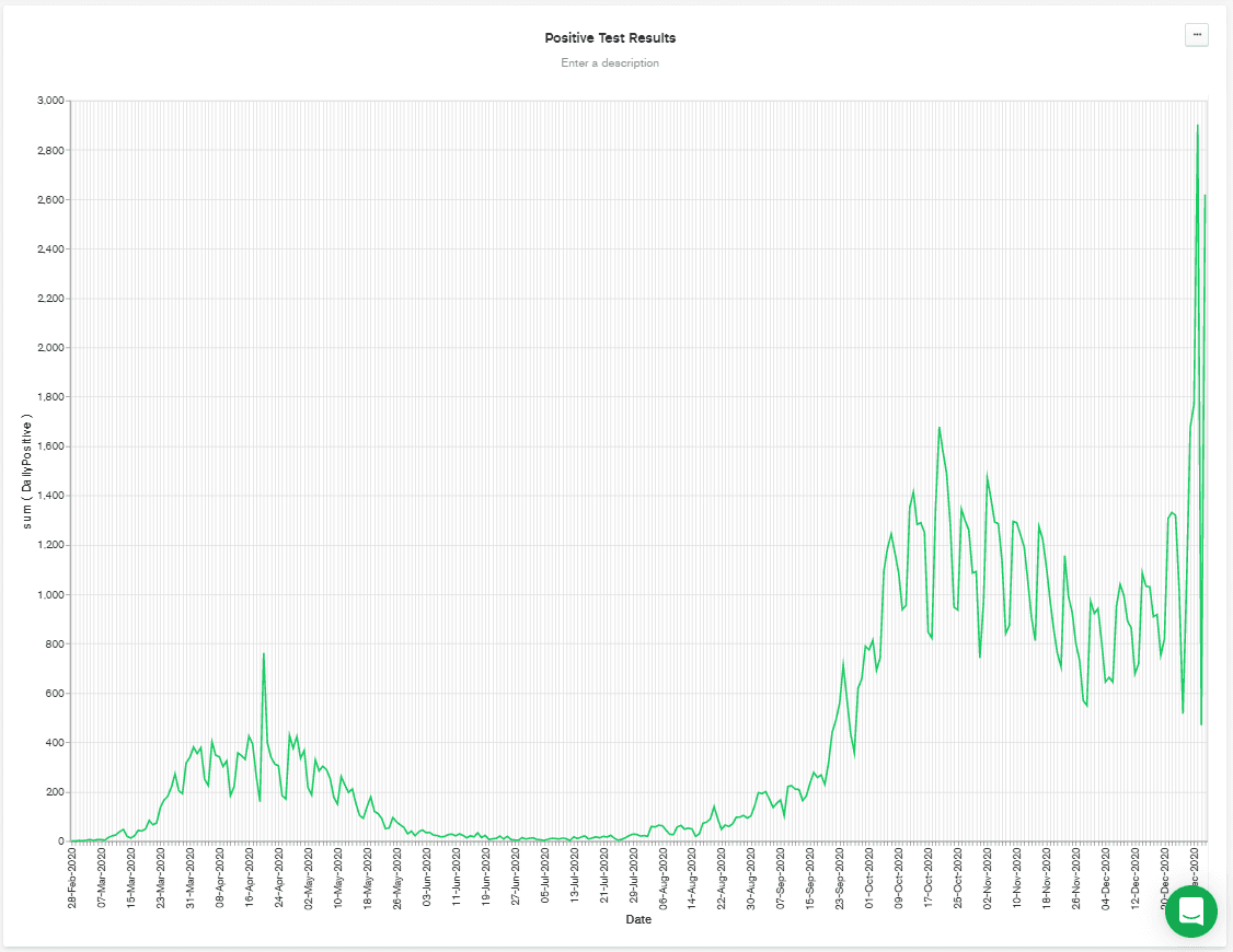
It's worth noting that the above chart was regenerated at the start of January, and so it shows a big spike towards the end of the chart. That's possibly due to relaxation of distancing rules over Christmas, combined with a faster-spreading mutation of the disease that has appeared in the UK.
Although the data is separated by area (or
CAName) in the collection, the data in the chart is automatically combined into a single line, showing the total figures across Scotland. I wanted to keep this chart, but also have a similar chart showing the numbers separated by area.I created a duplicate of this chart, by clicking "Save & Close" at the top-right. Then, in the dashboard, I click on the chart's "..." button and selected "Duplicate chart" from the menu. I picked one of the two identical charts and hit "Edit."
Back in the chart editing screen for the new chart, I drag-and-dropped
CAName over to the Series box. This displays nearly the chart that I have in my head but reveals a problem...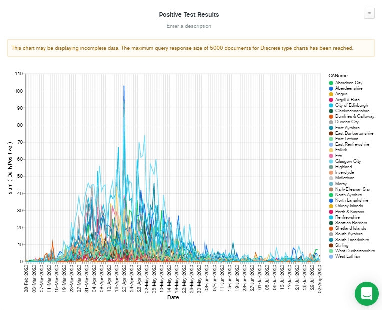
Note that although this chart was generated in early January, the data displayed only goes to early August. This is because of the problem described in the warning message at the top of the chart. "This chart may be displaying incomplete data. The maximum query response size of 5,000 documents for Discrete type charts has been reached."
The solution to this problem is simple in theory: Reduce the number of documents being used to display the chart. In practice, it involves deciding on a compromise:
- I could reduce the number of documents by binning the data by date (as happened automatically at the beginning!).
- I could limit the date range used by the chart.
- I could filter out some areas that I'm not interested in.
I decided on the second option: to limit the date range. This used to require a custom query added to the "Query" text box at the top of the screen, but a recent update to charts allows you to filter by date, using point-and-click operations. So, I clicked on the "Filter" tab and then dragged the
Date field from the left-hand column over to the "+ filter" box. I think it's probably useful to see the most recent figures, whenever they might be, so I left the panel with "Relative" selected, and chose to filter data from the past 90 days.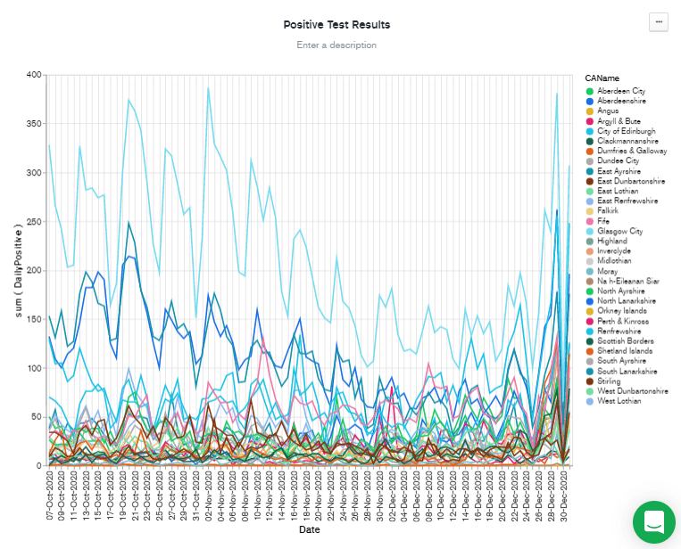
Filtering by recent dates has the benefit of scaling the Y axis to the most recent figures. But there are still a lot of lines there, so I added
CAName to the "Filter" box by dragging it from the "Fields" column, and then checked the CAName values I was interested in. Finally, I hit Save & Close to go back to the dashboard.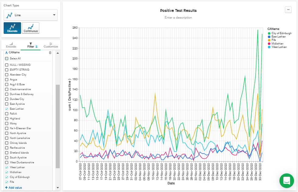
Ideally, I'd have liked to normalize this data based on population, but I'm going to leave that out of this blog post, to keep this to a reasonable length.
Next, I wanted to show how quick it can be to visualize geographical data in MongoDB Charts. I clicked on "Add chart" and selected
covid.daily as my data source again, but this time, I selected "Geospatial" as my "Chart Type." Then I dragged the CAName field to the "Location" box, and DailyPositive to the "Color" box.
Whoops! It didn't recognize the shapes! What does that mean? The answer is in the "Customize" tab, under "Shape Scheme," which is currently set to "Countries and Regions." Change this value to "UK Counties And Districts." You should immediately see a chart like this:
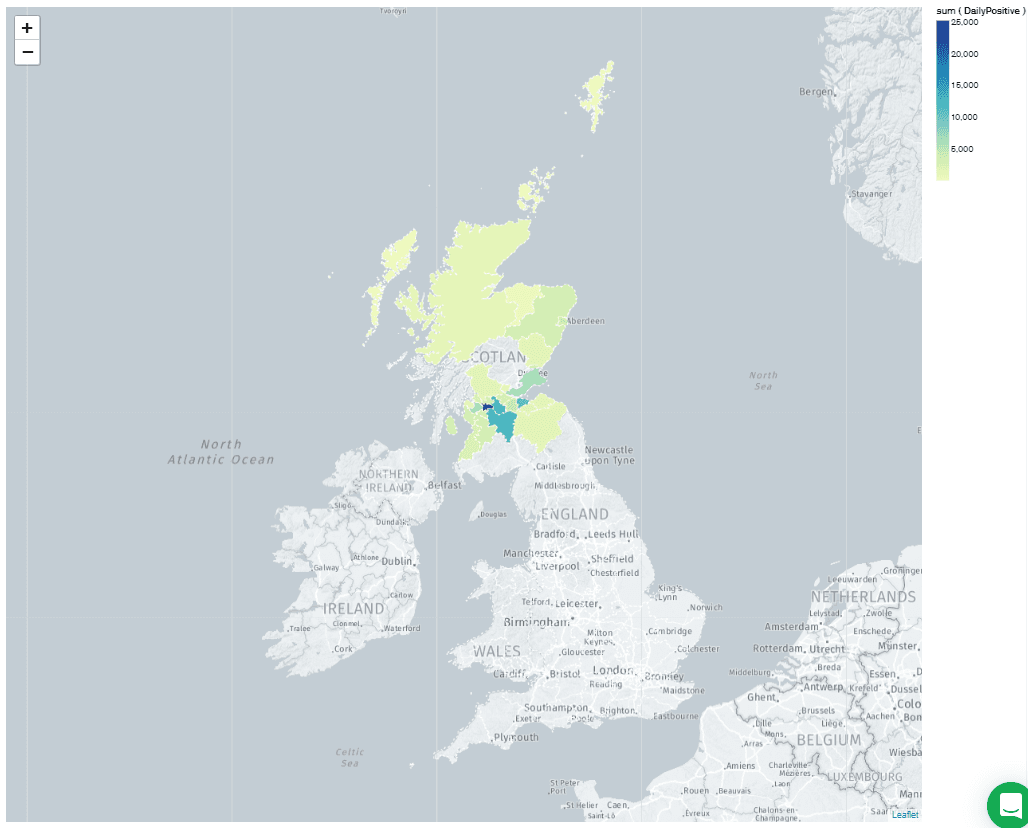
Weirdly, there are unshaded areas over part of the country. It turns out that these correspond to "Dumfries & Galloway" and "Argyll & Bute." These values are stored with the ampersand (&) in the
daily collection, but the chart shapes are only recognized if they contain the full word "and." Fortunately, I could fix this with a short aggregation pipeline in the "Query" box at the top of the window.Note: The $replaceOne operator is only available in MongoDB 4.4! If you've set up an Atlas cluster with an older release of MongoDB, then this step won't work.
This aggregation pipeline consists of a single $addFields operation which replaces " & " in the
CAName field with "and." This corrects the map so it looks like this: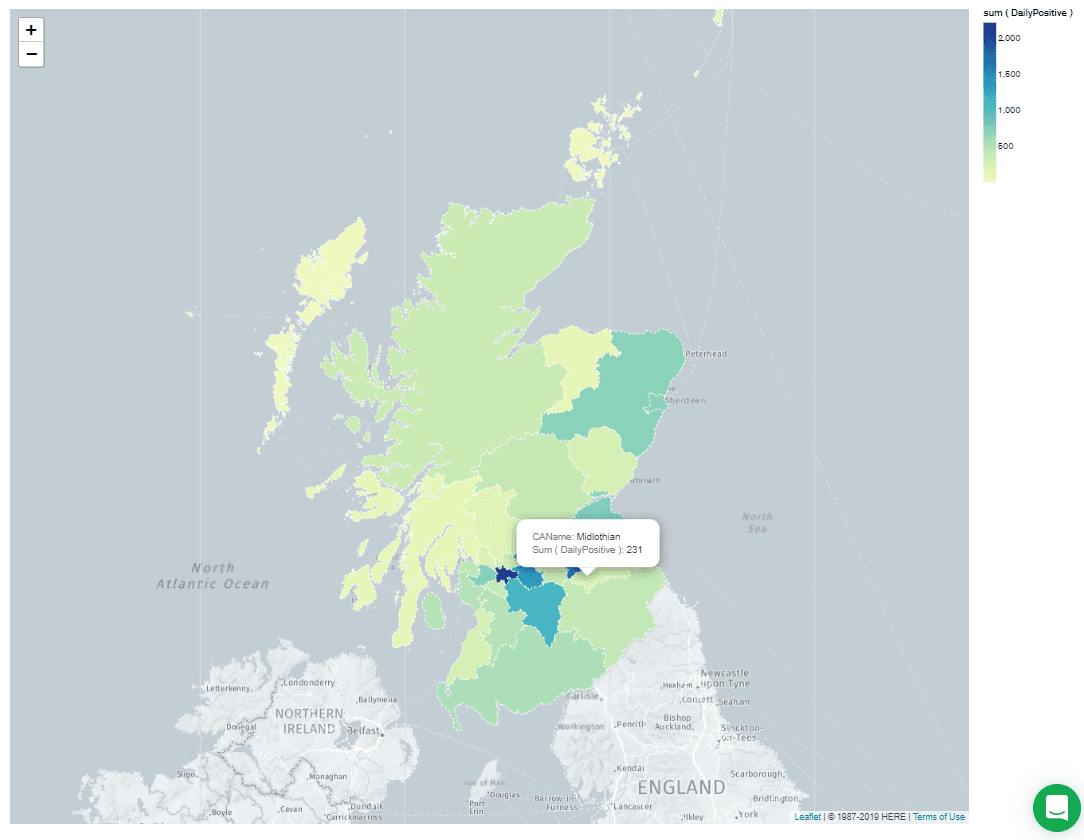
I'm going to go away and import some population data into my collection, so that I can see what the concentration of infections are, and get a better idea of how safe my area is, but that's the end of this tutorial!
I hope you enjoyed this rambling introduction to data massage and import with Jupyter Notebook, and the run-through of a collection of MongoDB Charts features. I find this workflow works well for me as I explore different datasets. I'm always especially amazed at how powerful MongoDB Charts can be, especially with a little aggregation pipeline magic.
If you have questions, please head to our developer community website where the MongoDB engineers and the MongoDB community will help you build your next big idea with MongoDB.