Hi Phil,
Thank you for your interest in the embedding SDK.
The rendering specification customisations that the SDK supports are the same customisations that you can find in the Chart Builder. So if there is something that you can’t do in the Chart Builder in terms of customisations, it won’t be supported by the SDK.
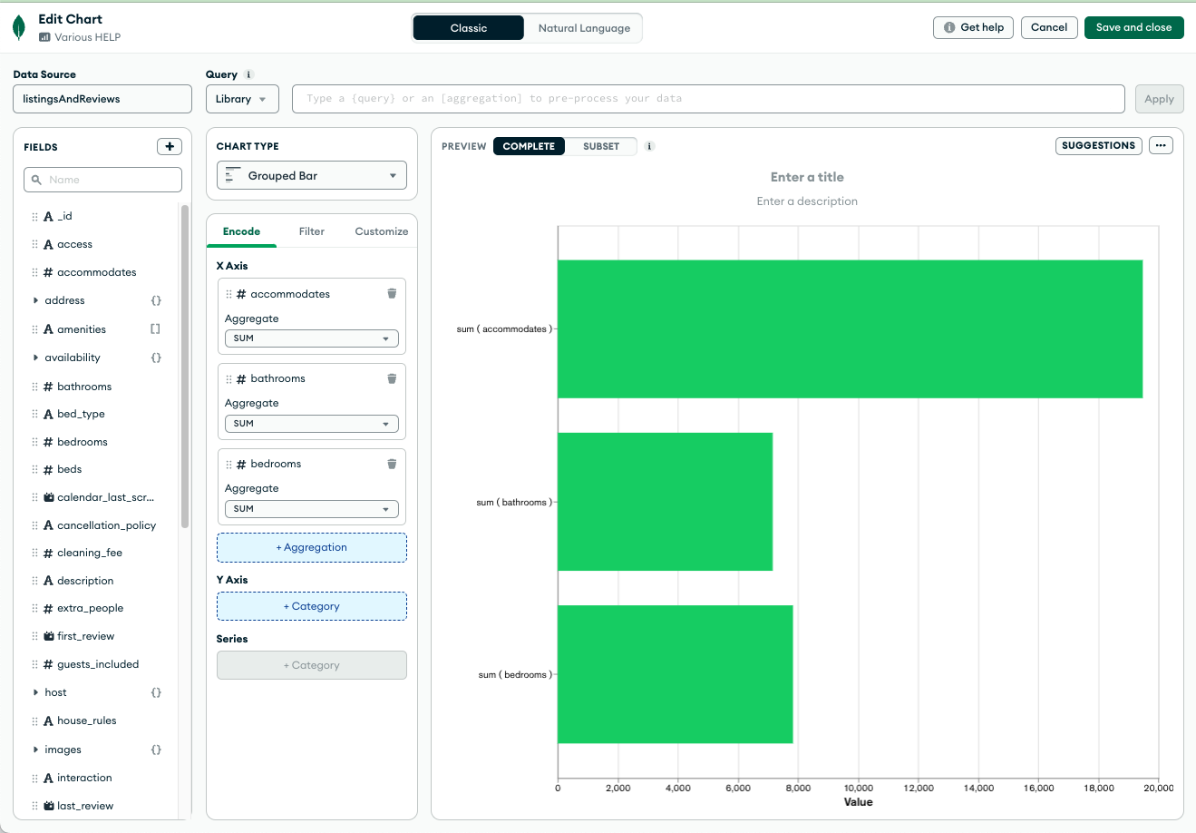
The reason you see one customisation colour for all bars is because the chart is single series, and it has one colour for all bars. Even though you have multiple fields encoded on the aggregation channel, there is no category channel on your chart, so these aggregations are not grouped by any other field.
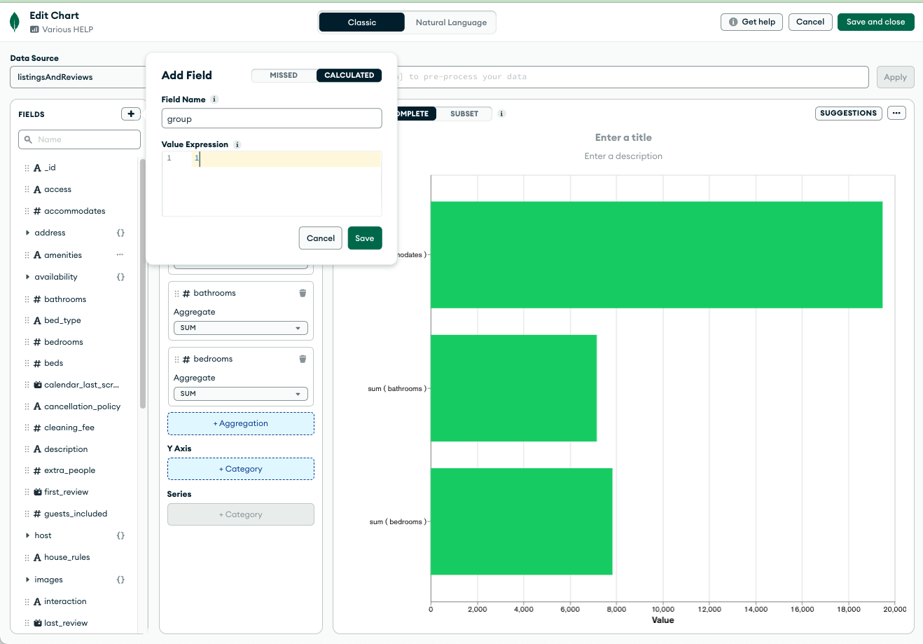
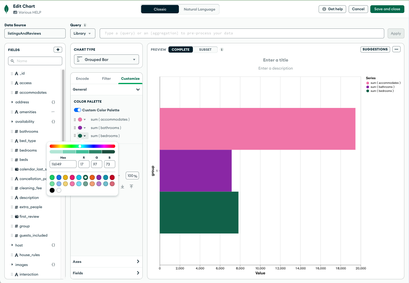
If you want to see the values on the “x” as multi-series, they need to be grouped by a common field. In this case, I would suggest to encode a field into the “y” axis. If you don’t have a suitable field in your documents, you can add a calculated field with a constant value. Then you will be able to see five series and put a different colour on each of them. You can change the colours in the chart builder customisations tab or via the embedding SDK. I’ve attached some screenshots to make it easier to explain.

This embedding SDK snippet is for multi-series chart with multiple fields in the same channel:
renderingSpec: {
      version: 1,
      options: {
        colorPalette: {
          type: 'discrete',
          channels: ['x', 'x_series_0', 'x_series_1'],
          value: ['#21A7F0', '#76C68F', '#C9E52F'],
        },
      },
    }
I hope this helps. Let us know if you have any additional questions. ![]()