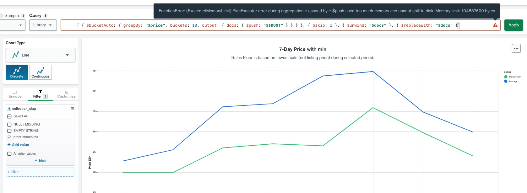
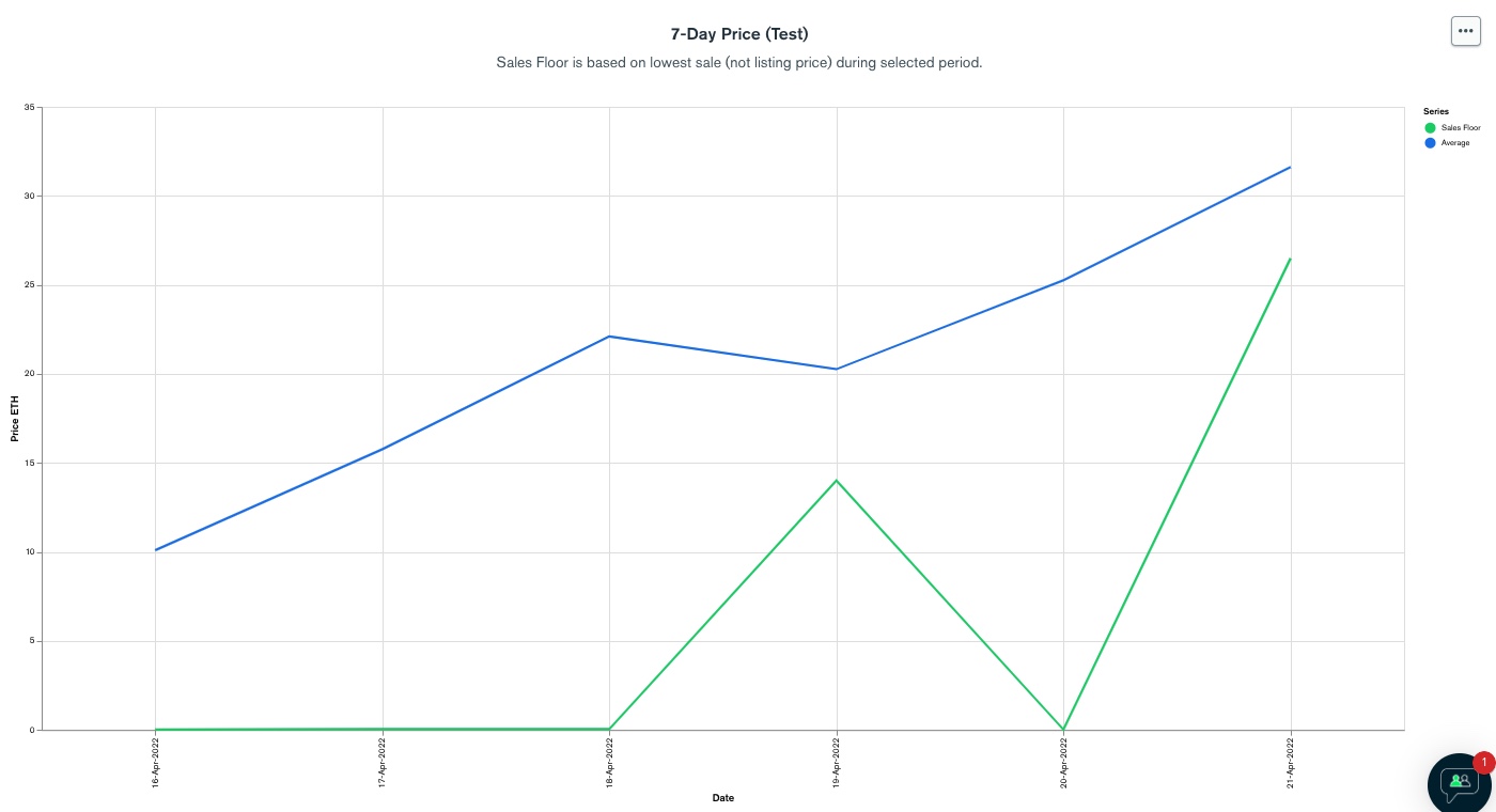
I am trying to draw a 7-day price chart for some NFTs, using MongoDB data. The chart is showing the minimum (floor) prices over a few days (green color line in the attached).
One problem is that, a few extreme transactions that sold at ridiculously low prices, made the sales floor green line going to zero.
If I filter the data using a query like this:
{"price": {$gte: 0.5}}
Green line will look more realistic:
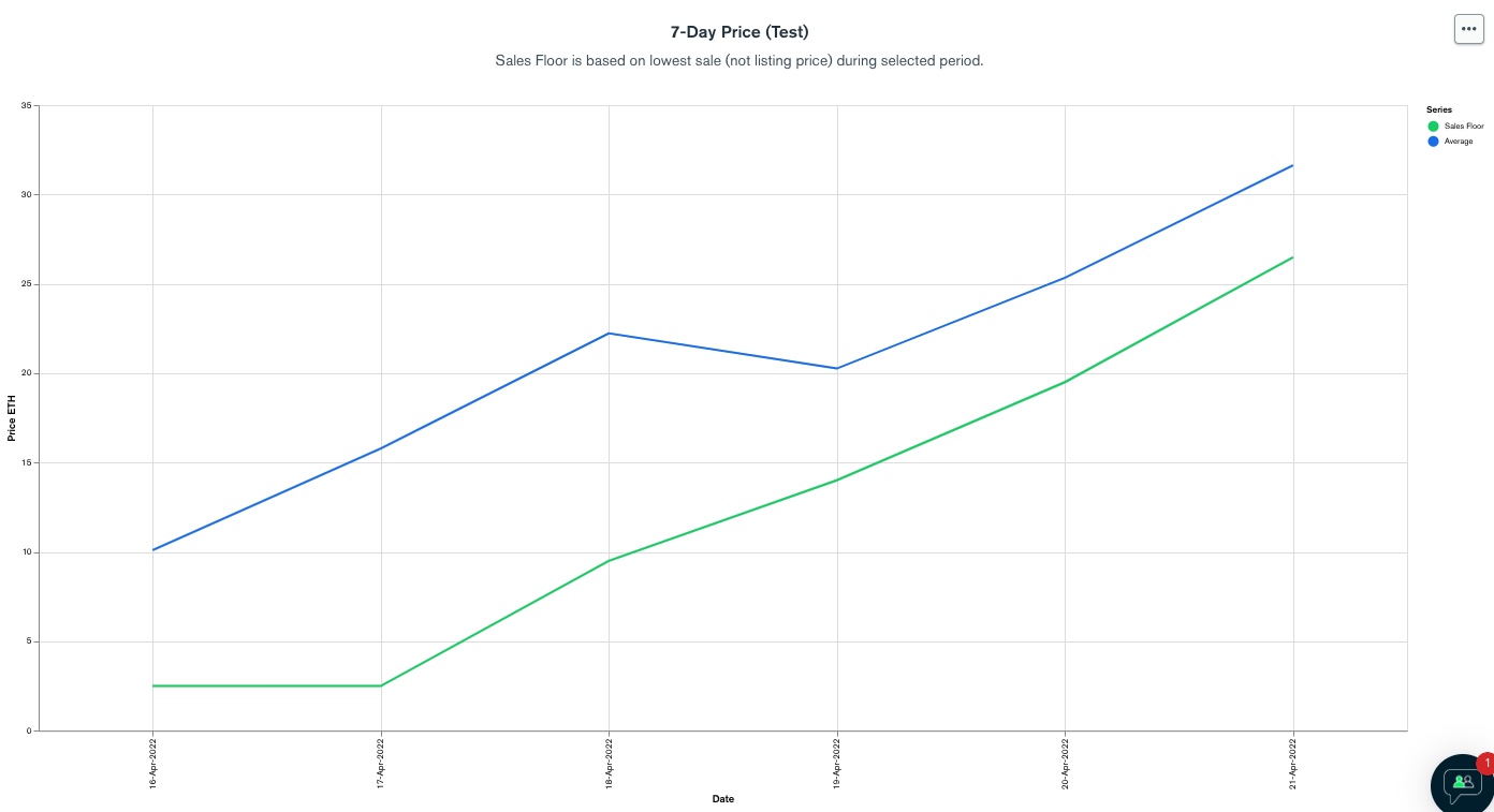
But this only works because I know this particular chart the price should be around 10 to 20 so anything less than 0.5 is considered extreme. In reality, I do not know what is the prices being feed into the chart, the price could be between 10 to 20, or between 0.01 to 0.02. So I cannot hard code 0.5.
After researching, I learnt that I could use aggregation pipeline, specifically bucketAuto command, to split the prices into 10 buckets, remove last bucket, effectively remove the bottom 10% of the prices for specific NFT prices.
But unfortunately, I then learnt that, I cant inject this aggregation pipeline into my chart when embedding it as iframe. This is roughly how I render the chart iframe for a specific NFT collection:
“https://charts.mongoxx.com/xxxxx/embed/charts?id=” + chartId + ‘&theme=’ + this.theme() + ‘&maxDataAge=3600&autoRefresh=true&filter={“metadata.collection_slug”:{$eq:"’ + xxxxxx + '"}}
I cannot create ONE single aggregation pipeline to remove bottom 10% of the outlier values because the prices/transactions collection contains prices for many NFTs.
I can theoretically create thousands of aggregation pipelines at the data sources manually, but that is extremely painful and not logical.
Is there other tricks to resolve this issue? Fundamentally I just want to remove the extreme values in the chart, without hard coding anything.