The latest release of MongoDB Charts adds Conditional Formatting; an exciting new feature that enables chart authors to highlight important changes in their chart data, based on a set of rules that they define. Conditional Formatting rules can be applied to table charts and number charts.
Why use Conditional Formatting?
For table charts, the data is densely packed into the visualisation using rows and columns. This is great for comparing many values simultaneously, but as the density increases it may become more difficult to find and focus on the data that matters.
Many authors use Number charts to track key individual metrics within their data. While the number itself can be useful, sometimes it isn’t enough to convey other necessary information for its context – for instance, is a high number good or bad?
Conditional Formatting can aid users in understanding the data by applying different styles based on rules to highlight what is important, and to provide them with more context.
See Conditional Formatting in Action with Formula 1 Data
Formula 1 motorsport is what I like to refer to as the “sport of nerds”, because analyzing and understanding huge amounts of data, and being able to quickly make a decision on that analysis can be the difference between winning and losing.
So let’s see how Conditional Formatting can help with this task using data from the 2021 FIA Formula 1 World Championship.
Single Color Conditional Formatting
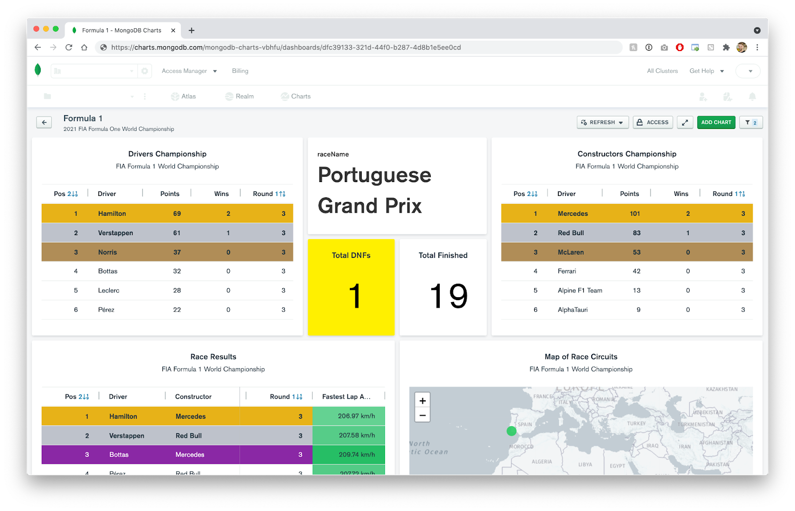
Let’s start off with something simple. Below is a table showing the 2021 Drivers Championship after three rounds. A driver’s position in the championship is determined by the total number of points they have been awarded over successive rounds of the season.

Let’s edit this chart and add Conditional Formatting to highlight the top three drivers in the championship with colors to represent 1st, 2nd, and 3rd place.
Click on the Customize tab, and then click on the Conditional Formatting menu to expand the accordion. As you can see we haven’t yet defined any rules, so let’s add a new rule by clicking the + Add button.
A drawer will open up from the left hand side of the screen displaying the Add Format Rules view. A conditional formatting rule must have at least one condition, and all conditions must match in order for the rule to be applied.
Let’s highlight the row of the driver currently in 1st place by adding a single color rule with one condition.
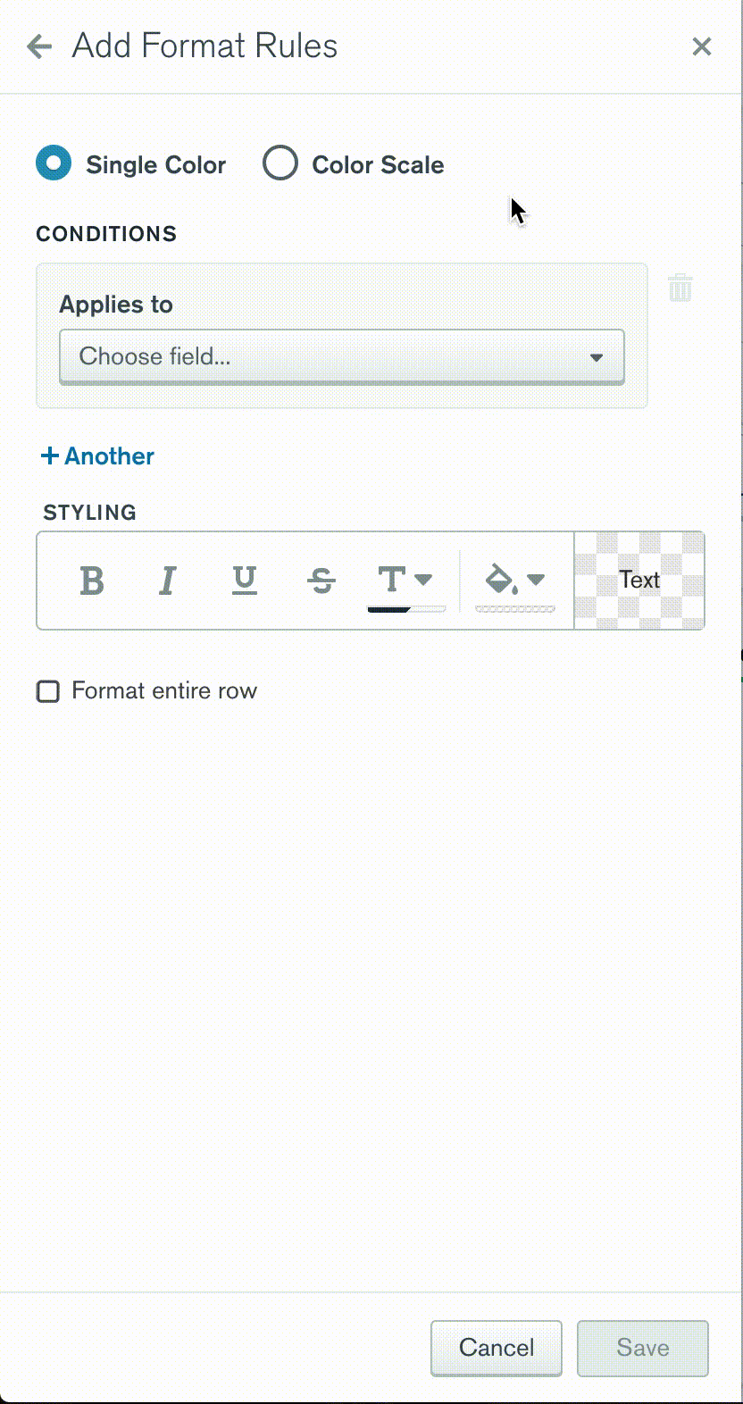
Since this rule will be determined by the driver’s current position in the championship, we need to add a condition to act on this data. We can target this field by selecting Pos from the Applies to select control.
Now that we know what field we are targeting, we must next choose an operator to use for the comparison. Since we are only interested in data that matches a specific value, we select the Equal To numeric operator.
Next we must provide an input for the operand to be compared to. For this rule we are only interested in highlighting the driver that is in first place in the championship, so we enter a value of 1 into the Input.
You can think of this condition as saying; “is the value of the field Pos equal to the value of 1?” If it is, then apply the styling of this rule, otherwise do not.
Finally we choose what styling changes should be applied by choosing from the options under Styling. In this example, we want to highlight the background color of the cell in a gold color to signify 1st place, and we will also apply a bold font weight to the text to make it more prominent.
Additionally we also would like for these styles to be applied to the entire row, and not just the cell that the condition is applicable to, so we will check the Format entire row option.
And that’s it! Once we save the rule, you’ll notice that the table re-renders in the Chart Builder Preview to show that the data is being evaluated correctly and the Conditional Formatting rule is applied. We then simply rinse and repeat this process to add additional rules to highlight the drivers in 2nd and 3rd place, resulting in the following output:

Color Scale Conditional Formatting
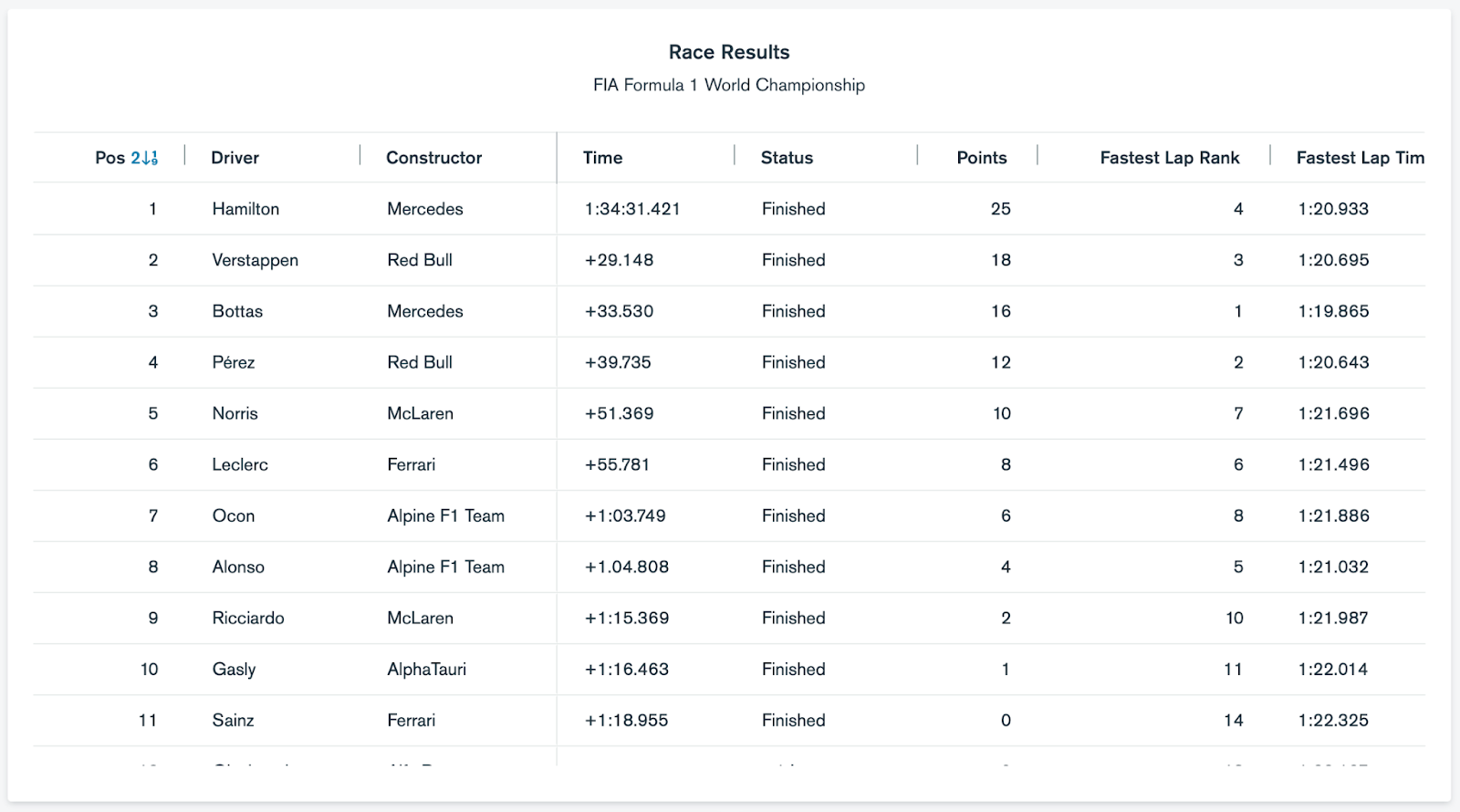
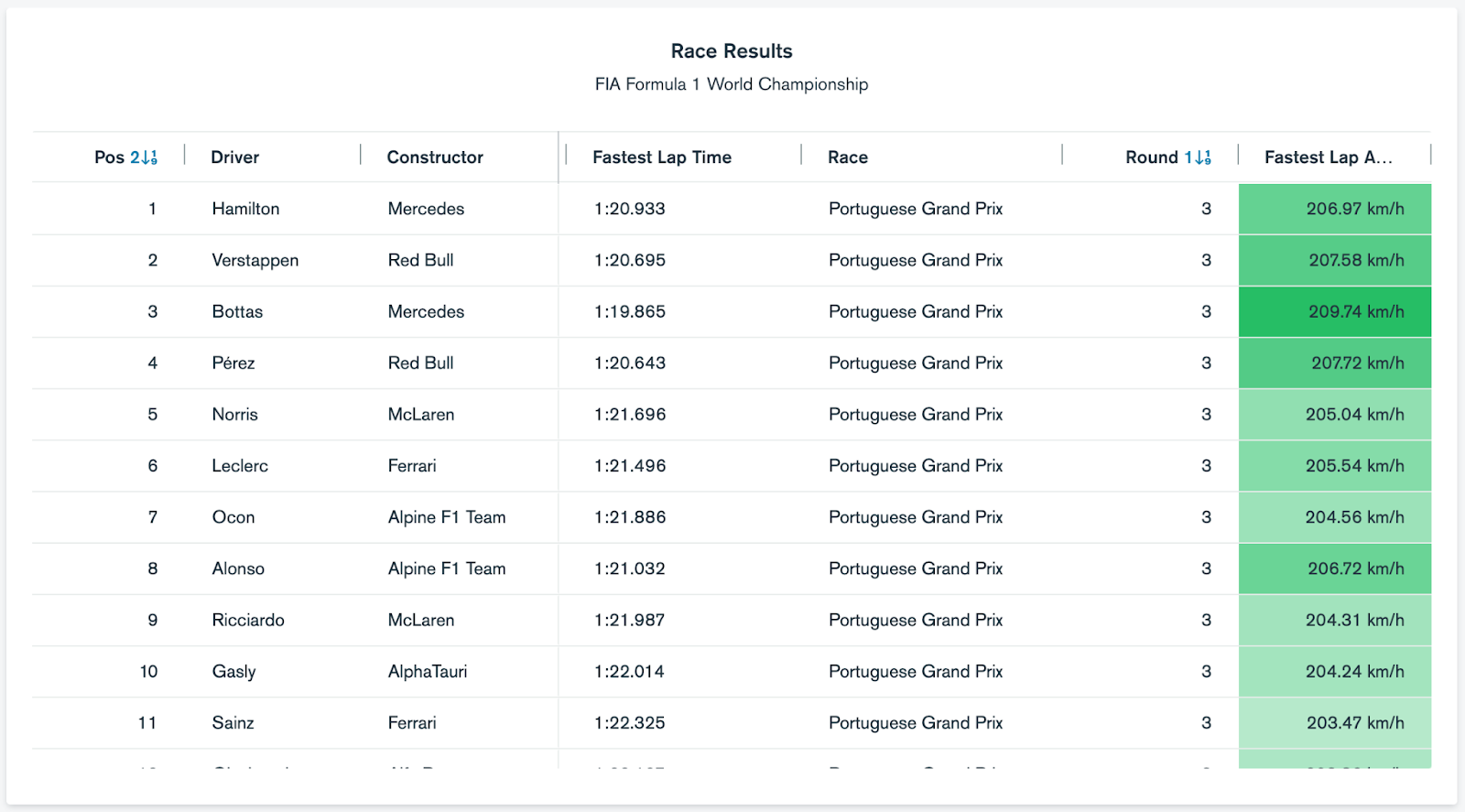
When comparing tabular data, sometimes it is desirable to use color to show where each value lies relative to other values in the column. The table below shows the race results for the third round of the 2021 FIA Formula 1 World Championship. Each row displays the final result for each driver taking part in the race.
Let’s compare the Average Speed of each driver’s Fastest Lap using a Color Scale Conditional Formatting rule. Navigate to the Add Format Rule screen in the same way by going to “Customize > Conditional Formatting > + Add”, but this time select the Color Scale radio option.
Note: Conditional Formatting Color Scale rules can only have one condition, and this condition can only be applied to fields in a Table Chart encoded as Value columns.
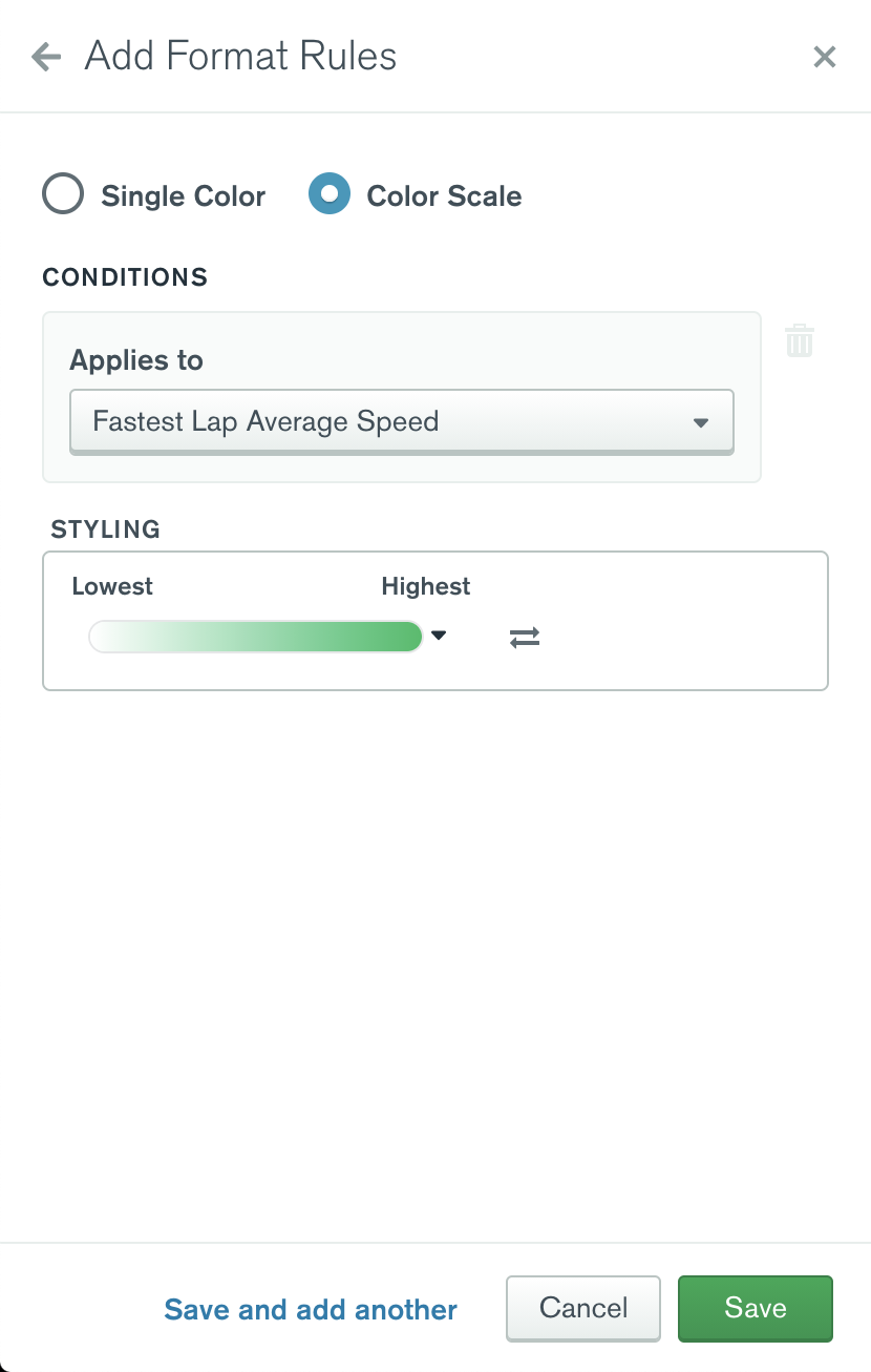
Select the Fastest Lap Average Speed as the target for the condition.
You’ll notice that unlike the discrete Single Color rules, there are no other settings to configure for the condition. This is because a Color Scale will compare the values across the documents in sort order, and will determine a background color to apply to the cell based on the rank of the value within the range.
Since we are interested in finding the highest Average Speed across each driver’s fastest lap, we will select a sequential color scale, where higher values are colored green, and lower values are colored in white. Save the rule to see the changes applied.
As you can see, for the third round of the 2021 FIA Formula 1 World Championship, the fastest lap average speed was set by Valtteri Bottas at a blistering speed of 209.74 km/h (130.32 mph)!
And there we have it. I hope this brief introduction to Conditional Formatting has highlighted (pun intended) the capabilities of this exciting new feature! In this post we’ve only scratched the surface of what’s possible though, Conditional Formatting has many many more powerful operators than what we have demonstrated here, including matching values by range, regular expression and even ranks. Why not take it for a test drive yourself to see what is possible?
If you haven’t tried Charts yet, it’s quick, easy and free to get started. Simply sign up for MongoDB Cloud, deploy a free Atlas cluster and click Charts in the top navigation bar. You can also ask questions on the MongoDB Developer Community Forums, or suggest new or improved features using the MongoDB Feedback Engine.